 kage
kage
callfifi.app
Design analysis
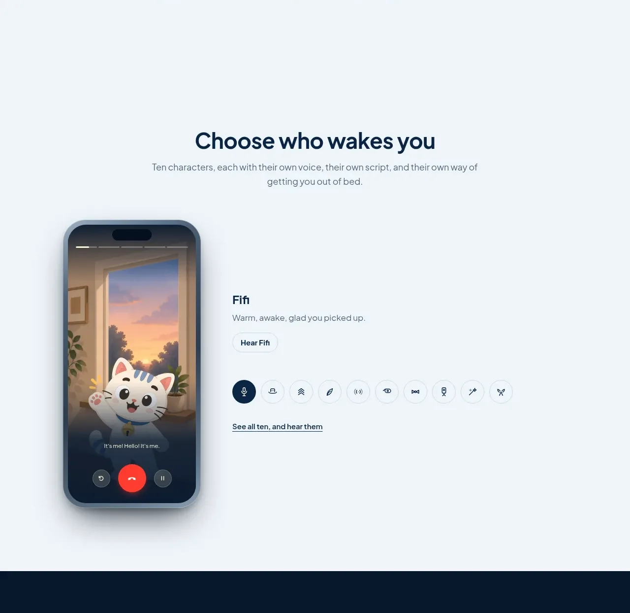
This section introduces selectable voices or characters with a large device mockup beside a compact selection interface and a link to browse more.
Prompt preview
## Reference images

Study these alongside the description below: hierarchy, rhythm, spacing, colour. Build for the product you are asked about, using this design language.

- Component: https://kage-design-assets.t3.tigrisfiles.io/components/fifi/65f510a7-1d11-431a-a427-6e570df25f2f-1789538467-3.webp
- Full page it was cut from: https://kage-design-assets.t3.tigrisfiles.io/screenshots/fifi/65f510a7-1d11-431a-a427-6e570df25f2f-1789538432367-full.webp
- Component on Kage: https://kage.design/component/fifi-feature-grid

## Before you start
Ask what the user's product is, who it serves, and what their brand personality and palette are. Apply the following principles to that product rather than reproducing the reference.

Create a feature showcase with a centered heading and short subtitle at the top, followed by a generous two-column product-demo layout. Use the same pale cool background as the surrounding content. Place a tall interface mockup on the left and explanatory content on the right. The right side should include a small feature title, one-line description, a light pill button, a horizontal row of circular or softly rounded selectable options, and an underlined browse-all link. Use subtle cool-gray borders, 16–24px radii, soft shadow only around the mockup, and a restrained accent state in deep navy. Keep the demo controls visually secondary to the device. On mobile, put the copy above the visual and make the options horizontally scrollable.

Never: use logos, product names, copy, illustrations, or imagery from the reference.
More components

 Authentication product capabilities
tiun. · Feature grid
Authentication product capabilities
tiun. · Feature grid
 Customer data and user management
tiun. · Feature grid
Customer data and user management
tiun. · Feature grid
 Problem and unified solution narrative
tiun. · Feature grid
Problem and unified solution narrative
tiun. · Feature grid
 Integration and agent workflow
tiun. · Feature grid
Integration and agent workflow
tiun. · Feature grid
 Billing and checkout capabilities
tiun. · Feature grid
Billing and checkout capabilities
tiun. · Feature grid

 Receiving money channels
Payflip · Feature grid
Receiving money channels
Payflip · Feature grid