 kage
kage
callfifi.app
Design analysis
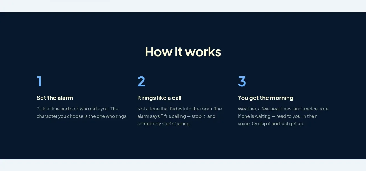
A dark band explains the workflow through three evenly spaced numbered columns with concise titles and descriptions.
Prompt preview
## Reference images

Study these alongside the description below: hierarchy, rhythm, spacing, colour. Build for the product you are asked about, using this design language.

- Component: https://kage-design-assets.t3.tigrisfiles.io/components/fifi/65f510a7-1d11-431a-a427-6e570df25f2f-1789538467-4.webp
- Full page it was cut from: https://kage-design-assets.t3.tigrisfiles.io/screenshots/fifi/65f510a7-1d11-431a-a427-6e570df25f2f-1789538432367-full.webp
- Component on Kage: https://kage.design/component/fifi-feature-grid-2

## Before you start
Ask what the user's product is, who it serves, and what their brand personality and palette are. Apply the following principles to that product rather than reproducing the reference.

Build a dark process section using a deep navy surface around #06182b and warm-white heading text. Center a section heading, then lay out three equal columns in a max-width container. Give each step a large blue number around #67aef5, a short bold title, and a compact muted description. Keep the numbers aligned on one baseline and preserve generous horizontal gaps. Use approximately 72px top and bottom padding, a 34–40px section heading, and 15px body text. On mobile, stack the steps vertically with clear spacing and maintain the numbered progression.

Never: use logos, product names, copy, illustrations, or imagery from the reference.
More components

 Authentication product capabilities
tiun. · Feature grid
Authentication product capabilities
tiun. · Feature grid
 Customer data and user management
tiun. · Feature grid
Customer data and user management
tiun. · Feature grid
 Problem and unified solution narrative
tiun. · Feature grid
Problem and unified solution narrative
tiun. · Feature grid
 Integration and agent workflow
tiun. · Feature grid
Integration and agent workflow
tiun. · Feature grid
 Billing and checkout capabilities
tiun. · Feature grid
Billing and checkout capabilities
tiun. · Feature grid

 Receiving money channels
Payflip · Feature grid
Receiving money channels
Payflip · Feature grid