kage
kage
callfifi.app
Design analysis
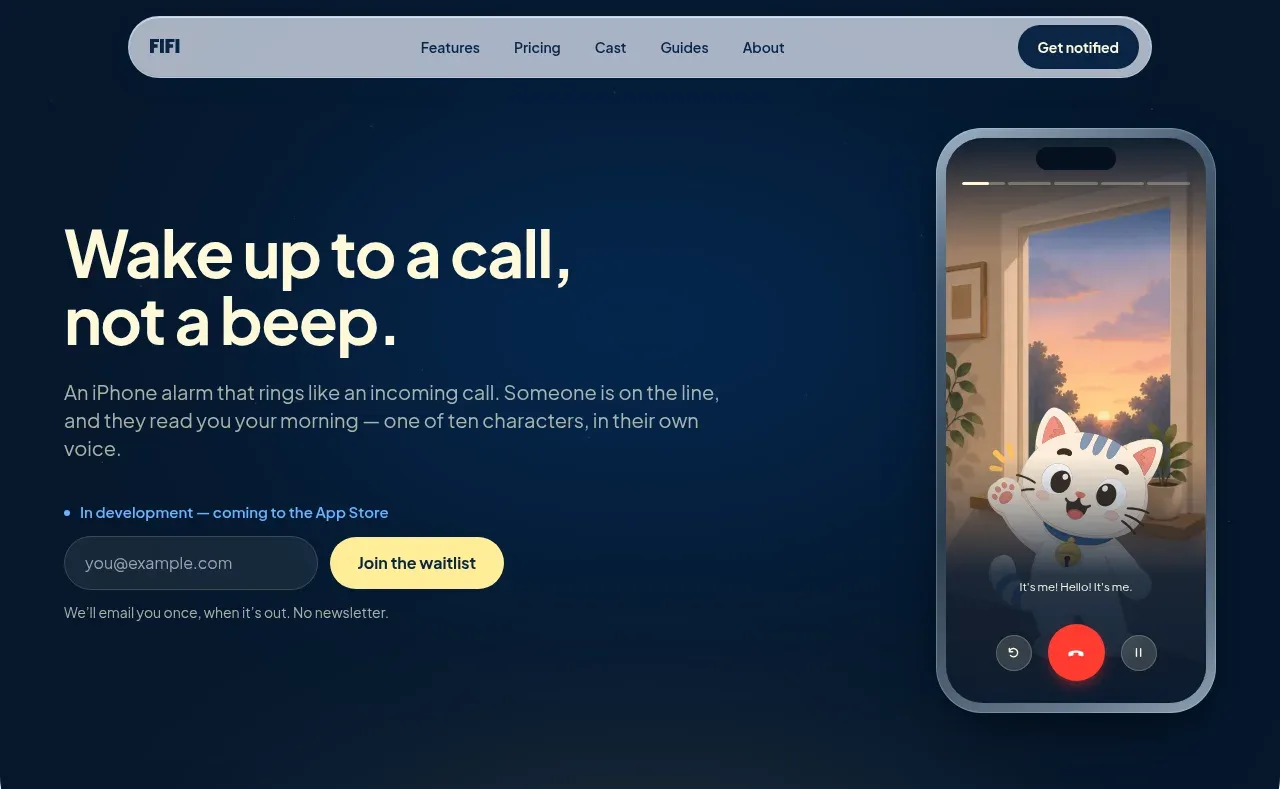
The hero pairs a large promise and waitlist form on the left with a tall phone-call visual on the right, all inside a dark rounded-bottom panel.
Prompt preview
## Reference images

Study these alongside the description below: hierarchy, rhythm, spacing, colour. Build for the product you are asked about, using this design language.

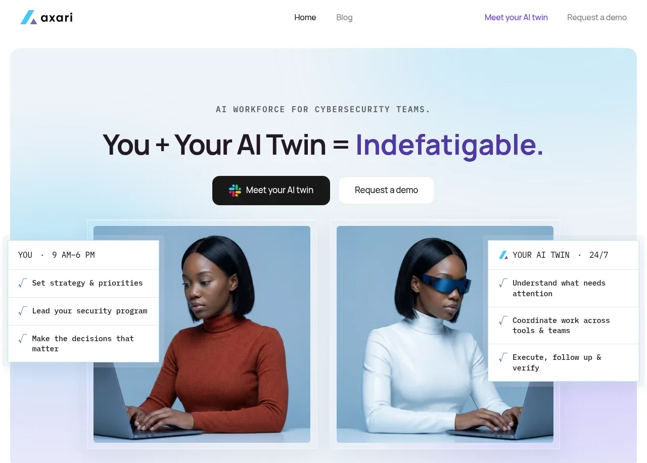
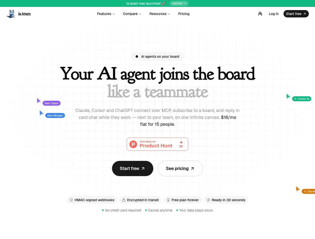
- Component: https://kage-design-assets.t3.tigrisfiles.io/components/fifi/65f510a7-1d11-431a-a427-6e570df25f2f-1789538467-1.webp
- Full page it was cut from: https://kage-design-assets.t3.tigrisfiles.io/screenshots/fifi/65f510a7-1d11-431a-a427-6e570df25f2f-1789538432367-full.webp
- Component on Kage: https://kage.design/component/fifi-hero

## Before you start
Ask what the user's product is, who it serves, and what their brand personality and palette are. Apply the following principles to that product rather than reproducing the reference.

Create a two-column hero directly beneath the navigation. Use a deep navy background around #06182b, large warm-white headline text around #f5f3d7, muted blue-gray supporting copy, and a soft rounded bottom edge. Align content to a generous max-width grid: text occupies roughly 58% and a product visual occupies the remainder. Give the headline a tight 52–60px desktop scale, 1.0–1.05 line height, and a maximum width that creates two purposeful lines. Place a small status line above a compact email form, with a dark translucent input and a pale yellow rounded submit button. Add a short reassurance note below. The visual should be a tall product mockup or abstract interface, not a literal copy; let it overlap the hero's vertical rhythm while staying inside the section. Stack columns on mobile and preserve a clear primary action.

Never: use logos, product names, copy, illustrations, or imagery from the reference.