 kage
kage
callfifi.app
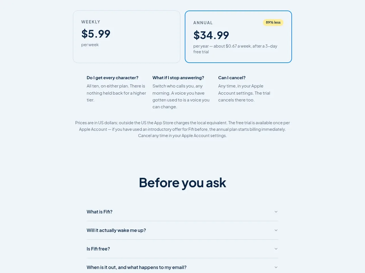
Design analysis
The pricing section frames annual value, shows two large plan cards, then answers three practical purchase questions in a compact comparison row.
Prompt preview
## Reference images

Study these alongside the description below: hierarchy, rhythm, spacing, colour. Build for the product you are asked about, using this design language.

- Component: https://kage-design-assets.t3.tigrisfiles.io/components/fifi/65f510a7-1d11-431a-a427-6e570df25f2f-1789538468-6.webp
- Full page it was cut from: https://kage-design-assets.t3.tigrisfiles.io/screenshots/fifi/65f510a7-1d11-431a-a427-6e570df25f2f-1789538432367-full.webp
- Component on Kage: https://kage.design/component/fifi-pricing-table

## Before you start
Ask what the user's product is, who it serves, and what their brand personality and palette are. Apply the following principles to that product rather than reproducing the reference.

Create a centered pricing section on a pale cool background. Start with a strong heading, a concise value-oriented paragraph, and two horizontally aligned pricing cards. Make one card a quiet secondary option and the preferred card clearly selected with a brighter blue border around #1687d2 and a small savings badge in a warm accent. Each card should include an uppercase cadence label, large price, supporting unit copy, and enough padding for easy scanning. Below, add three short FAQ-like columns covering common objections. Use 18–24px card radii, subtle borders, navy typography, and responsive stacking. Keep pricing legible and avoid visual clutter.

Never: use logos, product names, copy, illustrations, or imagery from the reference.
More components
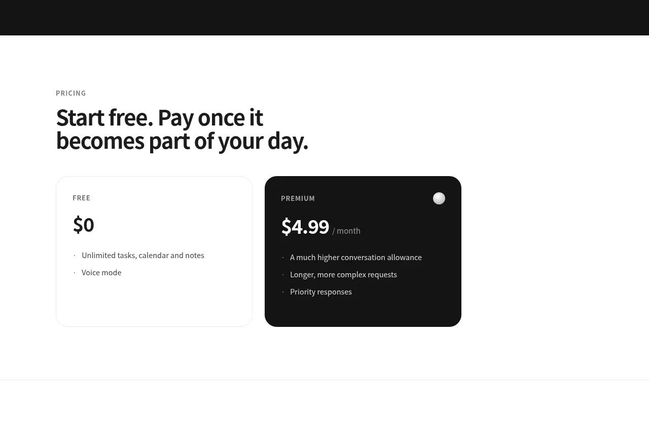
 Free and premium pricing
Grimo AI · Pricing table
Free and premium pricing
Grimo AI · Pricing table
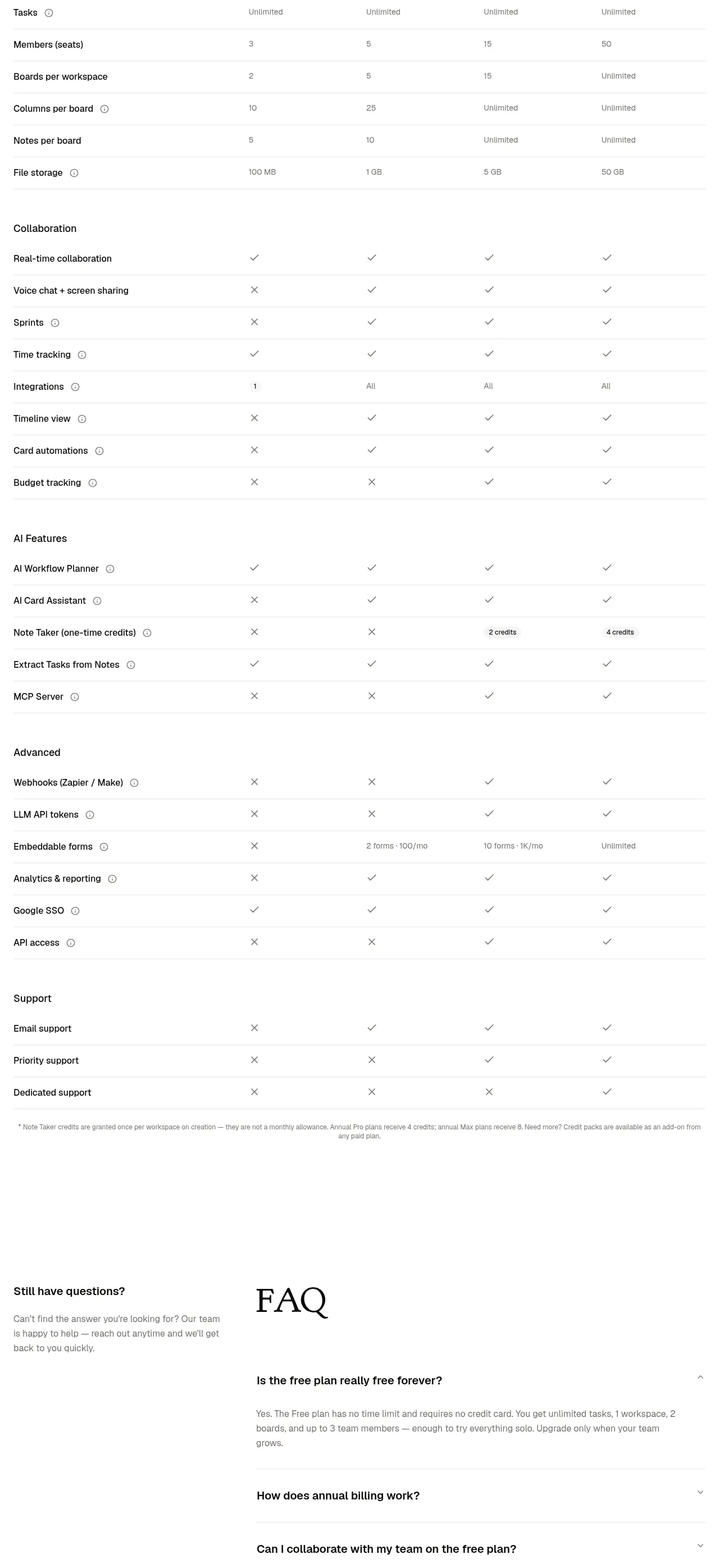
 Transparent pricing comparison
is.team · Pricing table
Transparent pricing comparison
is.team · Pricing table
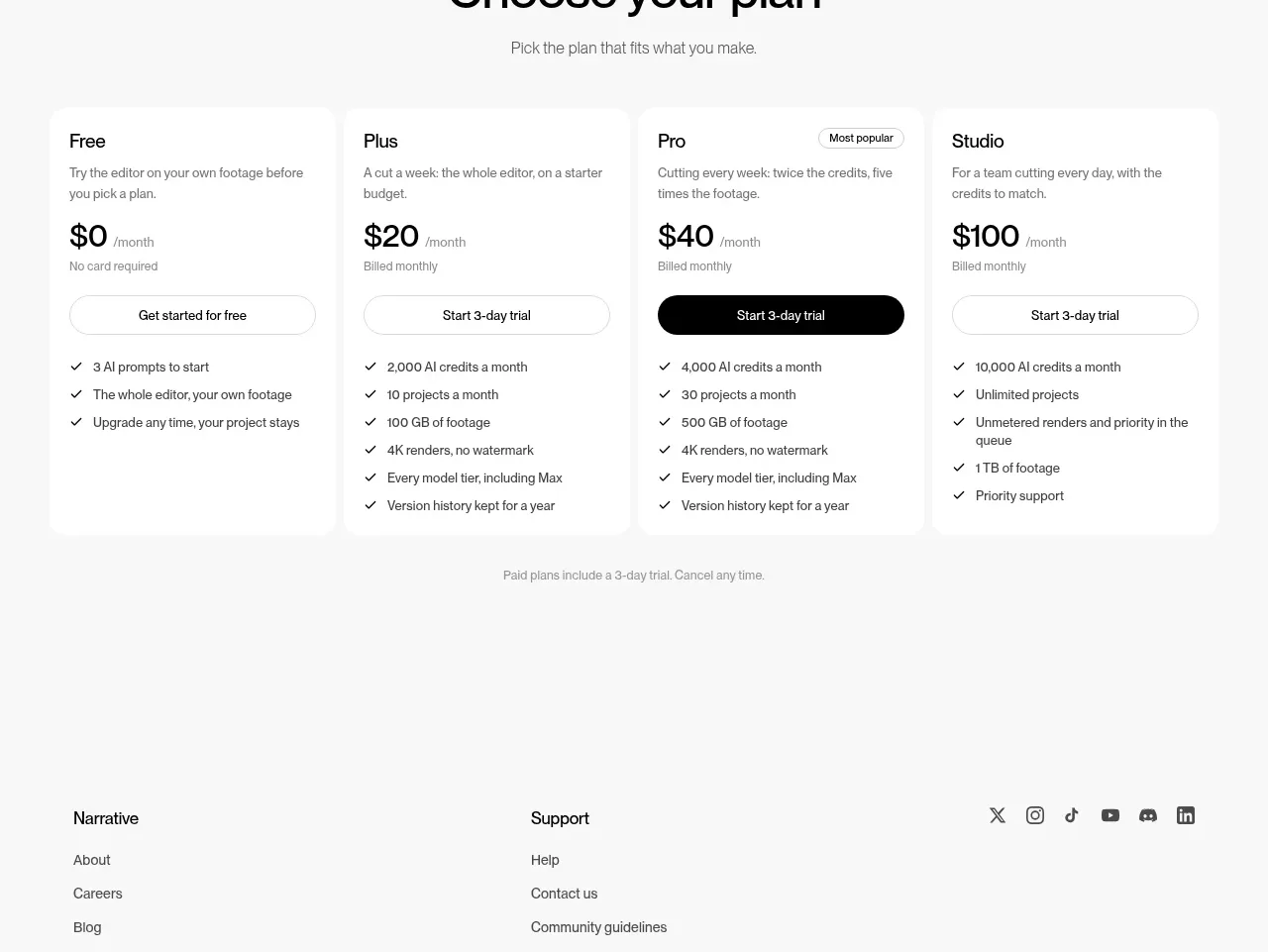
 Four-tier pricing table
Narrative · Pricing table
Four-tier pricing table
Narrative · Pricing table
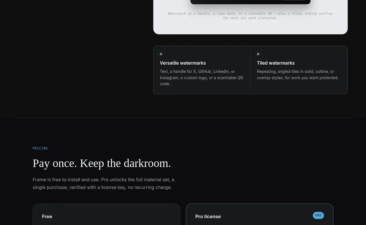
 Free and paid license pricing
Portfolio Frame · Pricing table
Free and paid license pricing
Portfolio Frame · Pricing table
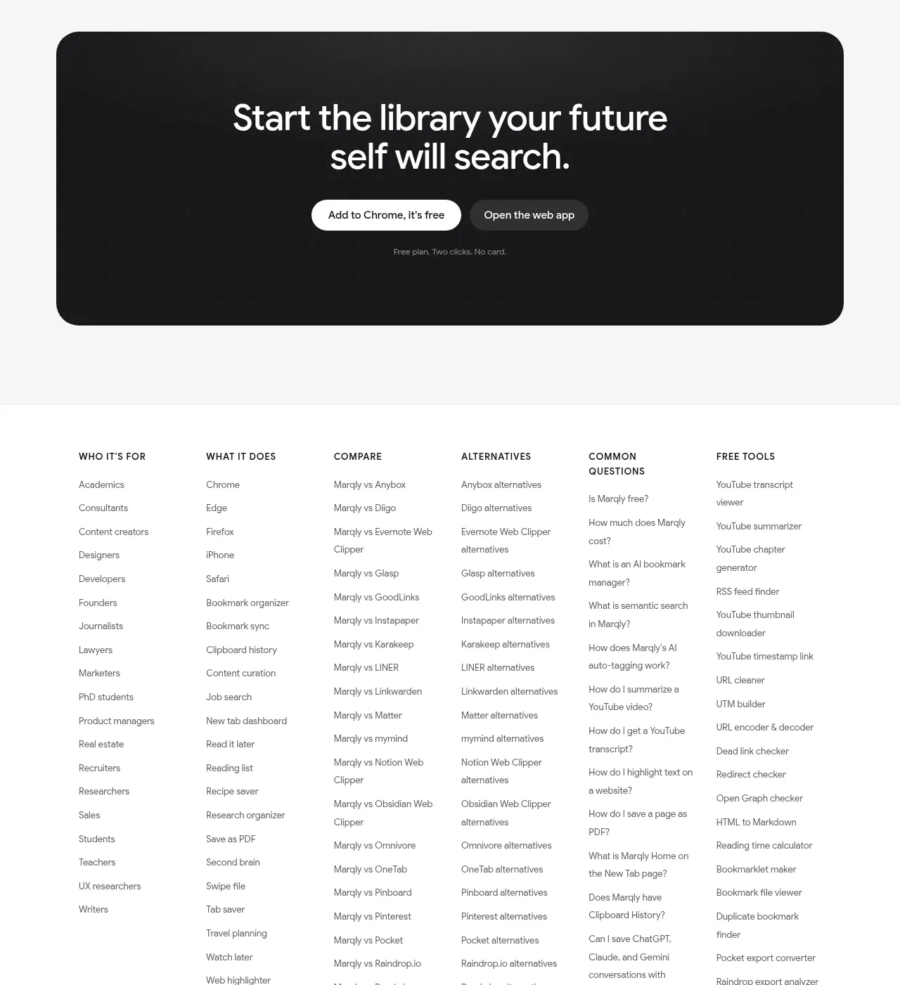
 Free and pro pricing
Marqly 6.0 · Pricing table
Free and pro pricing
Marqly 6.0 · Pricing table
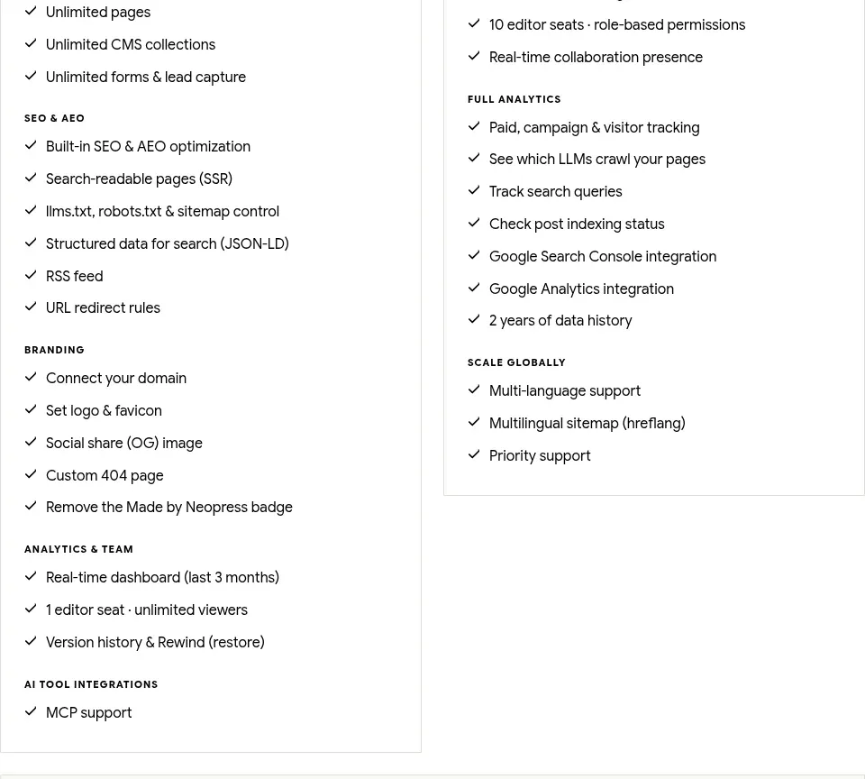
 Traffic-scaled pricing
Neopress · Pricing table
Traffic-scaled pricing
Neopress · Pricing table