kage
kage
figma.com
Design analysis
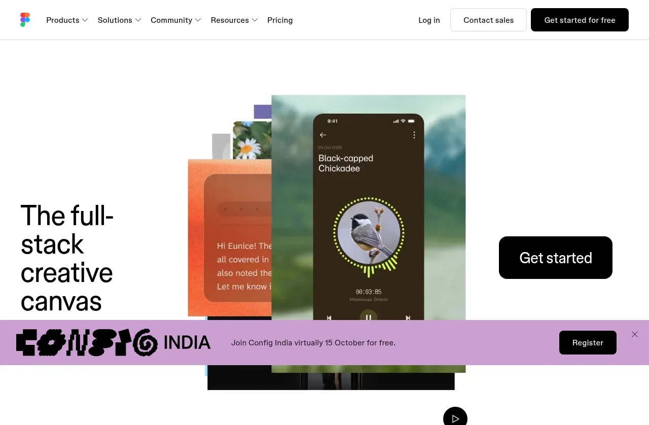
The opening hero combines a large left-aligned statement, a prominent black CTA, and a layered creative visual centered in the upper half, followed by a small circular play control.
Prompt preview
## Reference images

Study these alongside the description below: hierarchy, rhythm, spacing, colour. Build for the product you are asked about, using this design language.

- Component: https://kage-design-assets.t3.tigrisfiles.io/components/figma-agent/07db1d51-fc5a-42e3-8555-5aed12aa6731-1791439425-1.webp
- Full page it was cut from: https://kage-design-assets.t3.tigrisfiles.io/screenshots/figma-agent/07db1d51-fc5a-42e3-8555-5aed12aa6731-1791439335233-full.webp
- Component on Kage: https://kage.design/component/figma-agent-hero

## Before you start
Ask what the user's product, audience, and brand are, then apply the principles below to that product rather than reproducing the reference.

Create a spacious software hero directly below the navigation. Use a mostly white canvas with a two-column composition: a large, bold, left-aligned headline occupying roughly one-third of the width, a prominent black rounded CTA toward the right, and a layered product/creative visual centered behind or between the columns. The visual should feel editorial and tactile, using overlapping cards or screens with varied sizes rather than a generic stock image. Keep the hero vertically generous, with the visual extending toward the lower portion and a small circular play button near the bottom if a demo is relevant. Use a contemporary sans-serif, headline around 40–48px with tight line-height, black text, and a single high-contrast action. Add subtle motion on hover or entry, but preserve clarity and performance.

Never:
- use logos, product names, copy, illustrations, or imagery from the reference
- recreate the same device mockups, imagery, or headline
- add multiple competing hero CTAs