kage
kage
figma.com
Design analysis
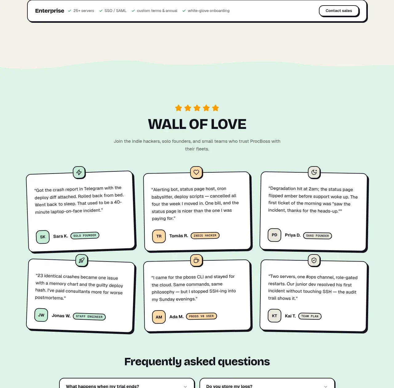
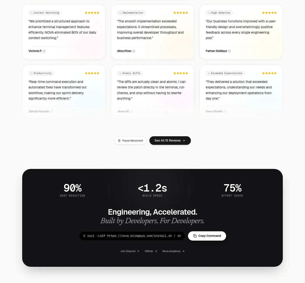
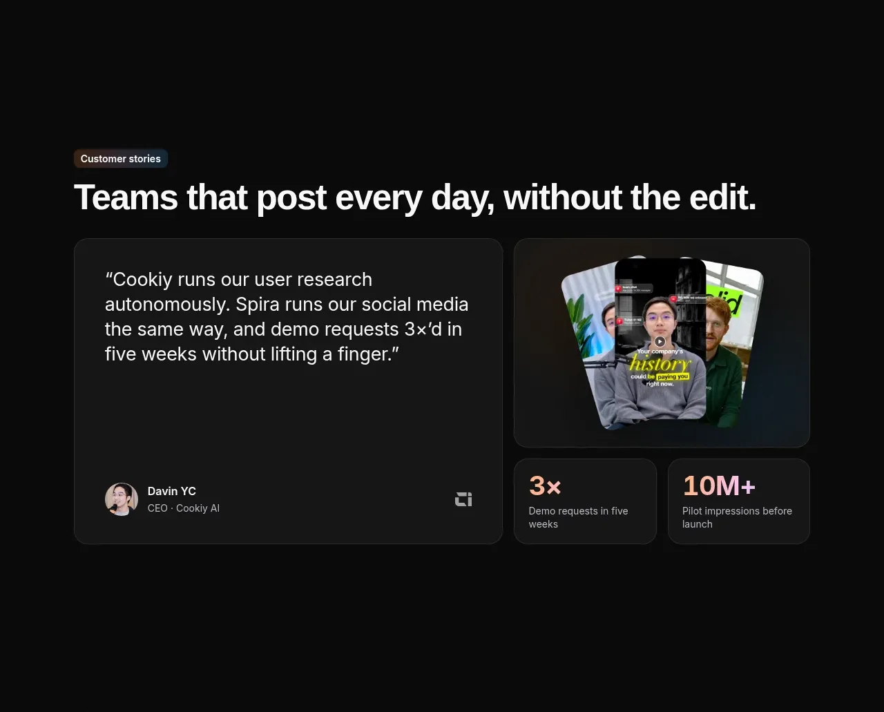
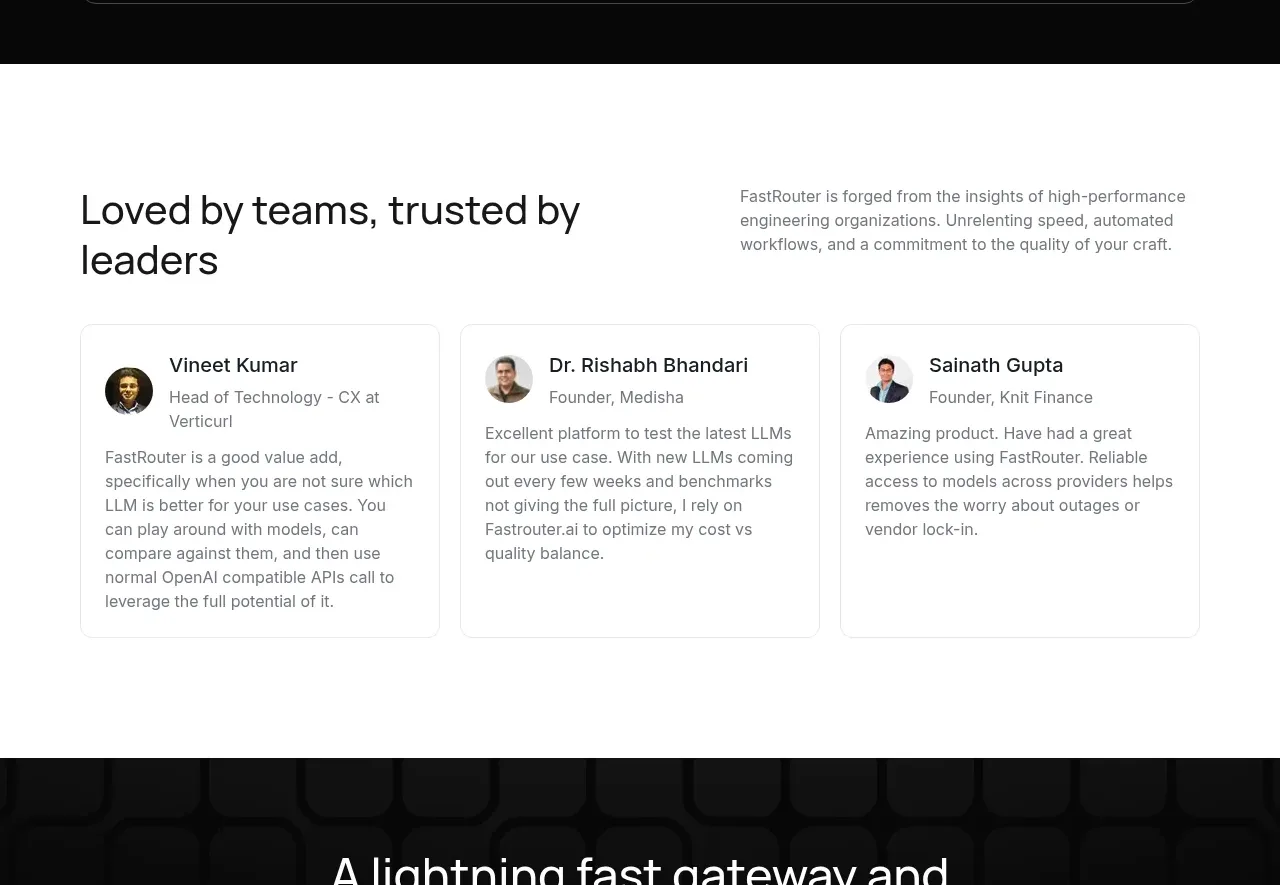
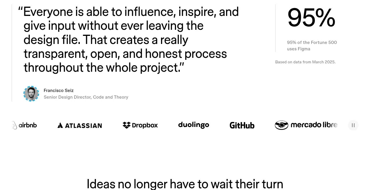
A testimonial section combines a large customer quote, attribution, a prominent adoption statistic, and a row of recognizable customer marks.
Prompt preview
## Reference images

Study these alongside the description below: hierarchy, rhythm, spacing, colour. Build for the product you are asked about, using this design language.

- Component: https://kage-design-assets.t3.tigrisfiles.io/components/figma-agent/07db1d51-fc5a-42e3-8555-5aed12aa6731-1791439428-7.webp
- Full page it was cut from: https://kage-design-assets.t3.tigrisfiles.io/screenshots/figma-agent/07db1d51-fc5a-42e3-8555-5aed12aa6731-1791439335233-full.webp
- Component on Kage: https://kage.design/component/figma-agent-testimonials

## Before you start
Ask what the user's product, audience, and brand are, then apply the principles below to that product rather than reproducing the reference.

Build a proof section with two levels of evidence. At the top, use a large quote in a readable but emphatic style, with a small avatar or neutral profile treatment, speaker name, and role beneath it. Beside or below the quote, show one large adoption statistic with a short qualification and source note. Finish with a horizontal logo/customer-mark row or text-based customer list, using subdued monochrome treatment and generous spacing. Add optional carousel controls if multiple quotes exist, but ensure the current quote remains accessible to screen readers. Keep borders minimal, use black and gray text on white, and separate the statistic with a thin vertical rule on desktop.

Never:
- use logos, product names, copy, illustrations, or imagery from the reference
- invent unverifiable customer claims or reuse the reference quote
- make the statistic larger than the supporting context can justify