 kage
kage
tryfigo.com
Design analysis
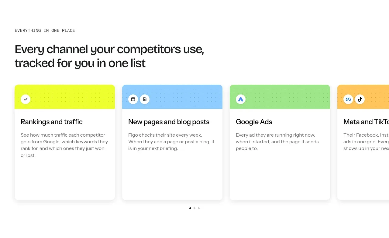
A small eyebrow and clear section heading introduce a horizontally arranged set of channel cards, with colorful headers and carousel pagination underneath.
Prompt preview
## Reference images

Study these alongside the description below: hierarchy, rhythm, spacing, colour. Build for the product you are asked about, using this design language.

- Component: https://kage-design-assets.t3.tigrisfiles.io/components/figo/1fdd4f4a-2ffc-49bc-a537-37335d7ddf1d-1789711314-2.webp
- Full page it was cut from: https://kage-design-assets.t3.tigrisfiles.io/screenshots/figo/1fdd4f4a-2ffc-49bc-a537-37335d7ddf1d-1789711271827-full.webp
- Component on Kage: https://kage.design/component/figo-feature-grid

## Before you start
Ask what the user's product is, who it serves, and what its brand personality and primary conversion goal are. Apply the principles below to that product rather than reproducing the reference.

Build a feature section with a small uppercase eyebrow, a concise two-line heading, and a horizontally scrolling card rail. Each card should have a vivid pastel header with a subtle dot pattern, small circular category icons, a white content body, a short title, and restrained explanatory copy. Use a four-column desktop presentation that can overflow or scroll horizontally on narrow screens. Cards should be approximately equal height, with 10–14px radius, very light borders, and soft shadows. Add minimal pagination dots below the rail and keep the section background white with a generous top margin.

Never use logos, product names, copy, illustrations, or imagery from the reference.
More components

 AI-powered helpdesk feature section
intercom.com · Feature grid
AI-powered helpdesk feature section
intercom.com · Feature grid
 Integrations and ecosystem section
intercom.com · Feature grid
Integrations and ecosystem section
intercom.com · Feature grid
 AI agent capabilities section
intercom.com · Feature grid
AI agent capabilities section
intercom.com · Feature grid
 Unified support experience overview
intercom.com · Feature grid
Unified support experience overview
intercom.com · Feature grid

 Core invoicing capabilities
sendinvo.com · Feature grid
Core invoicing capabilities
sendinvo.com · Feature grid
 Audience and trade types
sendinvo.com · Feature grid
Audience and trade types
sendinvo.com · Feature grid