kage
kage
tryfigo.com

Design analysis
A highly structured marketing page uses generous white space, a compact utility navigation, and an oversized condensed black hero headline to establish a bold editorial voice. The rhythm moves from a blue product-demo panel into pastel channel cards, audience cards, spacious feature sections on pale gray, a dark testimonial block, an about split, pricing, FAQ, and a high-contrast footer; rounded cards, thin shadows, and small uppercase labels keep the otherwise expressive palette controlled.
Prompt preview
## Reference images

Study these alongside the description below: hierarchy, rhythm, spacing, colour. Build for the product you are asked about, using this design language.

- Full page: https://kage-design-assets.t3.tigrisfiles.io/screenshots/figo/1fdd4f4a-2ffc-49bc-a537-37335d7ddf1d-1789711271827-full.webp
- Above the fold: https://kage-design-assets.t3.tigrisfiles.io/screenshots/figo/1fdd4f4a-2ffc-49bc-a537-37335d7ddf1d-1789711268191.webp
- Design on Kage: https://kage.design/designs/figo-landing-page

## Before you start
Ask the user what they are building, who it is for, and what brand assets they already have (name, colours, type choices, logo or other constraints). Wait for their answers before proceeding. Apply everything below to that product, not to the reference product.

## Page structure
1. **Utility header:** Place a small brand mark at the left, compact uppercase navigation links in the center, and a dark primary CTA at the right on a white background.
2. **Hero:** Center an oversized two-line condensed headline, followed by a short gray explanatory paragraph and paired primary/secondary buttons.
3. **Interactive product teaser:** Add a wide sky-blue panel with a subtle dotted texture and a floating white rounded search/query card showing a sample result and circular submit control.
4. **Channel overview:** Introduce the section with a small uppercase eyebrow and left-aligned heading, then show a horizontally scrolling row of tall white cards with vivid pastel headers, tiny circular channel icons, descriptions, and carousel dots.
5. **Audience/use-case cards:** On white, add another eyebrow and heading followed by three compact white cards in a row, each with a colored pill label, use-case title, short copy, and text link.
6. **Feature showcase block:** Switch to a pale gray background and use a large vertical rhythm. Start with a left text column and a right product-table mockup inside a soft gray rounded frame.
7. **Feature continuation:** Keep the same pale gray section and introduce two further left-aligned text-led feature statements separated by large blank space; reserve the right side for implied or lightly presented product visuals so the page feels spacious rather than dashboard-dense.
8. **Testimonials:** Change to a near-black section with a small eyebrow, white heading, and three testimonial cards. Give each card a pastel textured top strip, dark body, circular initial badge, quote, and small attribution.
9. **CTA divider:** Within the dark section, add a thin horizontal divider and center a short support statement with a light CTA button.
10. **About split:** Return to white and place layered colored report/product cards on the left with a text column on the right containing eyebrow, headline, short paragraph, and dark button.
11. **Pricing intro:** Use a pale gray pricing section with a centered eyebrow, two-line heading, supporting text, and a small comparison link.
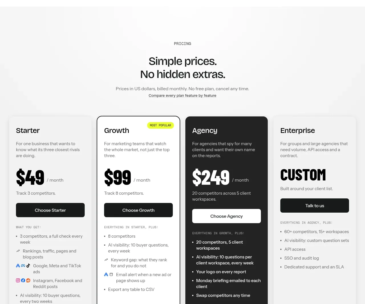
12. **Pricing grid:** Show four pricing cards in one row: light Starter, outlined/popular Growth, dark inverse Agency, and light Enterprise. Include plan descriptions, highly prominent prices or custom label, CTA buttons, and dense feature lists; use a bright badge to mark the popular plan.
13. **FAQ:** On white, center the FAQ eyebrow and heading, add compact category filter pills, then stack wide pale-gray accordion rows with plus controls and a subdued load-more button.
14. **Footer top:** Use a dark footer with a large condensed slogan on the left, a vertical group of navigation links in the middle, and an email field plus CTA on the right.
15. **Footer marquee:** Add a large outlined, horizontally scrolling typographic band with pastel circular icons and alternating pastel outline words. Finish with a low-contrast legal row, privacy/terms links, and small external-feature badges.

## Design language
- Build hierarchy with extreme contrast in scale: tiny uppercase eyebrow labels and utility text support large black display headings; use a calm 16–20px sans-serif for body copy.
- Pair a condensed, heavy display face for hero headlines, prices, slogans, and marquee text with a neutral grotesk sans for navigation, descriptions, labels, and controls. Keep display headings tightly tracked and line-height compact.
- Let rhythm change by section: tightly grouped hero controls and cards give way to very tall, quiet feature bands, then return to dense testimonials, pricing, and FAQ modules.
- Use a mostly white canvas with pale gray section washes around feature and pricing areas. Approximate colours: white `#FFFFFF`, ink `#171918`, soft gray `#F4F4F3`, sky blue `#8DCCF3`, lime `#D9F51A`, mint `#9BE58B`, yellow `#F8C85D`, lavender `#D6B7F3`, and dark charcoal `#202221`.
- Treat pastel colour as a functional accent: apply it to product-demo backgrounds, card headers, audience labels, testimonial strips, icons, and marquee outlines rather than tinting large amounts of body content.
- Use white cards with 10–14px rounded corners, very soft gray shadows, and restrained borders. Use a near-black filled card sparingly for emphasis; popular pricing uses a crisp dark outline rather than a heavy shadow.
- Keep controls compact and tactile: dark rounded-rectangle primary buttons, pale secondary buttons, clear arrow affordances, plus icons for accordions, and pill filters with a single dark selected state.
- Product mockups should look like simplified real interfaces: white panels, thin dividers, small data labels, compact tables, status pills, and layered pastel backplates. Avoid decorative complexity.
- Preserve wide gutters and strong alignment across the page, while allowing the channel carousel to overflow horizontally. Use subtle hover elevation, button colour transitions, carousel movement, and accordion expansion; keep motion understated and functional.

## Never
- Do not reuse the reference logo, wordmark, product name, copy, illustrations, photography, screenshots, report content, testimonials, pricing values, or icon set.
- Do not present the result as Figo or imply an affiliation with it. Create original content, product visuals, and brand assets for the user's product.
Components from this page
All components
 Minimal product navigation
Figo · Navigation
Minimal product navigation
Figo · Navigation
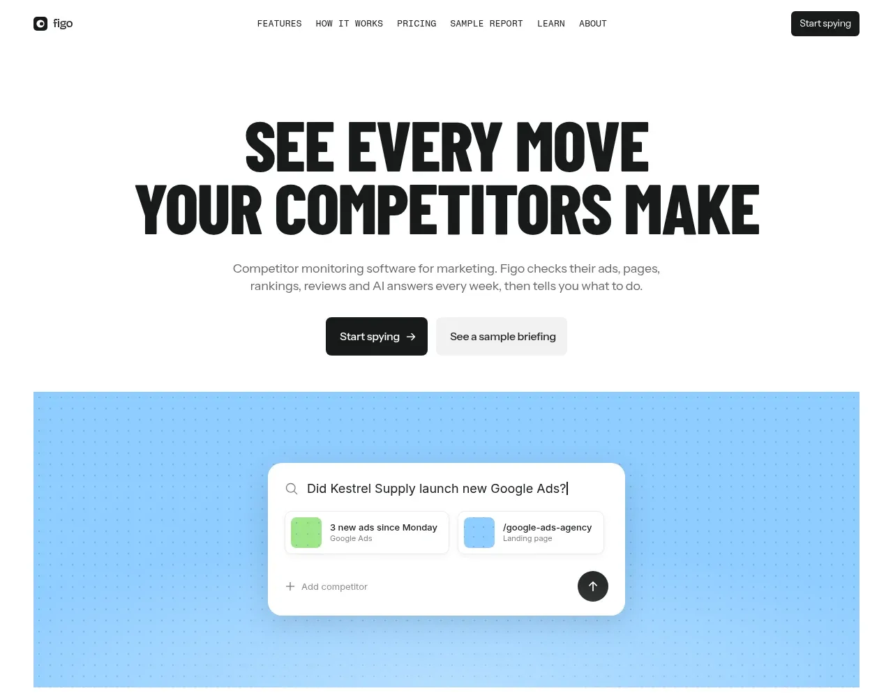 Bold competitor-monitoring hero
Figo · Hero
Bold competitor-monitoring hero
Figo · Hero
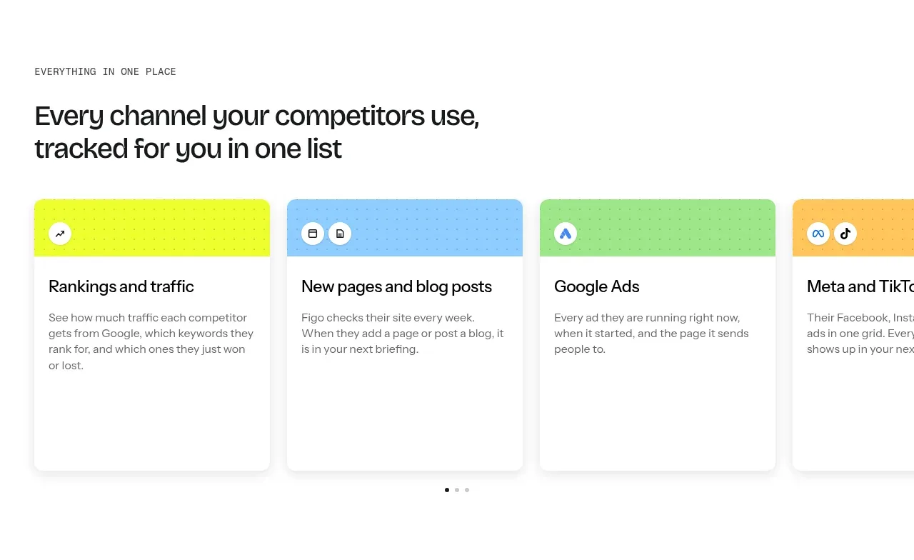 All-channel monitoring cards
Figo · Feature grid
All-channel monitoring cards
Figo · Feature grid
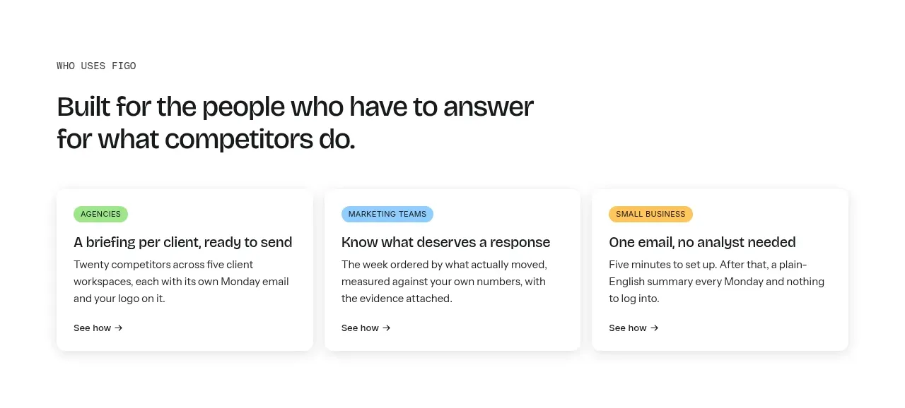 Audience outcome cards
Figo · Feature grid
Audience outcome cards
Figo · Feature grid
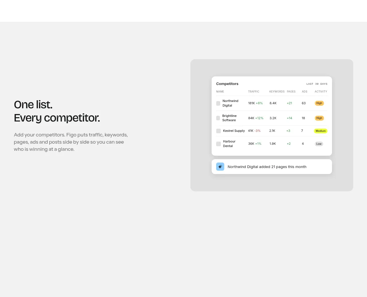 Competitor list product feature
Figo · Feature grid
Competitor list product feature
Figo · Feature grid
 Evidence detail feature
Figo · Feature grid
Evidence detail feature
Figo · Feature grid
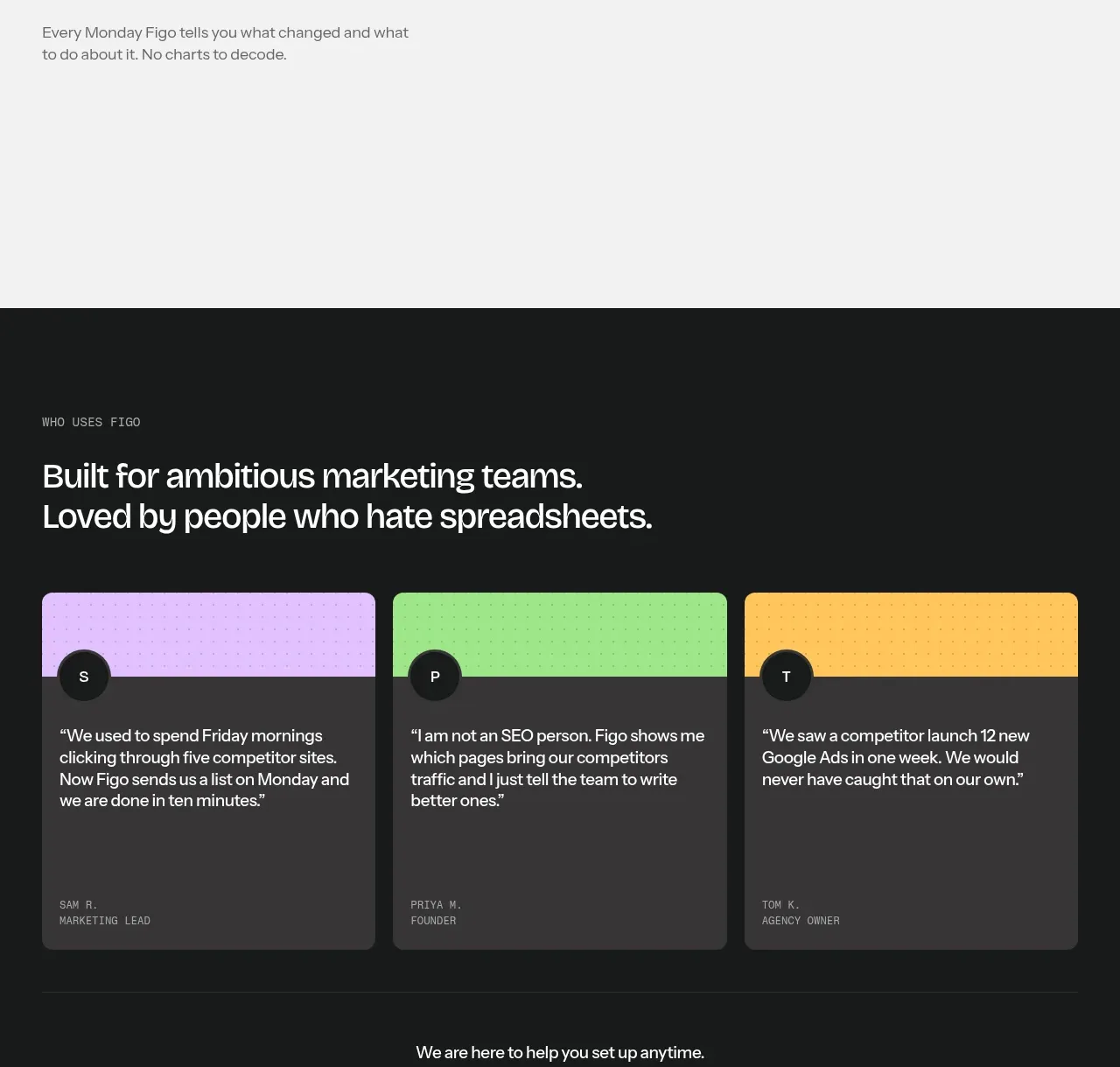 Plain-language reporting feature
Figo · Feature grid
Plain-language reporting feature
Figo · Feature grid
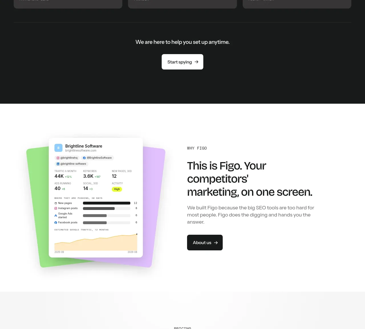 Dark customer proof section
Figo · Testimonials
Dark customer proof section
Figo · Testimonials
 About product split CTA
Figo · Call to action
About product split CTA
Figo · Call to action
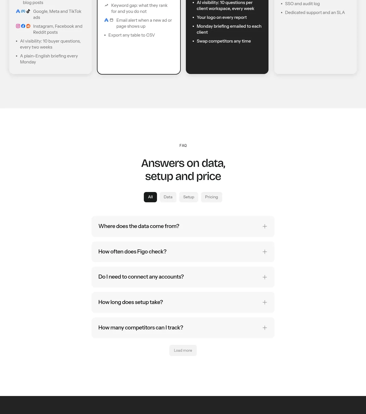 Four-tier pricing comparison
Figo · Pricing table
Four-tier pricing comparison
Figo · Pricing table
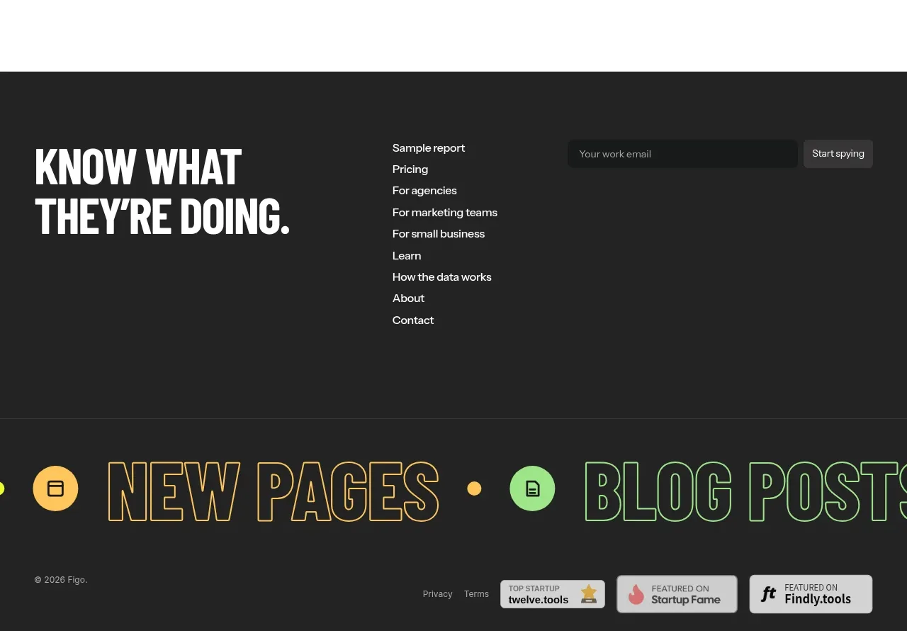 Categorized FAQ accordion
Figo · FAQ
Categorized FAQ accordion
Figo · FAQ