 kage
kage
tryfigo.com
Design analysis
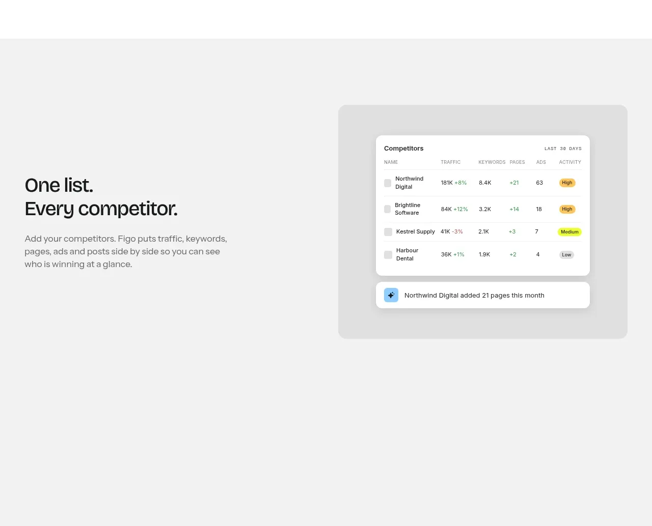
A pale-gray split feature band pairs a concise benefit statement with a floating competitor table mockup, making the product's central organizing idea immediately visual.
Prompt preview
## Reference images

Study these alongside the description below: hierarchy, rhythm, spacing, colour. Build for the product you are asked about, using this design language.

- Component: https://kage-design-assets.t3.tigrisfiles.io/components/figo/1fdd4f4a-2ffc-49bc-a537-37335d7ddf1d-1789711315-4.webp
- Full page it was cut from: https://kage-design-assets.t3.tigrisfiles.io/screenshots/figo/1fdd4f4a-2ffc-49bc-a537-37335d7ddf1d-1789711271827-full.webp
- Component on Kage: https://kage.design/component/figo-feature-grid-3

## Before you start
Ask what the user's product is, who it serves, and what its brand personality and primary conversion goal are. Apply the principles below to that product rather than reproducing the reference.

Design a split product-feature band on a very light gray background (`#f3f3f3`). Place a short heading and supporting paragraph in the left half, vertically centered, and a large dashboard/table mockup in the right half. The mockup should sit inside a slightly darker gray rounded frame and contain a compact white data table, status badges, and one small notification row. Use strong contrast between the sparse editorial copy and the detailed UI. Keep the layout aligned to a shared max-width, use 64–80px vertical padding, 24px corner radii for the frame, subtle shadows, and responsive stacking on mobile.

Never use logos, product names, copy, illustrations, or imagery from the reference.
More components

 AI-powered helpdesk feature section
intercom.com · Feature grid
AI-powered helpdesk feature section
intercom.com · Feature grid
 Integrations and ecosystem section
intercom.com · Feature grid
Integrations and ecosystem section
intercom.com · Feature grid
 AI agent capabilities section
intercom.com · Feature grid
AI agent capabilities section
intercom.com · Feature grid
 Unified support experience overview
intercom.com · Feature grid
Unified support experience overview
intercom.com · Feature grid

 Core invoicing capabilities
sendinvo.com · Feature grid
Core invoicing capabilities
sendinvo.com · Feature grid
 Audience and trade types
sendinvo.com · Feature grid
Audience and trade types
sendinvo.com · Feature grid