 kage
kage
tryfigo.com
Design analysis
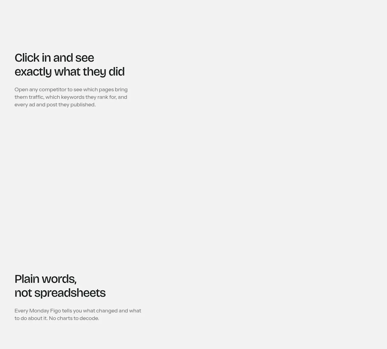
The next pale feature band shifts the emphasis to an action-oriented message about inspecting competitor behavior, leaving generous negative space for a future product visual.
Prompt preview
## Reference images

Study these alongside the description below: hierarchy, rhythm, spacing, colour. Build for the product you are asked about, using this design language.

- Component: https://kage-design-assets.t3.tigrisfiles.io/components/figo/1fdd4f4a-2ffc-49bc-a537-37335d7ddf1d-1789711315-5.webp
- Full page it was cut from: https://kage-design-assets.t3.tigrisfiles.io/screenshots/figo/1fdd4f4a-2ffc-49bc-a537-37335d7ddf1d-1789711271827-full.webp
- Component on Kage: https://kage.design/component/figo-feature-grid-4

## Before you start
Ask what the user's product is, who it serves, and what its brand personality and primary conversion goal are. Apply the principles below to that product rather than reproducing the reference.

Build a second alternating product-feature band using the same light-gray foundation and generous vertical rhythm. Put a compact heading and explanatory paragraph in one side of a two-column grid, with the other side reserved for a restrained product detail panel, activity view, or interactive visual. Prioritize the message and whitespace over decoration. Use near-black typography, muted gray body copy (`#777777`), 64–96px section padding, and a consistent max-width. If the visual is absent or secondary, preserve the empty space intentionally rather than filling it with generic imagery.

Never use logos, product names, copy, illustrations, or imagery from the reference.
More components

 AI-powered helpdesk feature section
intercom.com · Feature grid
AI-powered helpdesk feature section
intercom.com · Feature grid
 Integrations and ecosystem section
intercom.com · Feature grid
Integrations and ecosystem section
intercom.com · Feature grid
 AI agent capabilities section
intercom.com · Feature grid
AI agent capabilities section
intercom.com · Feature grid
 Unified support experience overview
intercom.com · Feature grid
Unified support experience overview
intercom.com · Feature grid

 Core invoicing capabilities
sendinvo.com · Feature grid
Core invoicing capabilities
sendinvo.com · Feature grid
 Audience and trade types
sendinvo.com · Feature grid
Audience and trade types
sendinvo.com · Feature grid