 kage
kage
tryfigo.com
Design analysis
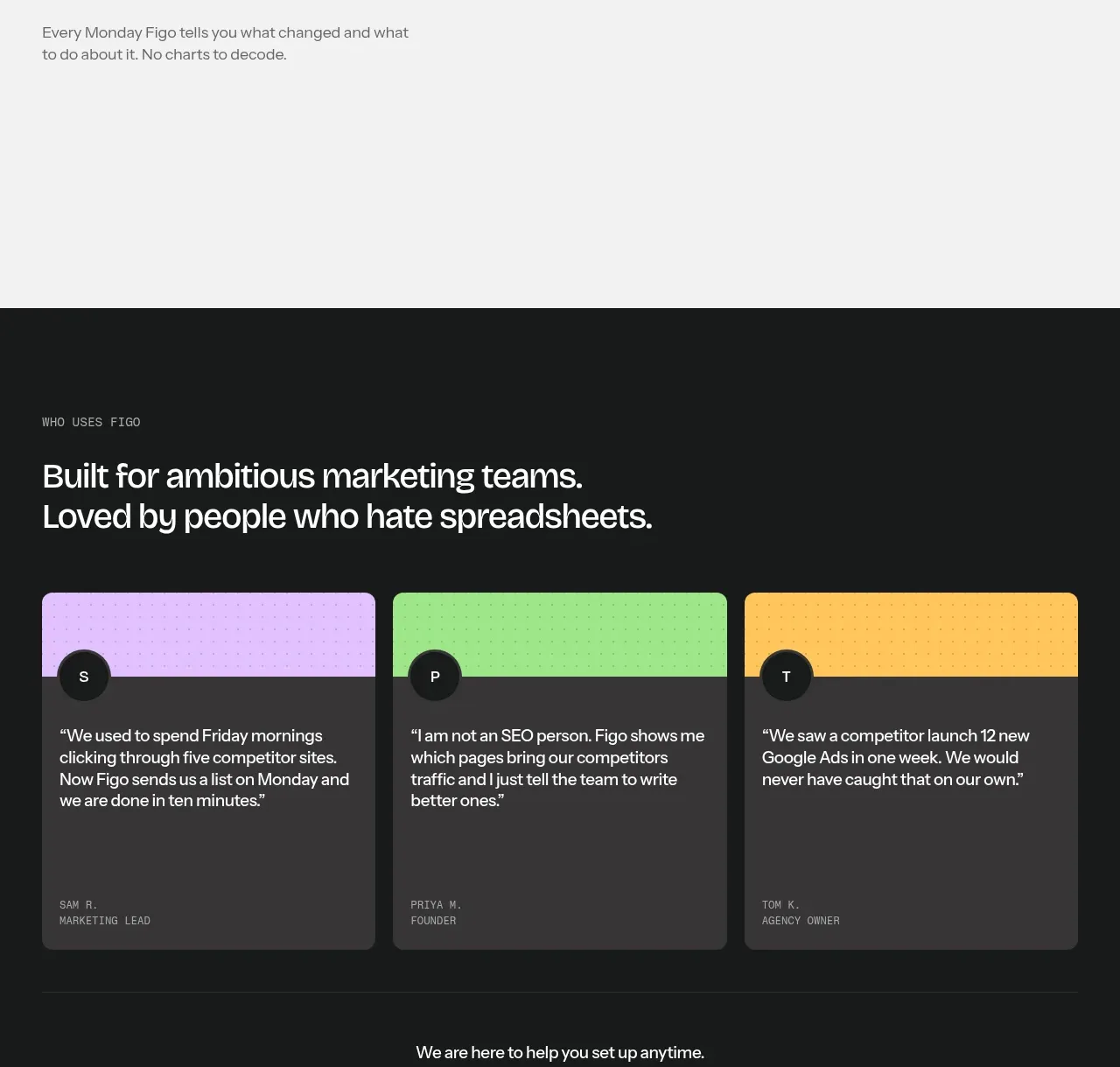
A third pale feature band uses an editorial heading and short explanation to position reporting as understandable rather than spreadsheet-heavy.
Prompt preview
## Reference images

Study these alongside the description below: hierarchy, rhythm, spacing, colour. Build for the product you are asked about, using this design language.

- Component: https://kage-design-assets.t3.tigrisfiles.io/components/figo/1fdd4f4a-2ffc-49bc-a537-37335d7ddf1d-1789711316-6.webp
- Full page it was cut from: https://kage-design-assets.t3.tigrisfiles.io/screenshots/figo/1fdd4f4a-2ffc-49bc-a537-37335d7ddf1d-1789711271827-full.webp
- Component on Kage: https://kage.design/component/figo-feature-grid-5

## Before you start
Ask what the user's product is, who it serves, and what its brand personality and primary conversion goal are. Apply the principles below to that product rather than reproducing the reference.

Create a third product-benefit band with a very light gray background and an editorial, text-first composition. Use a compact two-line heading with a short supporting paragraph beneath it, aligned to one side of a broad max-width canvas. Reserve the opposite area for a calm reporting visualization or deliberately open space. Keep the hierarchy clear: small eyebrow, 32–44px heading, 15–17px body text. Use generous vertical whitespace, no heavy borders, and one restrained accent color for any chart or highlight. Ensure this section remains useful on mobile by stacking the copy above the visual.

Never use logos, product names, copy, illustrations, or imagery from the reference.
More components

 AI-powered helpdesk feature section
intercom.com · Feature grid
AI-powered helpdesk feature section
intercom.com · Feature grid
 Integrations and ecosystem section
intercom.com · Feature grid
Integrations and ecosystem section
intercom.com · Feature grid
 AI agent capabilities section
intercom.com · Feature grid
AI agent capabilities section
intercom.com · Feature grid
 Unified support experience overview
intercom.com · Feature grid
Unified support experience overview
intercom.com · Feature grid

 Core invoicing capabilities
sendinvo.com · Feature grid
Core invoicing capabilities
sendinvo.com · Feature grid
 Audience and trade types
sendinvo.com · Feature grid
Audience and trade types
sendinvo.com · Feature grid