kage
kage
tryfigo.com
Design analysis
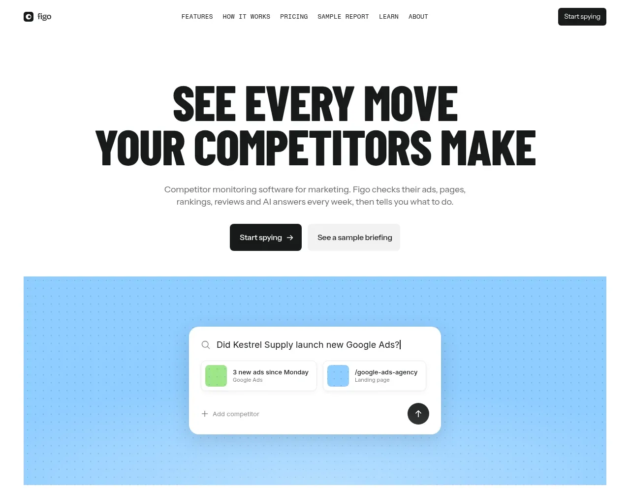
The hero combines an oversized two-line statement, concise explanation, paired calls to action, and a bright blue product-search visual that makes the workflow tangible.
Prompt preview
## Reference images

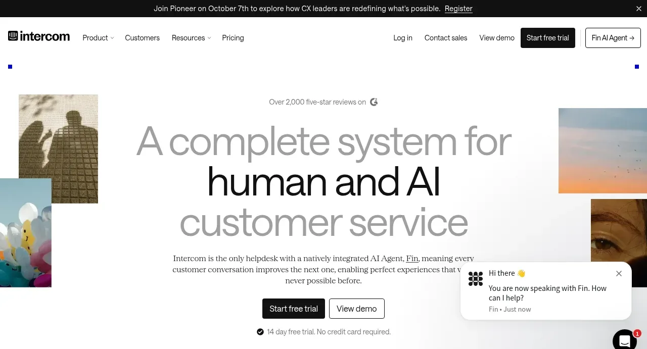
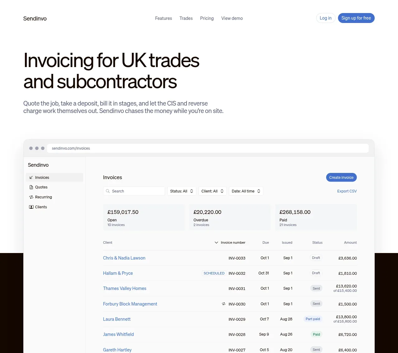
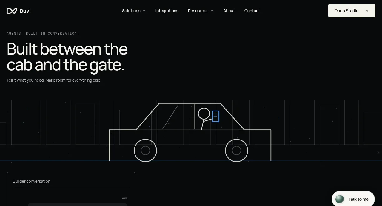
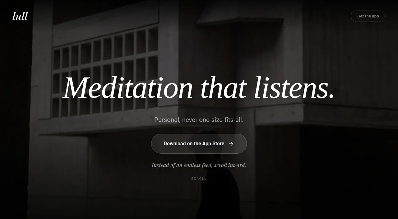
Study these alongside the description below: hierarchy, rhythm, spacing, colour. Build for the product you are asked about, using this design language.

- Component: https://kage-design-assets.t3.tigrisfiles.io/components/figo/1fdd4f4a-2ffc-49bc-a537-37335d7ddf1d-1789711314-1.webp
- Full page it was cut from: https://kage-design-assets.t3.tigrisfiles.io/screenshots/figo/1fdd4f4a-2ffc-49bc-a537-37335d7ddf1d-1789711271827-full.webp
- Component on Kage: https://kage.design/component/figo-hero

## Before you start
Ask what the user's product is, who it serves, and what its brand personality and primary conversion goal are. Apply the principles below to that product rather than reproducing the reference.

Create a high-impact SaaS hero directly below the navigation. Center a very large condensed or heavy sans-serif headline over two lines, with tight line-height and near-black text (`#141515`). Place a muted gray supporting paragraph beneath it, then two adjacent CTAs: a dark filled primary button and a pale secondary button. Give the lower half to a wide, centered product interaction mockup inside a saturated powder-blue panel (`#9bd7fa`) with a faint dotted texture; the mockup should be a white rounded search/query card with small result chips and a circular submit control. Use ample white space, a max-width around 830px, 28–32px card radius, soft shadows, and a clear transition from message to proof.

Never use logos, product names, copy, illustrations, or imagery from the reference.