 kage
kage
tryfigo.com
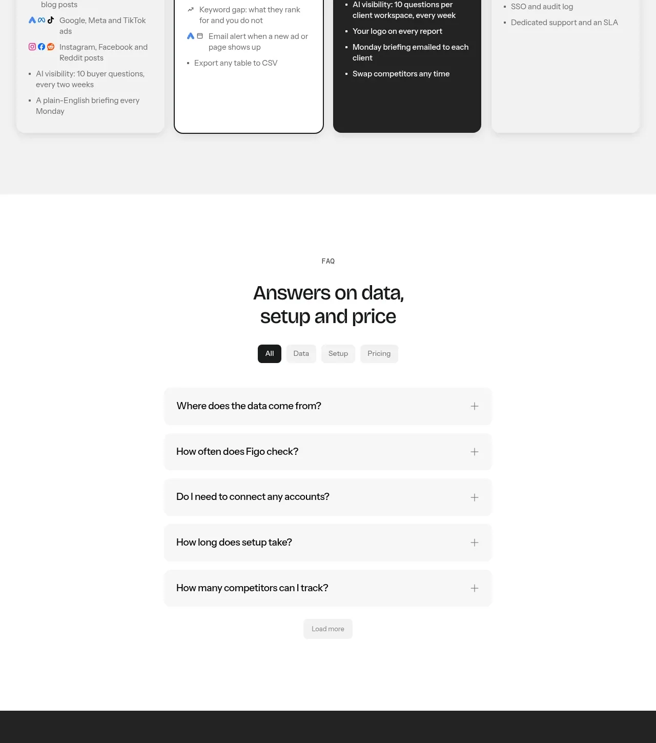
Design analysis
A centered pricing introduction leads into four equal plan cards, with one emphasized popular plan and one dark premium tier for contrast.
Prompt preview
## Reference images

Study these alongside the description below: hierarchy, rhythm, spacing, colour. Build for the product you are asked about, using this design language.

- Component: https://kage-design-assets.t3.tigrisfiles.io/components/figo/1fdd4f4a-2ffc-49bc-a537-37335d7ddf1d-1789711317-9.webp
- Full page it was cut from: https://kage-design-assets.t3.tigrisfiles.io/screenshots/figo/1fdd4f4a-2ffc-49bc-a537-37335d7ddf1d-1789711271827-full.webp
- Component on Kage: https://kage.design/component/figo-pricing-table

## Before you start
Ask what the user's product is, who it serves, and what its brand personality and primary conversion goal are. Apply the principles below to that product rather than reproducing the reference.

Build a pricing section on a very light gray background (`#f5f5f5`). Center a small uppercase eyebrow, a two-line heading, a short billing note, and a comparison link above a four-column plan grid. Each card needs a plan name, brief audience description, prominent price or custom label, billing suffix, primary button, and concise bullet list. Make the second plan visually selected with a dark outline and a small lime “popular” badge; make the third plan a dark charcoal inverted card with white text; keep the first and fourth cards light. Use 12–16px radii, equal heights, 16px gaps, strong vertical alignment, and responsive horizontal scrolling or stacking on mobile.

Never use logos, product names, copy, illustrations, or imagery from the reference.
More components
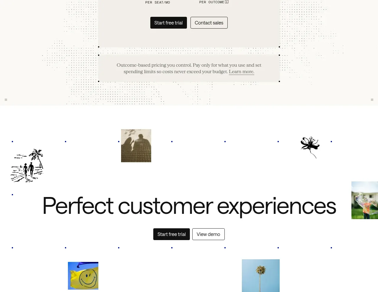
 Transparent pricing card
intercom.com · Pricing table
Transparent pricing card
intercom.com · Pricing table
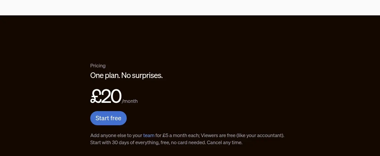
 Single-plan pricing offer
sendinvo.com · Pricing table
Single-plan pricing offer
sendinvo.com · Pricing table
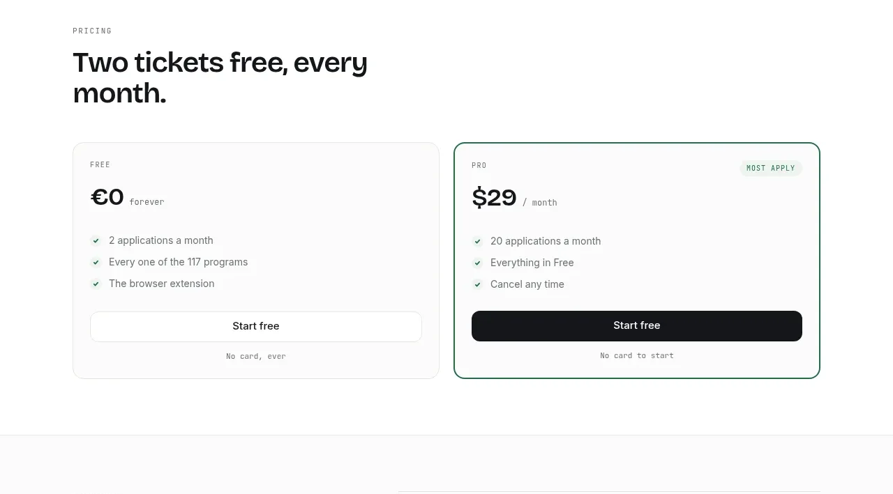
 Two-tier pricing table
ApplySeed · Pricing table
Two-tier pricing table
ApplySeed · Pricing table
F
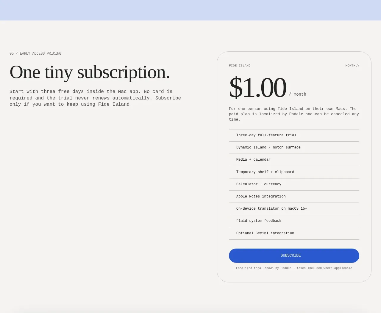
Single-plan early access pricing
Fide Island · Pricing table
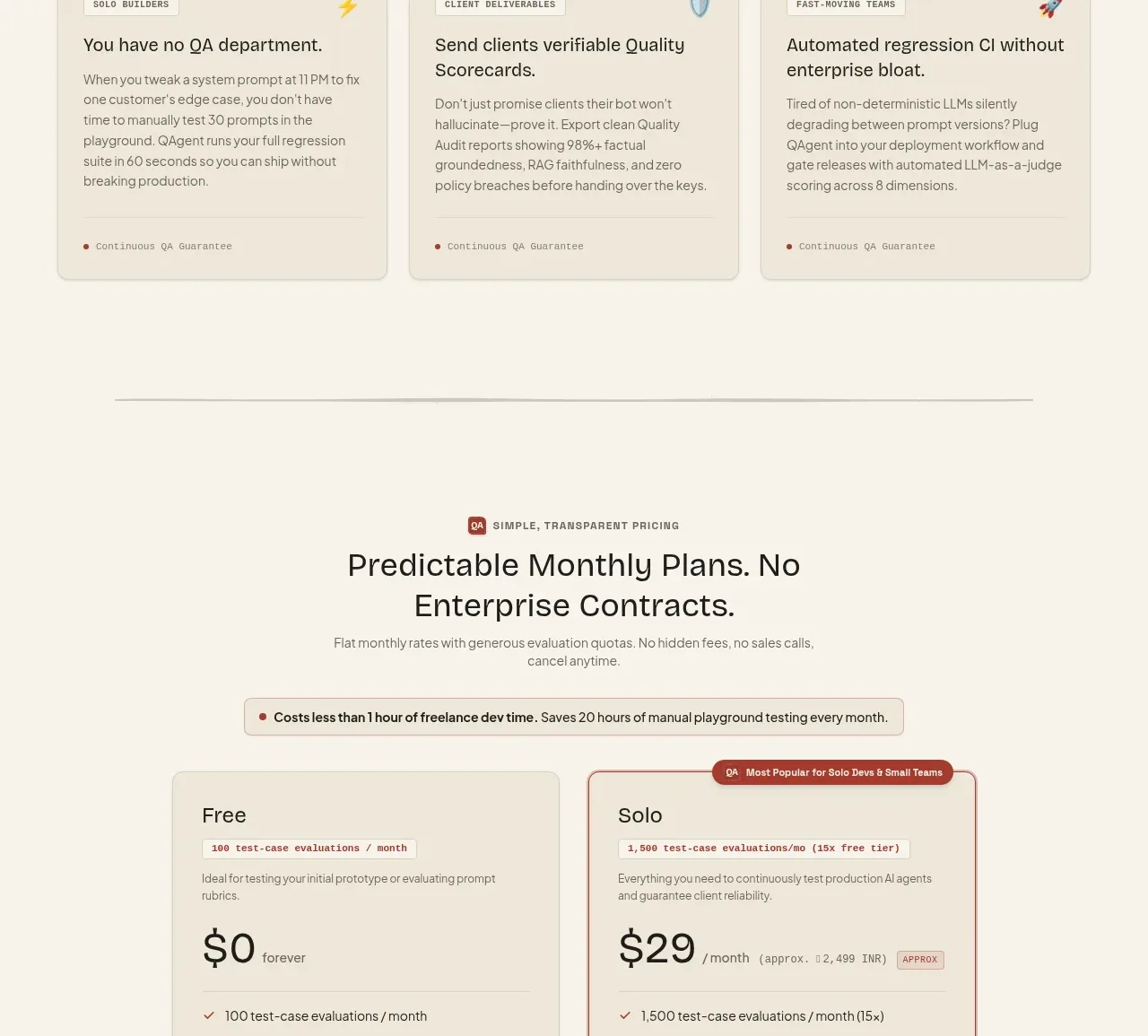
 Two-tier pricing table
QAgent · Pricing table
Two-tier pricing table
QAgent · Pricing table
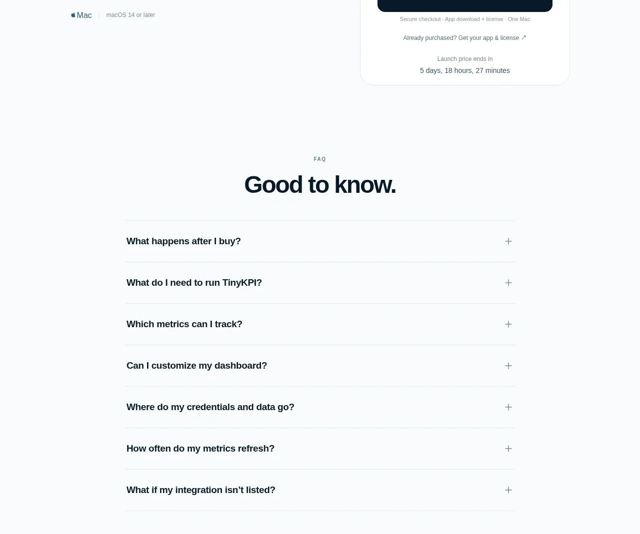
 Single launch price offer
TinyKPI · Pricing table
Single launch price offer
TinyKPI · Pricing table