kage
kage
tryfigo.com
Design analysis
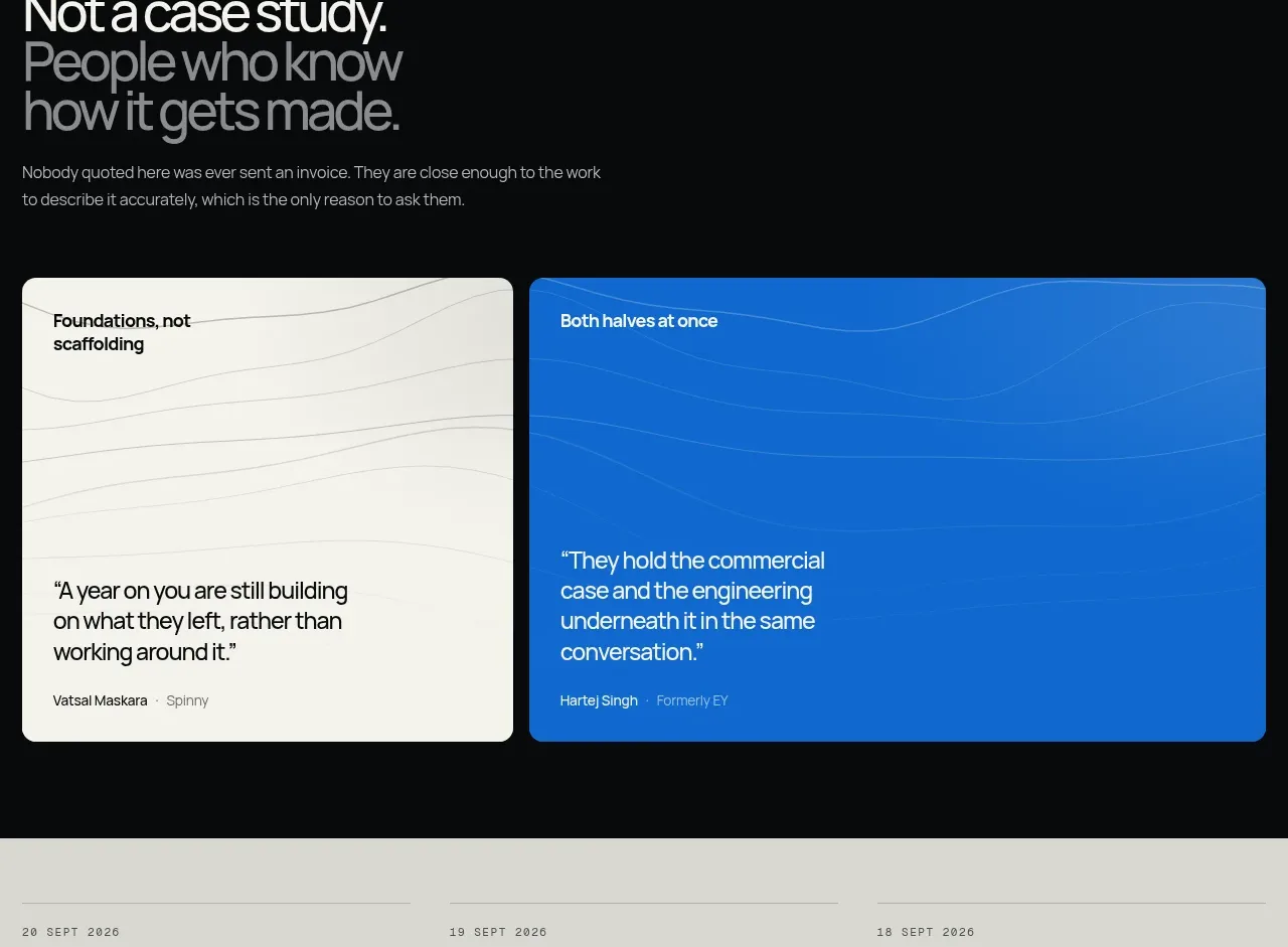
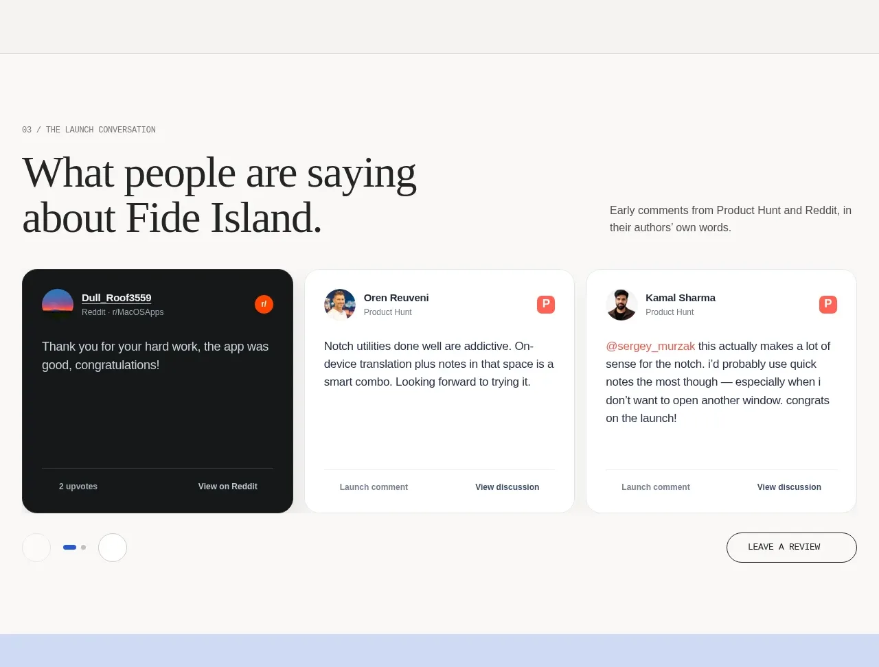
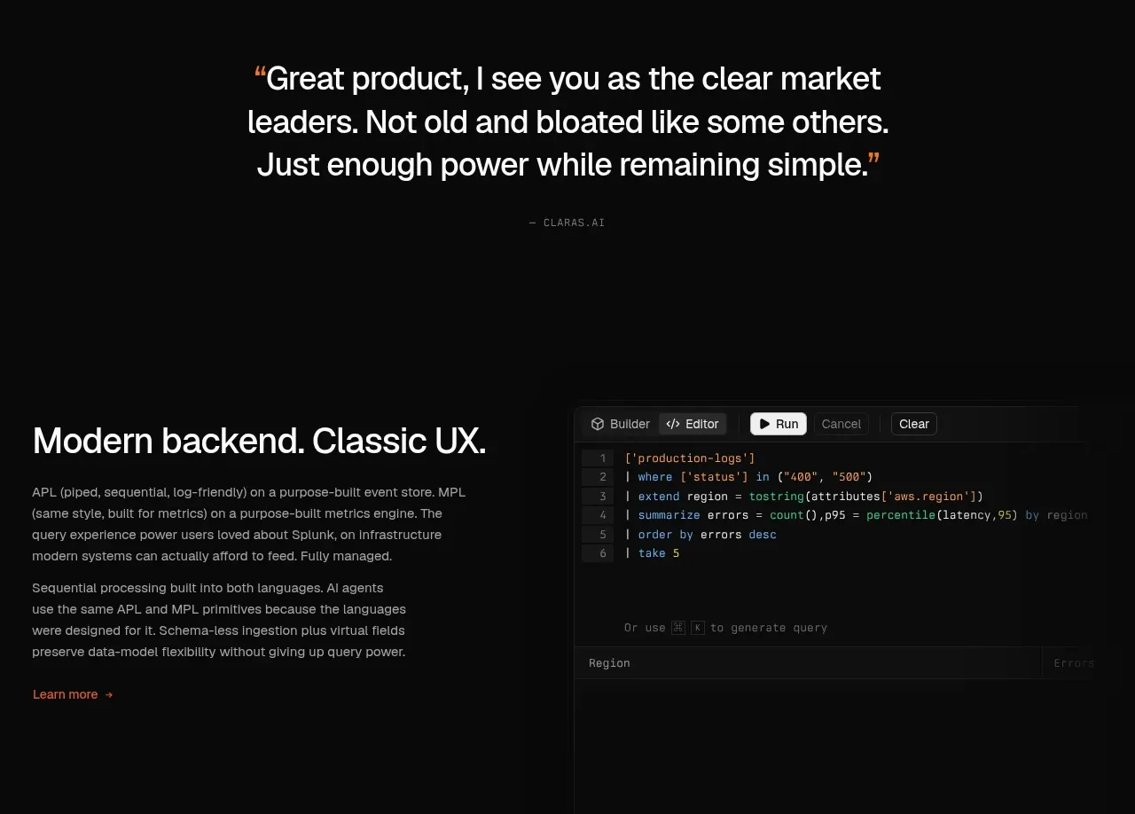
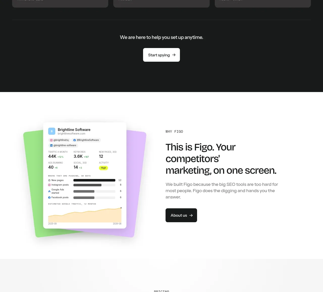
A dark testimonial section uses colorful card headers, direct quotes, attribution, and a centered follow-up CTA to create a strong emotional contrast after the feature story.
Prompt preview
## Reference images

Study these alongside the description below: hierarchy, rhythm, spacing, colour. Build for the product you are asked about, using this design language.

- Component: https://kage-design-assets.t3.tigrisfiles.io/components/figo/1fdd4f4a-2ffc-49bc-a537-37335d7ddf1d-1789711316-7.webp
- Full page it was cut from: https://kage-design-assets.t3.tigrisfiles.io/screenshots/figo/1fdd4f4a-2ffc-49bc-a537-37335d7ddf1d-1789711271827-full.webp
- Component on Kage: https://kage.design/component/figo-testimonials

## Before you start
Ask what the user's product is, who it serves, and what its brand personality and primary conversion goal are. Apply the principles below to that product rather than reproducing the reference.

Build a dark social-proof section using a near-black background (`#171918`) and white typography. Start with a small eyebrow and a large two-line statement, then show three equal testimonial cards in a row. Each card should have a bright pastel top strip with a subtle texture, a small dark circular avatar placeholder overlapping the strip, a short quote in white, and a small uppercase attribution at the bottom. Use dark charcoal card bodies (`#333232`), 12–14px radius, consistent heights, and 16px gaps. End the band with centered reassurance text and a contrasting light CTA button. On mobile, stack the cards.

Never use logos, product names, copy, illustrations, or imagery from the reference.