kage
kage
finalframe.photo
Design analysis
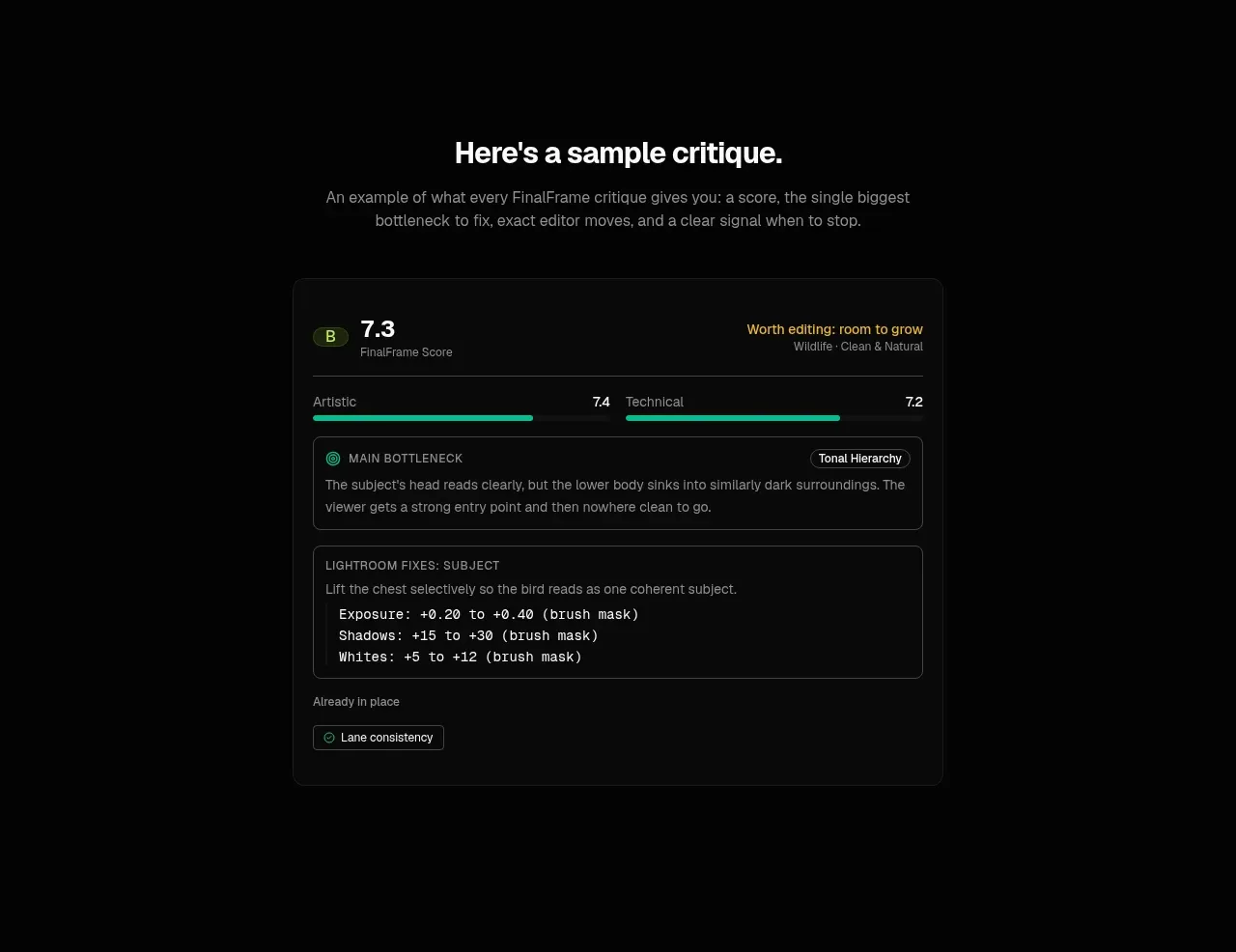
A centered product-output preview makes the abstract service tangible through a score, dual metrics, a bottleneck diagnosis, and concrete suggested adjustments.
Prompt preview
## Reference images

Study these alongside the description below: hierarchy, rhythm, spacing, colour. Build for the product you are asked about, using this design language.

- Component: https://kage-design-assets.t3.tigrisfiles.io/components/finalframe/10bde091-c6ec-4ca8-aeab-6378e76e091a-1790402732-4.webp
- Full page it was cut from: https://kage-design-assets.t3.tigrisfiles.io/screenshots/finalframe/10bde091-c6ec-4ca8-aeab-6378e76e091a-1790402604641-full.webp
- Component on Kage: https://kage.design/component/finalframe-card

## Before you start
Ask what the user's product output looks like, which metrics users need, and what single recommendation should be most prominent. Build a representative interface for that product.

Design a centered showcase section with a heading and short explanatory copy above a large dark analysis card. The preview should feel like a real application panel: use a subtle #0b0d0c surface, #242826 1px border, 10px radius, and layered inset panels. Include a compact score header, two horizontal metric bars, a highlighted primary diagnosis panel, and a second panel with concrete next steps or parameter changes. Use #f4f5f3 for hierarchy, #868c89 for annotations, mint #08c99a for progress and positive status, and a restrained amber for a caution label. Use monospace only for technical values. Ensure the preview remains legible on mobile by stacking metrics and allowing the card to resize.

Never: use logos, product names, copy, illustrations, or imagery from the reference.