 kage
kage
finalframe.photo
Design analysis
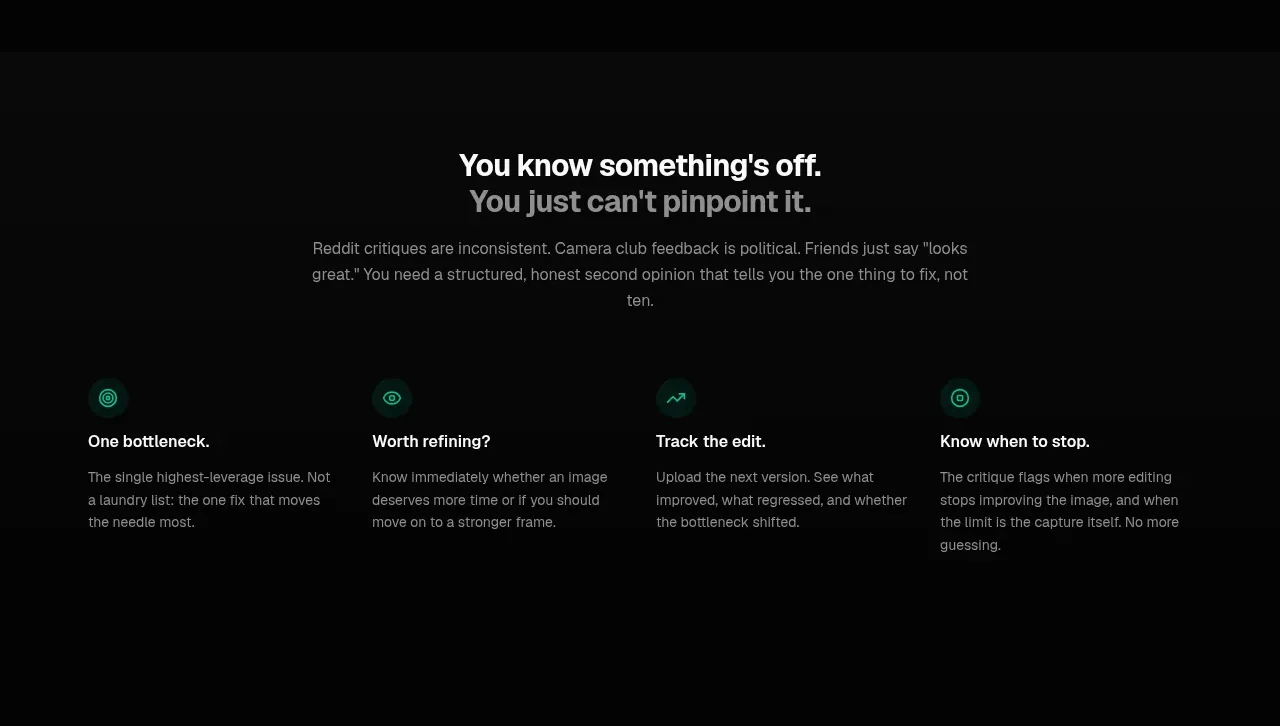
A centered problem statement leads into four evenly spaced benefit columns, turning an abstract promise into a memorable workflow and outcome.
Prompt preview
## Reference images

Study these alongside the description below: hierarchy, rhythm, spacing, colour. Build for the product you are asked about, using this design language.

- Component: https://kage-design-assets.t3.tigrisfiles.io/components/finalframe/10bde091-c6ec-4ca8-aeab-6378e76e091a-1790402732-3.webp
- Full page it was cut from: https://kage-design-assets.t3.tigrisfiles.io/screenshots/finalframe/10bde091-c6ec-4ca8-aeab-6378e76e091a-1790402604641-full.webp
- Component on Kage: https://kage.design/component/finalframe-feature-grid

## Before you start
Ask what recurring problem the user's product solves, what evidence supports the claim, and which outcomes matter most to its users. Use those answers to create an original version.

Create a dark explanatory section with a centered two-line heading, a concise paragraph, and a four-column benefit grid below. The heading should use strong white text with a muted second line; body copy should be readable gray (#858b88). Each column gets a tiny mint line icon or status glyph, a short outcome-oriented title, and two or three lines of copy. Align columns to a shared baseline, use 24–32px gaps, and preserve generous top and bottom padding. Use #050505 background, #0b0d0c surfaces only if cards are needed, #242826 borders, and #08c99a for icons. Keep cards quiet and content-led rather than adding decorative illustrations.

Never: use logos, product names, copy, illustrations, or imagery from the reference.
More components

 Three-step process cards
godaylight.com · Feature grid
Three-step process cards
godaylight.com · Feature grid

 Use-case selector with vertical video preview
Spira Maxima · Feature grid
Use-case selector with vertical video preview
Spira Maxima · Feature grid

 Insights and enterprise model access
FastRouter.ai · Feature grid
Insights and enterprise model access
FastRouter.ai · Feature grid
 Solutions by organizational role
FastRouter.ai · Feature grid
Solutions by organizational role
FastRouter.ai · Feature grid
 Routing reliability and model collaboration
FastRouter.ai · Feature grid
Routing reliability and model collaboration
FastRouter.ai · Feature grid
 Goal-oriented product capabilities
FastRouter.ai · Feature grid
Goal-oriented product capabilities
FastRouter.ai · Feature grid