 kage
kage
finalframe.photo
Design analysis
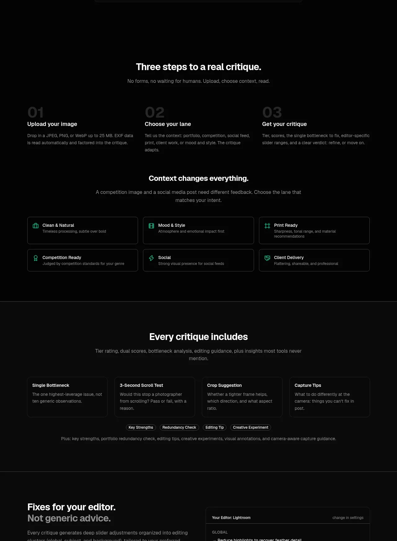
This long instructional band combines a three-step process with a six-option context selector, showing both how the product works and how it adapts to different user goals.
Prompt preview
## Reference images

Study these alongside the description below: hierarchy, rhythm, spacing, colour. Build for the product you are asked about, using this design language.

- Component: https://kage-design-assets.t3.tigrisfiles.io/components/finalframe/10bde091-c6ec-4ca8-aeab-6378e76e091a-1790402732-5.webp
- Full page it was cut from: https://kage-design-assets.t3.tigrisfiles.io/screenshots/finalframe/10bde091-c6ec-4ca8-aeab-6378e76e091a-1790402604641-full.webp
- Component on Kage: https://kage.design/component/finalframe-feature-grid-2

## Before you start
Ask what the user's product workflow is, how many steps are essential, and which contexts or modes change the result. Translate those answers into a clear progressive structure.

Build a dark instructional section with two related subsections. First, show a centered heading and a three-column numbered process; use oversized, low-contrast step numerals behind concise step titles and descriptions. Then introduce a second centered heading explaining why context matters, followed by a responsive 3-by-2 grid of selectable mode cards. Each card should have a small mint icon, a title, muted one-line explanation, 12px radius, a #252a28 border, and a subtle mint border/background treatment on hover and selected state. Use generous vertical separation between subsections, #050505 background, white headings, gray body text, and 16–24px grid gaps. Make the controls keyboard accessible and expose selected state clearly.

Never: use logos, product names, copy, illustrations, or imagery from the reference.
More components

 Three-step process cards
godaylight.com · Feature grid
Three-step process cards
godaylight.com · Feature grid

 Use-case selector with vertical video preview
Spira Maxima · Feature grid
Use-case selector with vertical video preview
Spira Maxima · Feature grid

 Insights and enterprise model access
FastRouter.ai · Feature grid
Insights and enterprise model access
FastRouter.ai · Feature grid
 Solutions by organizational role
FastRouter.ai · Feature grid
Solutions by organizational role
FastRouter.ai · Feature grid
 Routing reliability and model collaboration
FastRouter.ai · Feature grid
Routing reliability and model collaboration
FastRouter.ai · Feature grid
 Goal-oriented product capabilities
FastRouter.ai · Feature grid
Goal-oriented product capabilities
FastRouter.ai · Feature grid