 kage
kage
finalframe.photo
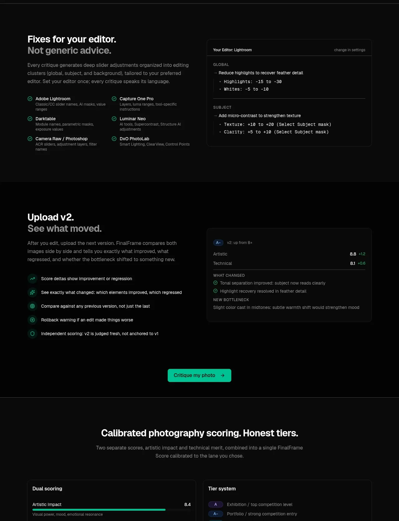
Design analysis
A series of compact capability cards establishes breadth, followed by editor-specific guidance and a version comparison panel that demonstrates an iterative workflow.
Prompt preview
## Reference images

Study these alongside the description below: hierarchy, rhythm, spacing, colour. Build for the product you are asked about, using this design language.

- Component: https://kage-design-assets.t3.tigrisfiles.io/components/finalframe/10bde091-c6ec-4ca8-aeab-6378e76e091a-1790402733-6.webp
- Full page it was cut from: https://kage-design-assets.t3.tigrisfiles.io/screenshots/finalframe/10bde091-c6ec-4ca8-aeab-6378e76e091a-1790402604641-full.webp
- Component on Kage: https://kage.design/component/finalframe-feature-grid-3

## Before you start
Ask what the user's product delivers, which integrations or tools matter, and how users compare iterations. Build an original capability-and-workflow section around those answers.

Create a dark feature section with three layers. Start with a centered heading and a row of four compact bordered cards describing the core outputs; add small pill tags beneath for secondary capabilities. Next, use a two-column layout: left side has a bold heading, explanatory copy, and a checklist of supported tools or integrations; right side has a dark code/configuration preview with a small header, grouped labels, and monospace adjustment lines. Finish with another two-column iteration comparison: checklist bullets on the left and a result card on the right showing changed scores, positive deltas, and a new issue. Use #050505 background, #0b0d0c panels, #242826 borders, #f2f4f2 primary text, #858b88 secondary text, mint #08c99a success states, and 10px radius. Use responsive stacking and preserve clear grouping.

Never: use logos, product names, copy, illustrations, or imagery from the reference.
More components

 Three-step process cards
godaylight.com · Feature grid
Three-step process cards
godaylight.com · Feature grid

 Use-case selector with vertical video preview
Spira Maxima · Feature grid
Use-case selector with vertical video preview
Spira Maxima · Feature grid

 Insights and enterprise model access
FastRouter.ai · Feature grid
Insights and enterprise model access
FastRouter.ai · Feature grid
 Solutions by organizational role
FastRouter.ai · Feature grid
Solutions by organizational role
FastRouter.ai · Feature grid
 Routing reliability and model collaboration
FastRouter.ai · Feature grid
Routing reliability and model collaboration
FastRouter.ai · Feature grid
 Goal-oriented product capabilities
FastRouter.ai · Feature grid
Goal-oriented product capabilities
FastRouter.ai · Feature grid