 kage
kage
finalframe.photo
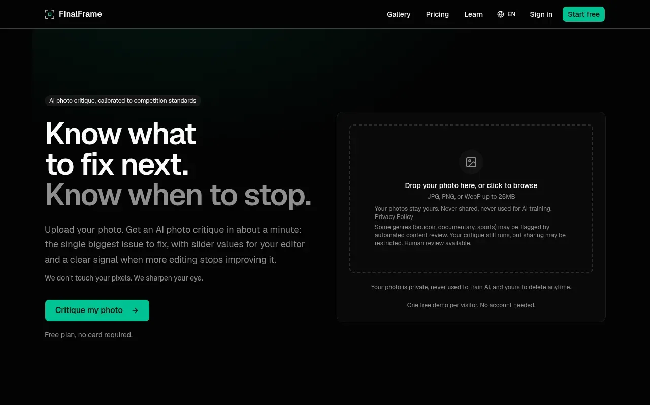
Design analysis
The hero pairs a strong diagnostic headline and concise explanation with a prominent upload dropzone, making the product promise and first action understandable immediately.
Prompt preview
## Reference images

Study these alongside the description below: hierarchy, rhythm, spacing, colour. Build for the product you are asked about, using this design language.

- Component: https://kage-design-assets.t3.tigrisfiles.io/components/finalframe/10bde091-c6ec-4ca8-aeab-6378e76e091a-1790402731-1.webp
- Full page it was cut from: https://kage-design-assets.t3.tigrisfiles.io/screenshots/finalframe/10bde091-c6ec-4ca8-aeab-6378e76e091a-1790402604641-full.webp
- Component on Kage: https://kage.design/component/finalframe-hero

## Before you start
Ask what the user's product does, what users should do first, and which brand colours and tone to use. Apply the following structure to that product instead of copying the reference.

Create a dark split hero directly below the navigation. Use a two-column layout inside a max-width container: the left side contains a small eyebrow, a large 42–56px headline with a deliberate two-line emphasis, muted supporting copy, a mint primary CTA, and a small reassurance line; the right side contains a large bordered upload/dropzone card. Use #050505 as the page background, #f4f5f3 for primary text, #8b918e for secondary text, and #08c99a for actions and focus states. Give the dropzone a slightly lighter black surface (#0b0d0c), 1px border (#222624), 10–12px radius, generous internal padding, a dashed inner target, and clear file-type/privacy guidance. Keep the visual hierarchy asymmetric but balanced, with generous vertical whitespace. On hover, highlight the dropzone border and CTA; make the upload accessible to keyboard and screen readers.

Never: use logos, product names, copy, illustrations, or imagery from the reference.
More components

 AI workflow hero
Incredible · Hero
AI workflow hero
Incredible · Hero

 Decentralized energy statement
godaylight.com · Hero
Decentralized energy statement
godaylight.com · Hero
 Grid problem statement
godaylight.com · Hero
Grid problem statement
godaylight.com · Hero
 Photographic power-home hero
godaylight.com · Hero
Photographic power-home hero
godaylight.com · Hero
 Warm mission statement panel
godaylight.com · Hero
Warm mission statement panel
godaylight.com · Hero

 Product hero with download action and video
HyperFrames Studio (Desktop) · Hero
Product hero with download action and video
HyperFrames Studio (Desktop) · Hero