 kage
kage
finalframe.photo
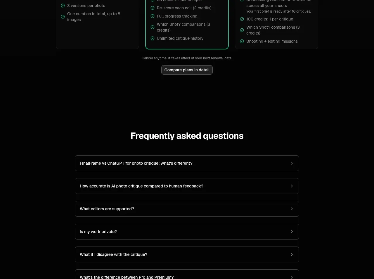
Design analysis
Three clearly differentiated plans make the middle option prominent while preserving a low-friction free tier and a secondary comparison action.
Prompt preview
## Reference images

Study these alongside the description below: hierarchy, rhythm, spacing, colour. Build for the product you are asked about, using this design language.

- Component: https://kage-design-assets.t3.tigrisfiles.io/components/finalframe/10bde091-c6ec-4ca8-aeab-6378e76e091a-1790402734-8.webp
- Full page it was cut from: https://kage-design-assets.t3.tigrisfiles.io/screenshots/finalframe/10bde091-c6ec-4ca8-aeab-6378e76e091a-1790402604641-full.webp
- Component on Kage: https://kage.design/component/finalframe-pricing-table

## Before you start
Ask what the user's plans, limits, billing model, and upgrade triggers are. Ask which plan should be recommended, then apply the pattern to that product.

Build a dark three-column pricing table with a centered heading and subtitle above it. Each plan card should include a name, prominent price, billing unit, short qualifier, feature checklist, and a button or action. Use a near-black page (#050505), slightly lighter cards (#0b0d0c), #242826 borders, and 10px radius. Make the recommended plan visibly distinct with a 1px mint border (#08c99a), subtle glow, and a small badge; keep the free plan calm and the premium plan differentiated by a coaching or advanced label. Use consistent card heights, align feature lists, and include a small cancellation note plus secondary compare-plans action below. Support monthly/annual toggle only if the product actually has both, and make pricing responsive by stacking cards.

Never: use logos, product names, copy, illustrations, or imagery from the reference.
More components
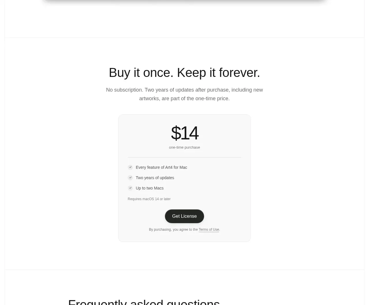
 Single purchase pricing card
Art4 · Pricing table
Single purchase pricing card
Art4 · Pricing table
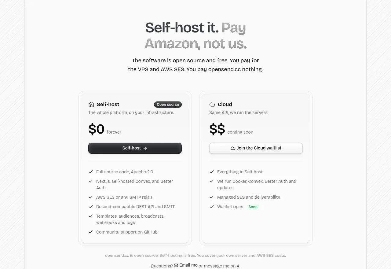
 Self-host versus cloud pricing
opensend.cc · Pricing table
Self-host versus cloud pricing
opensend.cc · Pricing table
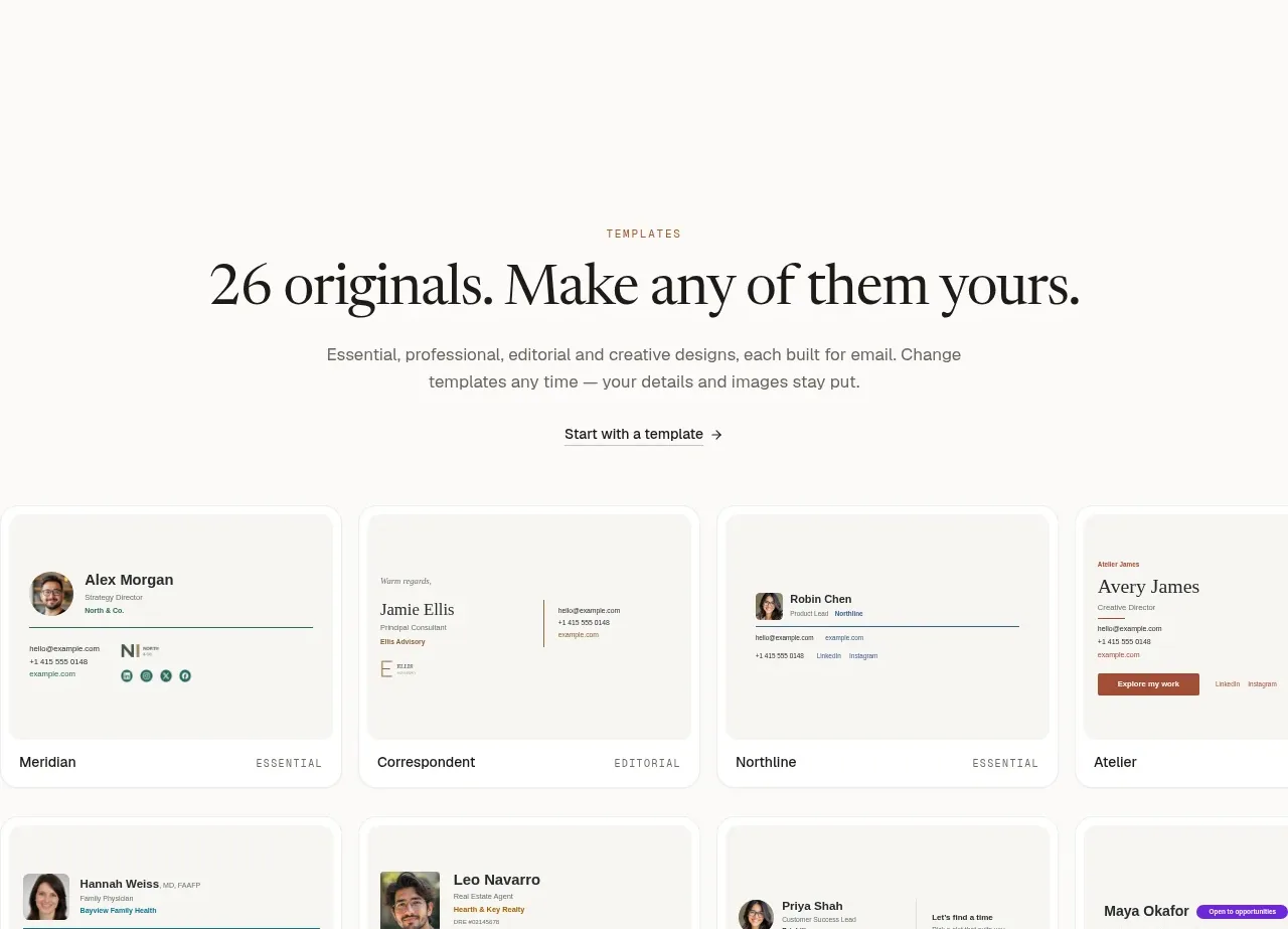
 Two-tier pricing table
esigna · Pricing table
Two-tier pricing table
esigna · Pricing table
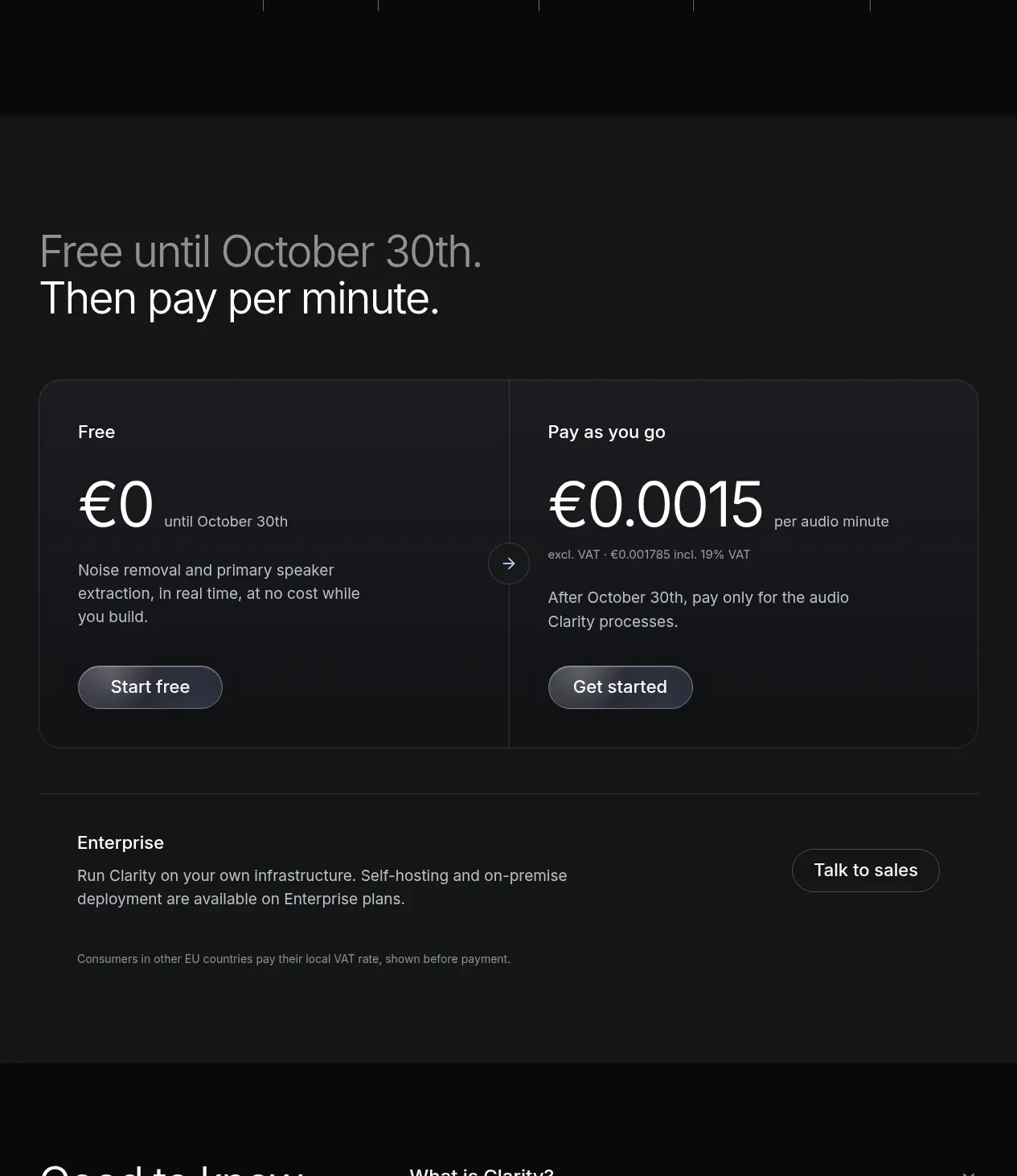
 Usage-based pricing
Clarity · Pricing table
Usage-based pricing
Clarity · Pricing table
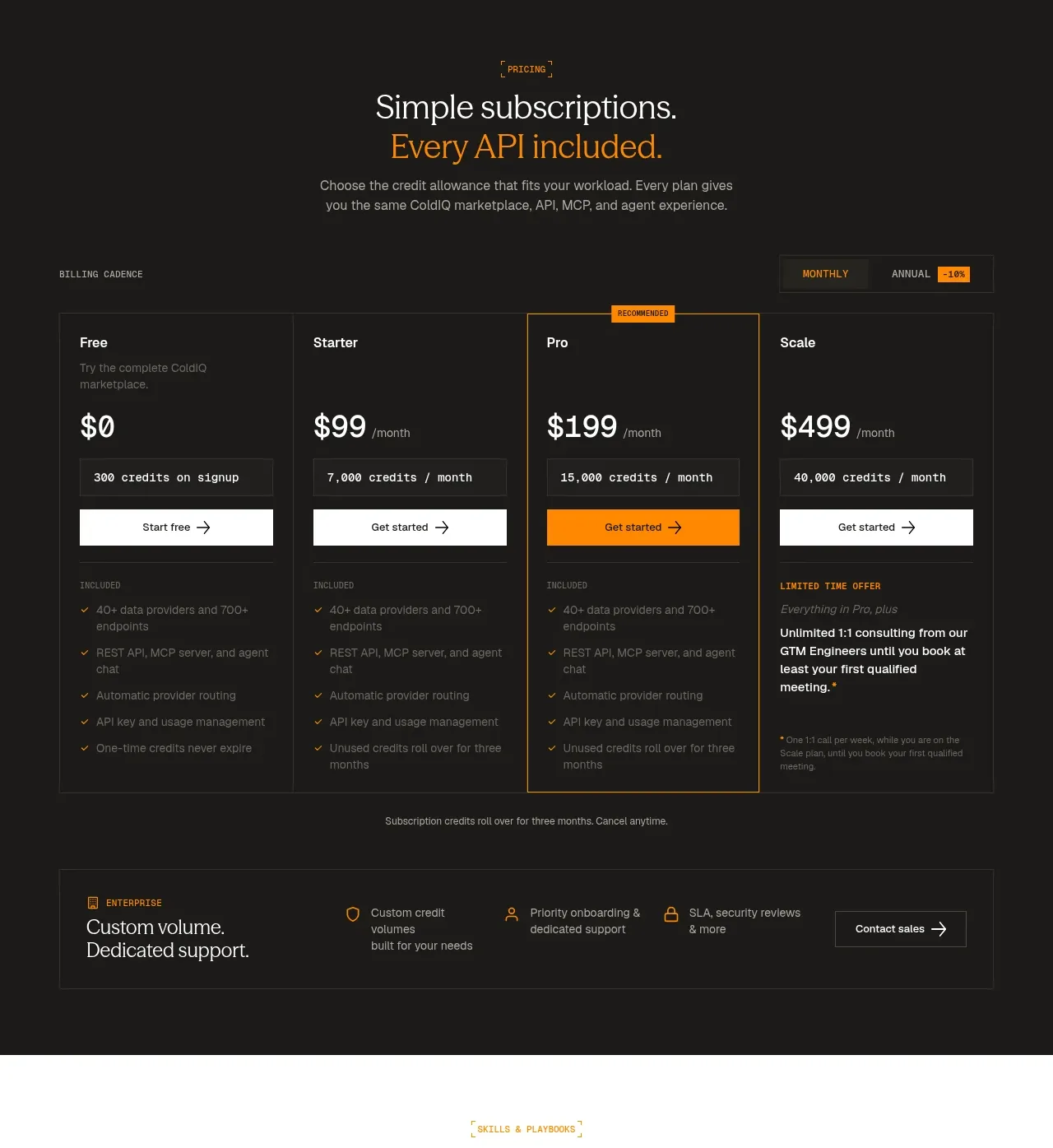
 Four-tier subscription pricing
ColdIQ x Slack · Pricing table
Four-tier subscription pricing
ColdIQ x Slack · Pricing table
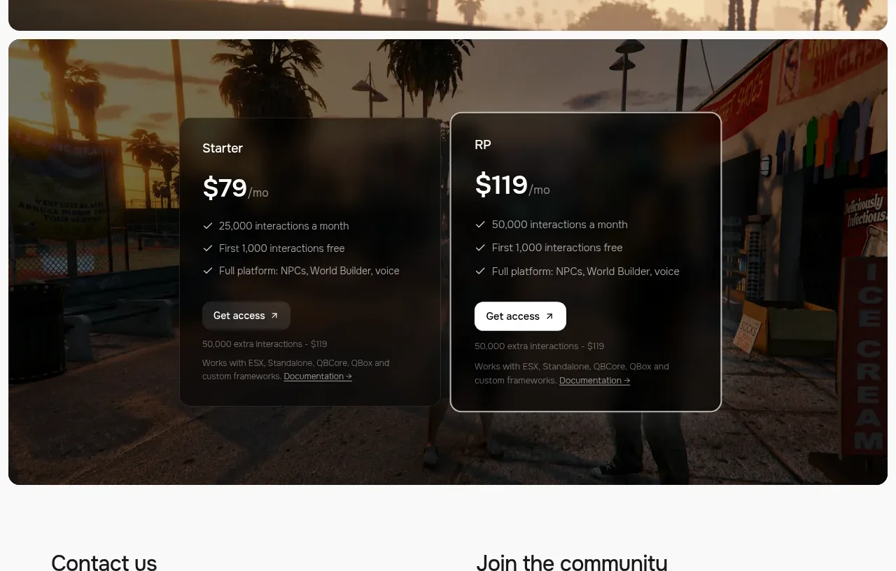
 Two-plan access pricing
Humalike x GTA RP · Pricing table
Two-plan access pricing
Humalike x GTA RP · Pricing table