 kage
kage
fish.audio
Design analysis
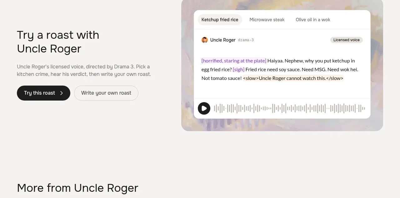
A split feature section introduces a distinctive voice use case with an explanatory text block and a large visual voice-player card, followed by three compact playable quote cards.
Prompt preview
## Reference images

Study these alongside the description below: hierarchy, rhythm, spacing, colour. Build for the product you are asked about, using this design language.

- Component: https://kage-design-assets.t3.tigrisfiles.io/components/fish-audio-drama-3/b8b3d5d8-1af1-45c3-b814-ec39ae20de20-1792217027-2.webp
- Full page it was cut from: https://kage-design-assets.t3.tigrisfiles.io/screenshots/fish-audio-drama-3/b8b3d5d8-1af1-45c3-b814-ec39ae20de20-1792216963457-full.webp
- Component on Kage: https://kage.design/component/fish-audio-drama-3-feature-grid

## Before you start
Ask what the user's product does, what audience it serves, and which brand cues should guide the design. Build an original feature section based on the structure below.

Create a feature band with a two-column lead row: a left text block containing a concise heading, supporting paragraph, and two pill buttons; a right visual demo card with an abstract background, a rounded white transcript panel, speaker metadata, expressive inline text, and a waveform player. Under the lead row, add a short section heading and a three-column row of compact audio quote cards. Each card should have a distinct soft abstract colour field, a quote/title, a waveform, a small play button, and a one-line emotional descriptor.

Use generous vertical whitespace, a 12-column grid, and consistent 24px card radii. Approximate colours: page `#f7f6f3`, blue wash `#dcecf3`, sage wash `#dfe8d0`, peach wash `#f2dfd1`, panels `#ffffff`, text `#181818`, secondary text `#77736e`, and borders `#ddd9d2`. Make audio controls keyboard accessible and clearly indicate the playing state.

Never: use logos, product names, copy, illustrations, or imagery from the reference.
More components

 Data-to-action engine
Salience · Feature grid
Data-to-action engine
Salience · Feature grid
 Actionable alert workflow
Salience · Feature grid
Actionable alert workflow
Salience · Feature grid
 Trust proof and core outcomes
Salience · Feature grid
Trust proof and core outcomes
Salience · Feature grid
 Three-step implementation flow
Salience · Feature grid
Three-step implementation flow
Salience · Feature grid
 What analytics misses
Salience · Feature grid
What analytics misses
Salience · Feature grid

 Workflow features and capabilities
CrewTower Mod for Claude Code · Feature grid
Workflow features and capabilities
CrewTower Mod for Claude Code · Feature grid