 kage
kage
fish.audio
Design analysis
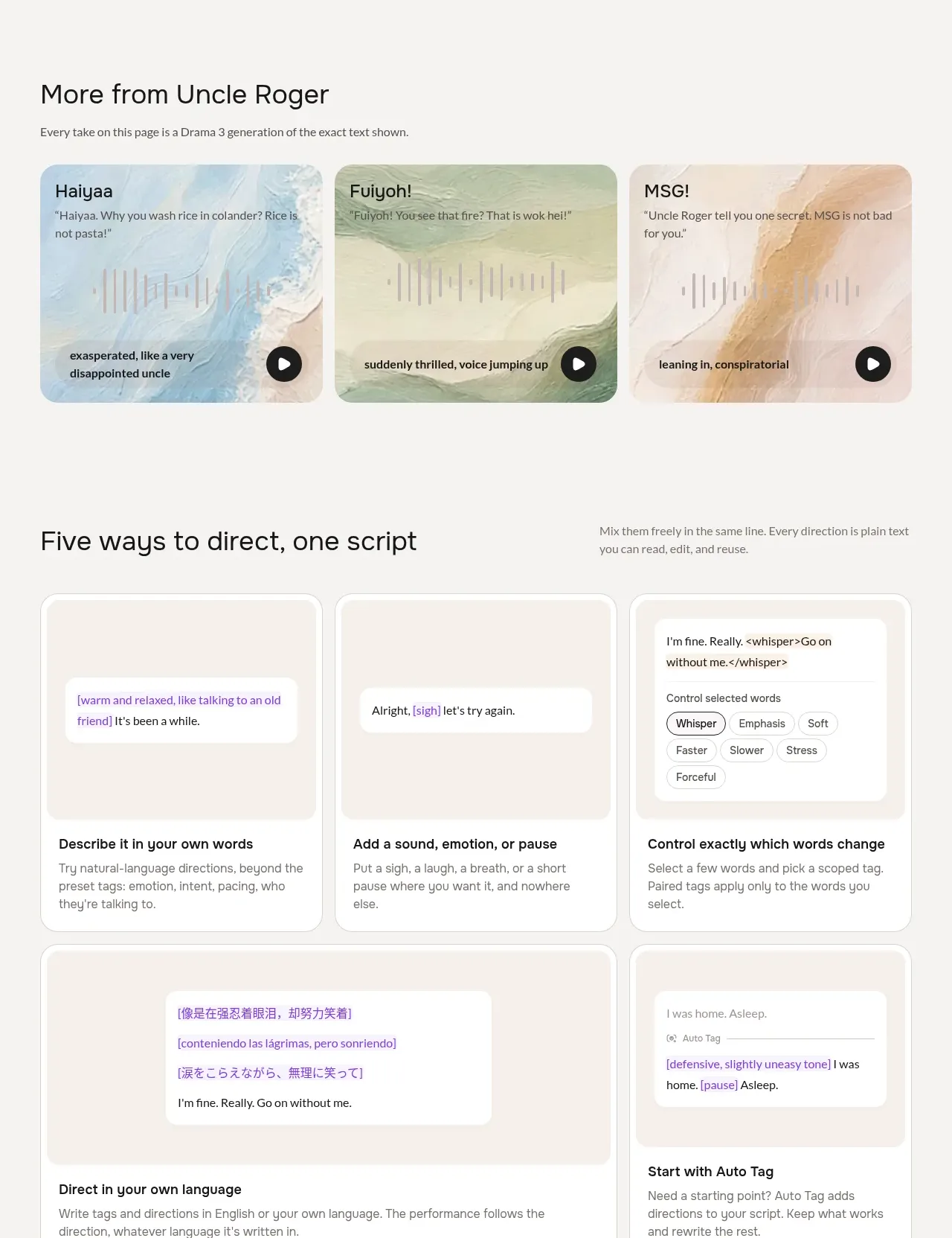
A heading introduces a dense asymmetric grid of rounded cards, each demonstrating a different interaction pattern for directing generated output through text, tags, languages, and automatic interpretation.
Prompt preview
## Reference images

Study these alongside the description below: hierarchy, rhythm, spacing, colour. Build for the product you are asked about, using this design language.

- Component: https://kage-design-assets.t3.tigrisfiles.io/components/fish-audio-drama-3/b8b3d5d8-1af1-45c3-b814-ec39ae20de20-1792217027-3.webp
- Full page it was cut from: https://kage-design-assets.t3.tigrisfiles.io/screenshots/fish-audio-drama-3/b8b3d5d8-1af1-45c3-b814-ec39ae20de20-1792216963457-full.webp
- Component on Kage: https://kage.design/component/fish-audio-drama-3-feature-grid-2

## Before you start
Ask about the user's product, its core workflow, and its brand system. Translate the following reusable card-grid pattern into that context without copying the reference.

Build a feature-grid section with a heading and a short supporting sentence above an asymmetric responsive grid. Use five cards: three equal cards across the first row, then one wide card and one narrower card below. Every card should have a pale inset demo area at the top and a descriptive title plus body copy below. Demonstrate varied product affordances such as natural-language instructions, adding an event or modifier, selecting a range, multilingual input, and automatic assistance. The demos can use chips, highlighted text, tags, and small status labels.

Use a quiet neutral canvas `#f7f6f3`, cards in `#ffffff`, inset demo surfaces in `#f3f0ea`, dark text `#171717`, purple accent text around `#6752a8`, muted copy `#787570`, 1px borders around `#dedbd5`, and 18–24px radii. Align all card content to a shared grid, keep demo panels visually dominant, and make chips have clear hover/focus states. Collapse to one column on narrow screens while preserving the wide-card emphasis through padding rather than fixed widths.

Never: use logos, product names, copy, illustrations, or imagery from the reference.
More components

 Data-to-action engine
Salience · Feature grid
Data-to-action engine
Salience · Feature grid
 Actionable alert workflow
Salience · Feature grid
Actionable alert workflow
Salience · Feature grid
 Trust proof and core outcomes
Salience · Feature grid
Trust proof and core outcomes
Salience · Feature grid
 Three-step implementation flow
Salience · Feature grid
Three-step implementation flow
Salience · Feature grid
 What analytics misses
Salience · Feature grid
What analytics misses
Salience · Feature grid

 Workflow features and capabilities
CrewTower Mod for Claude Code · Feature grid
Workflow features and capabilities
CrewTower Mod for Claude Code · Feature grid