 kage
kage
fish.audio
Design analysis
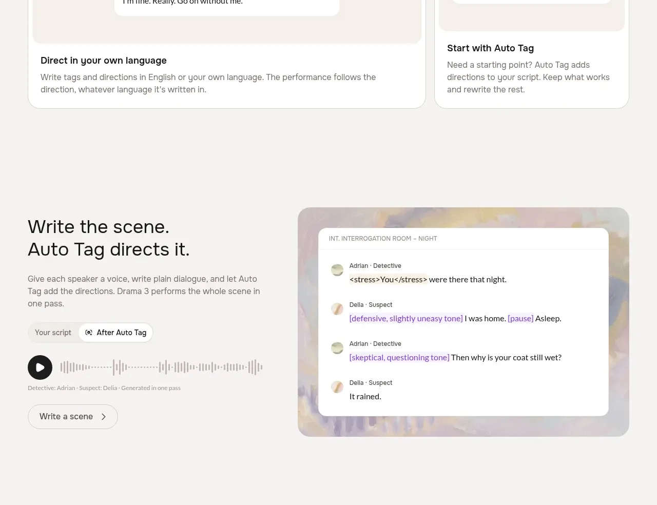
This product workflow section combines an editorial explanation and controls on the left with a large scene/transcript preview on the right, making the multi-speaker generation flow tangible.
Prompt preview
## Reference images

Study these alongside the description below: hierarchy, rhythm, spacing, colour. Build for the product you are asked about, using this design language.

- Component: https://kage-design-assets.t3.tigrisfiles.io/components/fish-audio-drama-3/b8b3d5d8-1af1-45c3-b814-ec39ae20de20-1792217028-4.webp
- Full page it was cut from: https://kage-design-assets.t3.tigrisfiles.io/screenshots/fish-audio-drama-3/b8b3d5d8-1af1-45c3-b814-ec39ae20de20-1792216963457-full.webp
- Component on Kage: https://kage.design/component/fish-audio-drama-3-feature-grid-3

## Before you start
Ask what the user's product and brand are, and what task this workflow should help users complete. Then build an original version of this pattern.

Create a two-column workflow section. The left column should include a large heading, concise explanatory copy, a small script/status control, a waveform or progress row, speaker metadata, and a secondary outlined CTA. The right column should be a large rounded visual frame containing a white conversation or editor panel with a small scene label, multiple speaker rows, avatar dots, inline direction tags, and generated dialogue. The visual should communicate that a plain script becomes a directed multi-speaker scene.

Use a warm off-white page background, an abstract low-contrast colour wash in the visual frame, white editor panel, 20–28px radii, subtle borders, and a restrained palette of black, gray, muted green, and lavender accents. Give the left and right columns balanced vertical rhythm and stack them on mobile. Make tags and speaker states readable without relying on colour alone.

Never: use logos, product names, copy, illustrations, or imagery from the reference.
More components

 Data-to-action engine
Salience · Feature grid
Data-to-action engine
Salience · Feature grid
 Actionable alert workflow
Salience · Feature grid
Actionable alert workflow
Salience · Feature grid
 Trust proof and core outcomes
Salience · Feature grid
Trust proof and core outcomes
Salience · Feature grid
 Three-step implementation flow
Salience · Feature grid
Three-step implementation flow
Salience · Feature grid
 What analytics misses
Salience · Feature grid
What analytics misses
Salience · Feature grid

 Workflow features and capabilities
CrewTower Mod for Claude Code · Feature grid
Workflow features and capabilities
CrewTower Mod for Claude Code · Feature grid