 kage
kage
flowcub.com
Design analysis
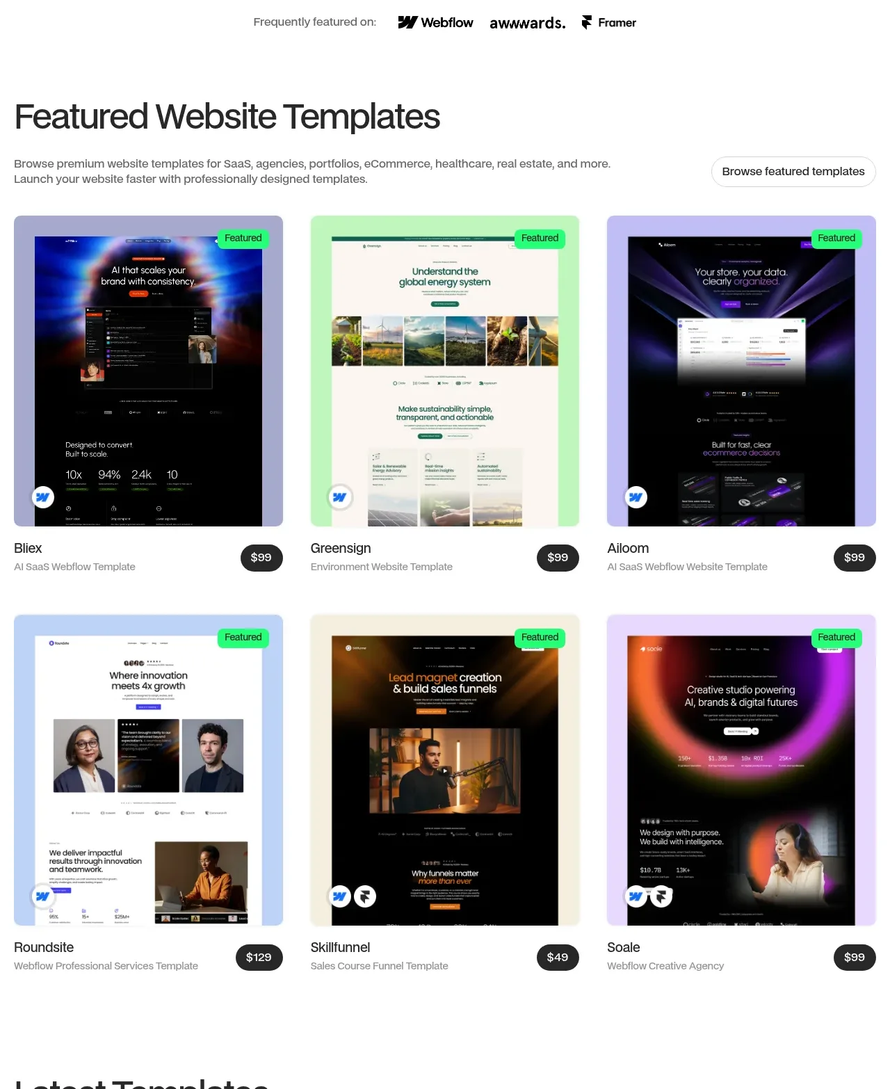
A heading and supporting line introduce a three-column grid of large visual template cards, each with a status badge, title, category, and price pill.
Prompt preview
## Reference images

Study these alongside the description below: hierarchy, rhythm, spacing, colour. Build for the product you are asked about, using this design language.

- Component: https://kage-design-assets.t3.tigrisfiles.io/components/flowcub-com/a37af876-acd7-4211-984b-565faddfb31d-1790420144-3.webp
- Full page it was cut from: https://kage-design-assets.t3.tigrisfiles.io/screenshots/flowcub-com/a37af876-acd7-4211-984b-565faddfb31d-1790420112256-full.webp
- Component on Kage: https://kage.design/component/flowcub-feature-grid

## Before you start
Ask what the user's product is, who it serves, and what its brand personality and primary conversion goal are. Then apply the following principles to that product rather than reproducing the reference.

Create a featured catalogue section with a left-aligned heading around 34–40px, a short muted description below it, and a right-aligned outline browse button. Follow with a responsive three-column grid of template cards. Each card should have a large 4:5 preview image with a softly colored frame, 12px radius, a small top-right status pill, and a metadata row below containing title, category, and a dark price pill. Use 26–28px gutters, 32px row gaps, white background, #111 text, #777 secondary text, #25F276 status accents, and #202020 price pills. Add a restrained hover lift and image scale, but preserve the card's layout and readable metadata. Collapse to two columns then one column on narrow screens.

Never: use logos, product names, copy, illustrations, or imagery from the reference.
More components

 Three-step process cards
godaylight.com · Feature grid
Three-step process cards
godaylight.com · Feature grid

 Use-case selector with vertical video preview
Spira Maxima · Feature grid
Use-case selector with vertical video preview
Spira Maxima · Feature grid

 Insights and enterprise model access
FastRouter.ai · Feature grid
Insights and enterprise model access
FastRouter.ai · Feature grid
 Solutions by organizational role
FastRouter.ai · Feature grid
Solutions by organizational role
FastRouter.ai · Feature grid
 Routing reliability and model collaboration
FastRouter.ai · Feature grid
Routing reliability and model collaboration
FastRouter.ai · Feature grid
 Goal-oriented product capabilities
FastRouter.ai · Feature grid
Goal-oriented product capabilities
FastRouter.ai · Feature grid