 kage
kage
flowcub.com
Design analysis
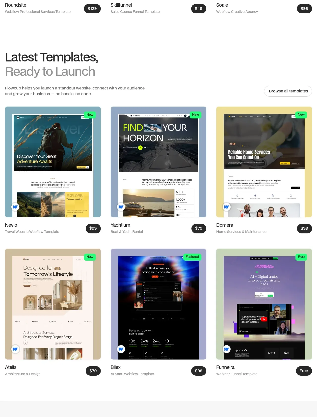
The second catalogue block reuses the proven card system while changing the editorial heading and status labels to make the collection feel current and expansive.
Prompt preview
## Reference images

Study these alongside the description below: hierarchy, rhythm, spacing, colour. Build for the product you are asked about, using this design language.

- Component: https://kage-design-assets.t3.tigrisfiles.io/components/flowcub-com/a37af876-acd7-4211-984b-565faddfb31d-1790420144-4.webp
- Full page it was cut from: https://kage-design-assets.t3.tigrisfiles.io/screenshots/flowcub-com/a37af876-acd7-4211-984b-565faddfb31d-1790420112256-full.webp
- Component on Kage: https://kage.design/component/flowcub-feature-grid-2

## Before you start
Ask what the user's product is, who it serves, and what its brand personality and primary conversion goal are. Then apply the following principles to that product rather than reproducing the reference.

Build a second catalogue grid that feels like a continuation without looking duplicated. Use a two-line editorial heading with the second line in a lighter gray, a concise explanatory paragraph, and a browse-all control. Render six large visual cards in three columns, with consistent preview aspect ratio, rounded corners, corner status badges, title/category metadata, and price or free labels. Maintain a clean white canvas, 28px outer gutters, 24px card gaps, #111 typography, #747474 secondary text, green #25F276 badges, and dark #202020 price chips. Support keyboard focus, lazy-loaded previews, and responsive one-column stacking.

Never: use logos, product names, copy, illustrations, or imagery from the reference.
More components

 Three-step process cards
godaylight.com · Feature grid
Three-step process cards
godaylight.com · Feature grid

 Use-case selector with vertical video preview
Spira Maxima · Feature grid
Use-case selector with vertical video preview
Spira Maxima · Feature grid

 Insights and enterprise model access
FastRouter.ai · Feature grid
Insights and enterprise model access
FastRouter.ai · Feature grid
 Solutions by organizational role
FastRouter.ai · Feature grid
Solutions by organizational role
FastRouter.ai · Feature grid
 Routing reliability and model collaboration
FastRouter.ai · Feature grid
Routing reliability and model collaboration
FastRouter.ai · Feature grid
 Goal-oriented product capabilities
FastRouter.ai · Feature grid
Goal-oriented product capabilities
FastRouter.ai · Feature grid