 kage
kage
flowcub.com
Design analysis
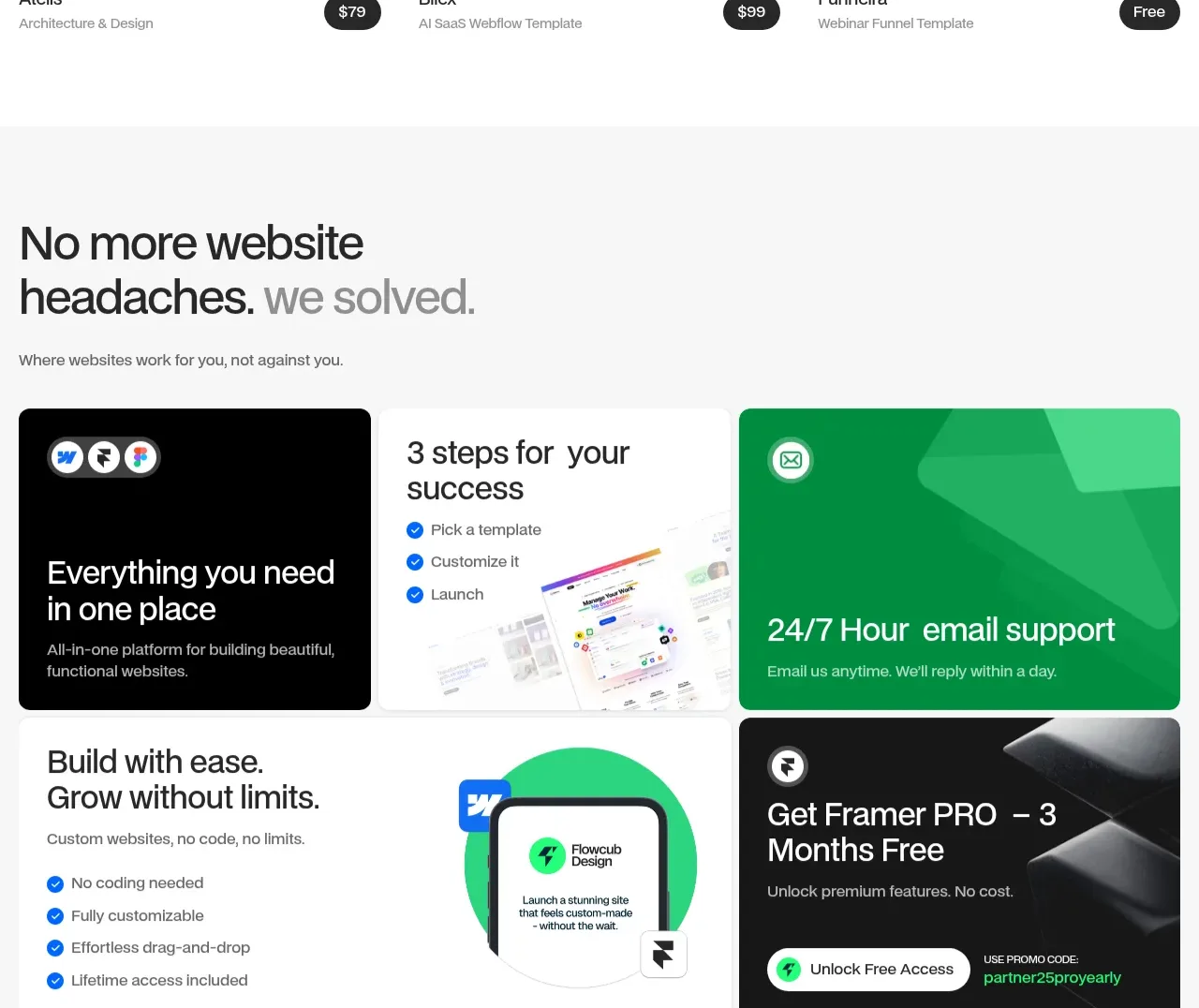
A pale section uses varied black, white, and green tiles to explain the product benefits quickly, creating visual rhythm without a conventional feature list.
Prompt preview
## Reference images

Study these alongside the description below: hierarchy, rhythm, spacing, colour. Build for the product you are asked about, using this design language.

- Component: https://kage-design-assets.t3.tigrisfiles.io/components/flowcub-com/a37af876-acd7-4211-984b-565faddfb31d-1790420145-5.webp
- Full page it was cut from: https://kage-design-assets.t3.tigrisfiles.io/screenshots/flowcub-com/a37af876-acd7-4211-984b-565faddfb31d-1790420112256-full.webp
- Component on Kage: https://kage.design/component/flowcub-feature-grid-3

## Before you start
Ask what the user's product is, who it serves, and what its brand personality and primary conversion goal are. Then apply the following principles to that product rather than reproducing the reference.

Create a two-row bento benefits section on a very light gray canvas (#F7F7F7). Begin with a bold two-line heading where the second phrase is gray, plus a short supporting sentence. Below it, arrange four or five cards with varied spans: a black feature card, a white checklist card, a saturated green support card, and one promotional or integration card. Use 14px radii, 20–28px padding, 28–34px headings, compact 15px descriptions, and blue circular check icons where lists appear. Use black #050505, white #FFFFFF, green #20D96B/#25F276, and subtle gray dividers. Keep tile heights visually balanced and make the layout stack gracefully on mobile.

Never: use logos, product names, copy, illustrations, or imagery from the reference.
More components

 Three-step process cards
godaylight.com · Feature grid
Three-step process cards
godaylight.com · Feature grid

 Use-case selector with vertical video preview
Spira Maxima · Feature grid
Use-case selector with vertical video preview
Spira Maxima · Feature grid

 Insights and enterprise model access
FastRouter.ai · Feature grid
Insights and enterprise model access
FastRouter.ai · Feature grid
 Solutions by organizational role
FastRouter.ai · Feature grid
Solutions by organizational role
FastRouter.ai · Feature grid
 Routing reliability and model collaboration
FastRouter.ai · Feature grid
Routing reliability and model collaboration
FastRouter.ai · Feature grid
 Goal-oriented product capabilities
FastRouter.ai · Feature grid
Goal-oriented product capabilities
FastRouter.ai · Feature grid