 kage
kage
flowcub.com
Design analysis
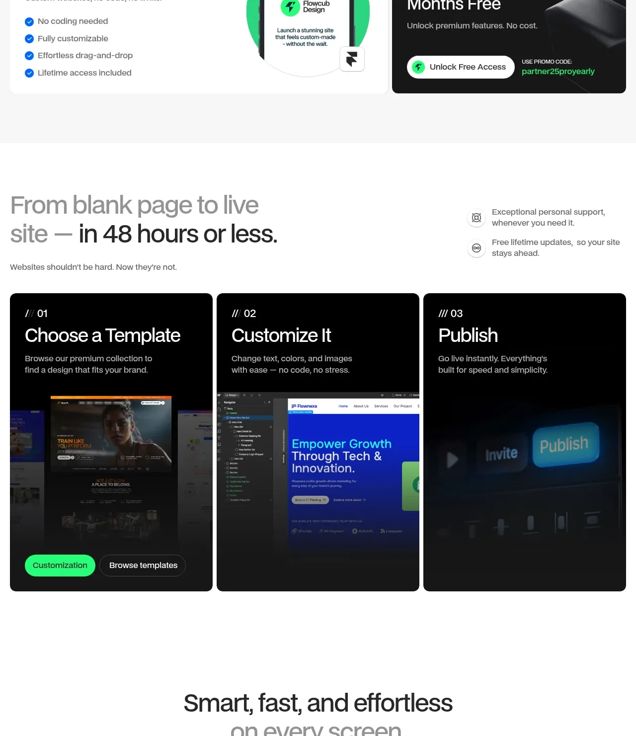
A concise process headline leads into three numbered dark cards, making the path from selection to publishing easy to scan and supported by preview imagery.
Prompt preview
## Reference images

Study these alongside the description below: hierarchy, rhythm, spacing, colour. Build for the product you are asked about, using this design language.

- Component: https://kage-design-assets.t3.tigrisfiles.io/components/flowcub-com/a37af876-acd7-4211-984b-565faddfb31d-1790420145-6.webp
- Full page it was cut from: https://kage-design-assets.t3.tigrisfiles.io/screenshots/flowcub-com/a37af876-acd7-4211-984b-565faddfb31d-1790420112256-full.webp
- Component on Kage: https://kage.design/component/flowcub-feature-grid-4

## Before you start
Ask what the user's product is, who it serves, and what its brand personality and primary conversion goal are. Then apply the following principles to that product rather than reproducing the reference.

Build a process section with a two-column intro: a large two-line heading on the left and two small reassurance statements on the right. Under it, place three equal-width dark cards in a row, numbered 01, 02, and 03. Each card needs a compact uppercase step marker, 30–36px white title, short gray-white description, and a large lower visual or video thumbnail with a dark gradient overlay. Use #050505 cards, #1A1A1A borders, 14px radius, 20px gaps, white and #AFAFAF text, and one green primary action plus one dark outlined action where appropriate. Add play affordances only to media that is actually playable. Stack cards vertically below tablet width.

Never: use logos, product names, copy, illustrations, or imagery from the reference.
More components

 Three-step process cards
godaylight.com · Feature grid
Three-step process cards
godaylight.com · Feature grid

 Use-case selector with vertical video preview
Spira Maxima · Feature grid
Use-case selector with vertical video preview
Spira Maxima · Feature grid

 Insights and enterprise model access
FastRouter.ai · Feature grid
Insights and enterprise model access
FastRouter.ai · Feature grid
 Solutions by organizational role
FastRouter.ai · Feature grid
Solutions by organizational role
FastRouter.ai · Feature grid
 Routing reliability and model collaboration
FastRouter.ai · Feature grid
Routing reliability and model collaboration
FastRouter.ai · Feature grid
 Goal-oriented product capabilities
FastRouter.ai · Feature grid
Goal-oriented product capabilities
FastRouter.ai · Feature grid