 kage
kage
flowcub.com
Design analysis
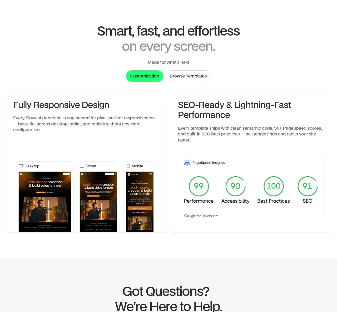
A centered promise and two side-by-side proof panels demonstrate responsive output and measurable technical quality rather than merely claiming it.
Prompt preview
## Reference images

Study these alongside the description below: hierarchy, rhythm, spacing, colour. Build for the product you are asked about, using this design language.

- Component: https://kage-design-assets.t3.tigrisfiles.io/components/flowcub-com/a37af876-acd7-4211-984b-565faddfb31d-1790420146-7.webp
- Full page it was cut from: https://kage-design-assets.t3.tigrisfiles.io/screenshots/flowcub-com/a37af876-acd7-4211-984b-565faddfb31d-1790420112256-full.webp
- Component on Kage: https://kage.design/component/flowcub-feature-grid-5

## Before you start
Ask what the user's product is, who it serves, and what its brand personality and primary conversion goal are. Then apply the following principles to that product rather than reproducing the reference.

Create a centered section with a large two-line headline, a lighter second line, a short subtitle, and paired pill CTAs. Below, use two equal-width bordered panels: one showing the same interface across desktop, tablet, and mobile frames; the other showing a performance audit with four circular metrics. Use white background, #111 text, #707070 supporting copy, #F1F1F1 panel borders, 12px radius, and a green accent #25F276 for buttons and positive metrics. Keep panel headings around 24–28px and ensure the device mockups and metric labels remain legible at smaller sizes. Prefer real accessible HTML or generated placeholders over decorative screenshots.

Never: use logos, product names, copy, illustrations, or imagery from the reference.
More components

 Three-step process cards
godaylight.com · Feature grid
Three-step process cards
godaylight.com · Feature grid

 Use-case selector with vertical video preview
Spira Maxima · Feature grid
Use-case selector with vertical video preview
Spira Maxima · Feature grid

 Insights and enterprise model access
FastRouter.ai · Feature grid
Insights and enterprise model access
FastRouter.ai · Feature grid
 Solutions by organizational role
FastRouter.ai · Feature grid
Solutions by organizational role
FastRouter.ai · Feature grid
 Routing reliability and model collaboration
FastRouter.ai · Feature grid
Routing reliability and model collaboration
FastRouter.ai · Feature grid
 Goal-oriented product capabilities
FastRouter.ai · Feature grid
Goal-oriented product capabilities
FastRouter.ai · Feature grid