 kage
kage
flowcub.com
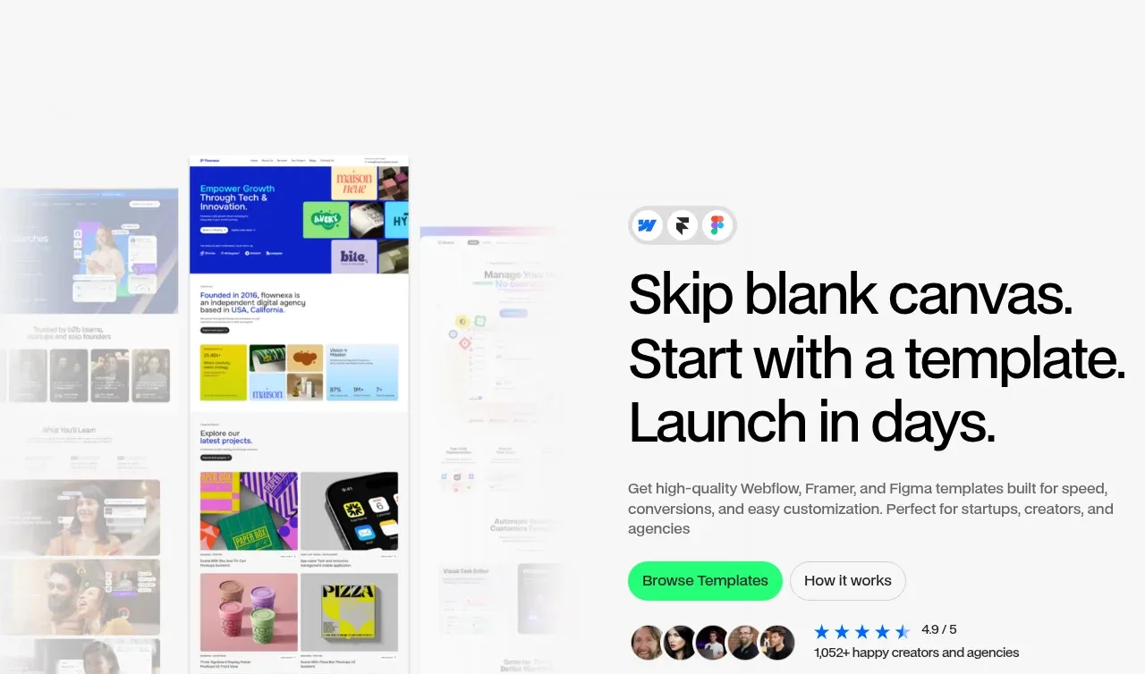
Design analysis
The hero combines a large promise, concise supporting copy, dual CTAs, social proof, and a softly blurred template collage so the value proposition and catalogue feel immediate.
Prompt preview
## Reference images

Study these alongside the description below: hierarchy, rhythm, spacing, colour. Build for the product you are asked about, using this design language.

- Component: https://kage-design-assets.t3.tigrisfiles.io/components/flowcub-com/a37af876-acd7-4211-984b-565faddfb31d-1790420143-1.webp
- Full page it was cut from: https://kage-design-assets.t3.tigrisfiles.io/screenshots/flowcub-com/a37af876-acd7-4211-984b-565faddfb31d-1790420112256-full.webp
- Component on Kage: https://kage.design/component/flowcub-hero

## Before you start
Ask what the user's product is, who it serves, and what its brand personality and primary conversion goal are. Then apply the following principles to that product rather than reproducing the reference.

Create a split hero inside a max-width 900px section: a large visual collage or product preview occupies the left half and an aligned text block occupies the right half. Let the visual fade softly into the background rather than ending as a hard rectangle. Use a three-line display headline at roughly 52–64px with tight 0.94 line-height and a short paragraph at 15–17px in muted gray. Place a filled primary CTA and outlined secondary CTA on one line, followed by a compact social-proof row with small circular avatars, rating marks, and a short metric. Use a nearly white background (#FAFAFA), black text (#0D0D0D), gray copy (#6F6F6F), vibrant green accent (#25F276), and subtle lavender/blue collage tones. Keep generous vertical breathing room, 32px gaps between content groups, and 999px pill buttons. Animate only the preview/ambient layers subtly; keep the CTA and message stable.

Never: use logos, product names, copy, illustrations, or imagery from the reference.
More components

 AI workflow hero
Incredible · Hero
AI workflow hero
Incredible · Hero
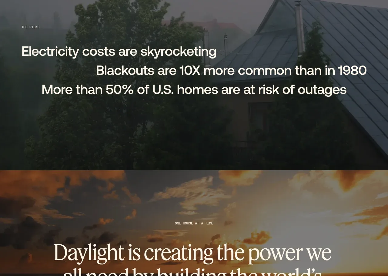
 Decentralized energy statement
godaylight.com · Hero
Decentralized energy statement
godaylight.com · Hero
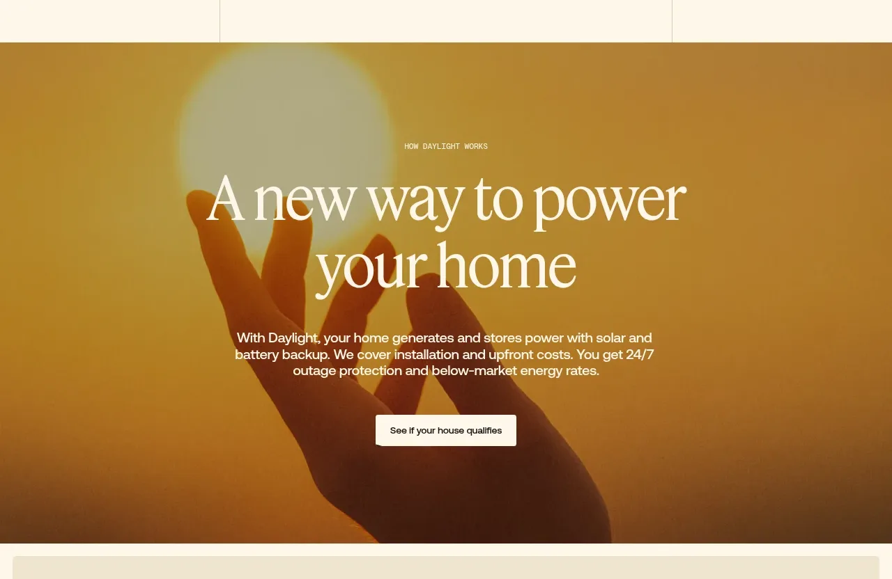 Warm mission statement panel
godaylight.com · Hero
Warm mission statement panel
godaylight.com · Hero
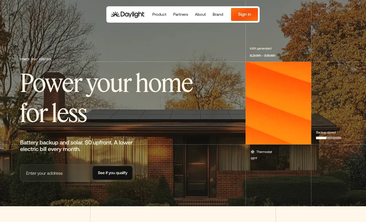 Photographic power-home hero
godaylight.com · Hero
Photographic power-home hero
godaylight.com · Hero
 Grid problem statement
godaylight.com · Hero
Grid problem statement
godaylight.com · Hero
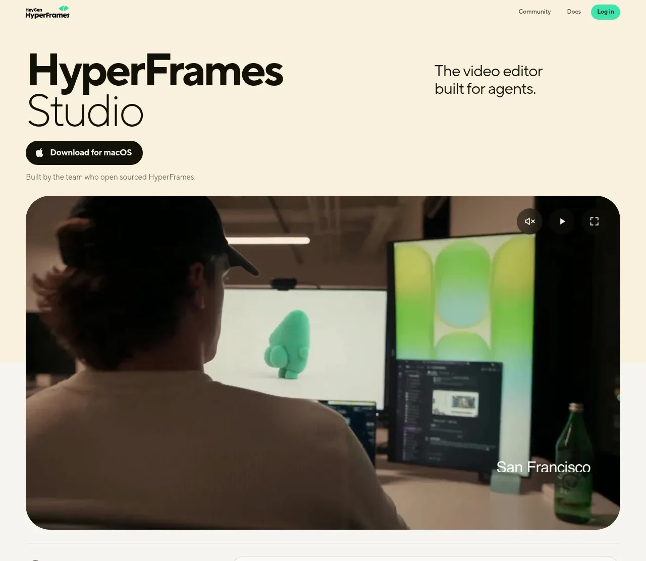
 Product hero with download action and video
HyperFrames Studio (Desktop) · Hero
Product hero with download action and video
HyperFrames Studio (Desktop) · Hero