 kage
kage
flowoapp.com
Design analysis
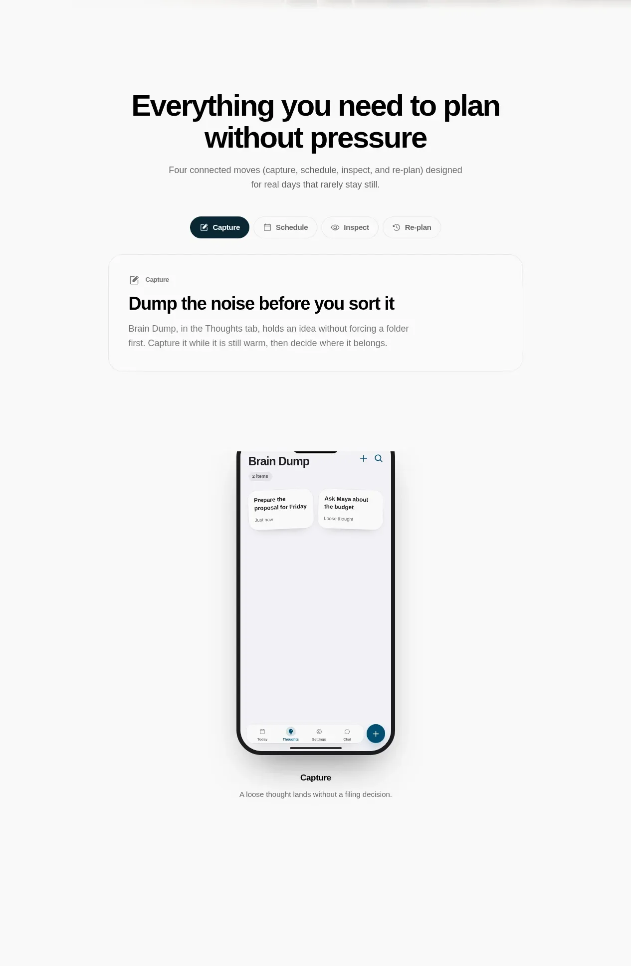
A centered section introduces a four-part workflow, then gives the active step a focused description and a tall mobile product preview.
Prompt preview
## Reference images

Study these alongside the description below: hierarchy, rhythm, spacing, colour. Build for the product you are asked about, using this design language.

- Component: https://kage-design-assets.t3.tigrisfiles.io/components/flowo/46dcd8ed-31a5-4fb1-ab3b-3d3a2b966cfb-1791439600-2.webp
- Full page it was cut from: https://kage-design-assets.t3.tigrisfiles.io/screenshots/flowo/46dcd8ed-31a5-4fb1-ab3b-3d3a2b966cfb-1791439391035-full.webp
- Component on Kage: https://kage.design/component/flowo-feature-grid

## Before you start
Ask what the user's product workflow is and which stages users need to understand first. Adapt the structure to the user's product and brand, using original labels, copy, and UI.

Build a spacious workflow overview with a centered headline, brief explanation, segmented step controls, and one active feature demonstration. The section should make a complex product feel sequential and approachable without becoming a dense feature list.

- Use a narrow centered container, with a 48–72px section heading block and 24–32px gap before the step controls.
- Set the heading at 30–40px with tight line-height; supporting copy at 13–15px in a muted gray (`#737373`).
- Render four compact tabs or pills with a dark teal active state (`#073847`) and pale neutral inactive states (`#F2F2EF`).
- Put the active step title and explanatory copy above or beside a centered phone-sized preview; keep the preview visually dominant but narrow.
- Use white cards, hairline borders (`#E7E7E3`), 12–20px radius, and a very soft shadow only for elevation.
- On mobile, stack the copy, controls, and preview; preserve an obvious active state and keyboard-accessible tab behavior.

Never use logos, product names, copy, illustrations, or imagery from the reference.
More components

 Privacy and optional intelligence
Mailwell · Feature grid
Privacy and optional intelligence
Mailwell · Feature grid
 Reliable, recoverable actions
Mailwell · Feature grid
Reliable, recoverable actions
Mailwell · Feature grid
 Unified account setup
Mailwell · Feature grid
Unified account setup
Mailwell · Feature grid
 Fast local workflow and calm reading
Mailwell · Feature grid
Fast local workflow and calm reading
Mailwell · Feature grid

 Cloud layer workflows
ProcBoss · Feature grid
Cloud layer workflows
ProcBoss · Feature grid
 Operational blind spots
ProcBoss · Feature grid
Operational blind spots
ProcBoss · Feature grid