kage
kage
fplxi.com

Design analysis
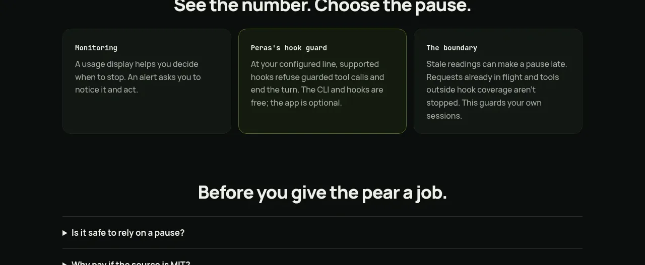
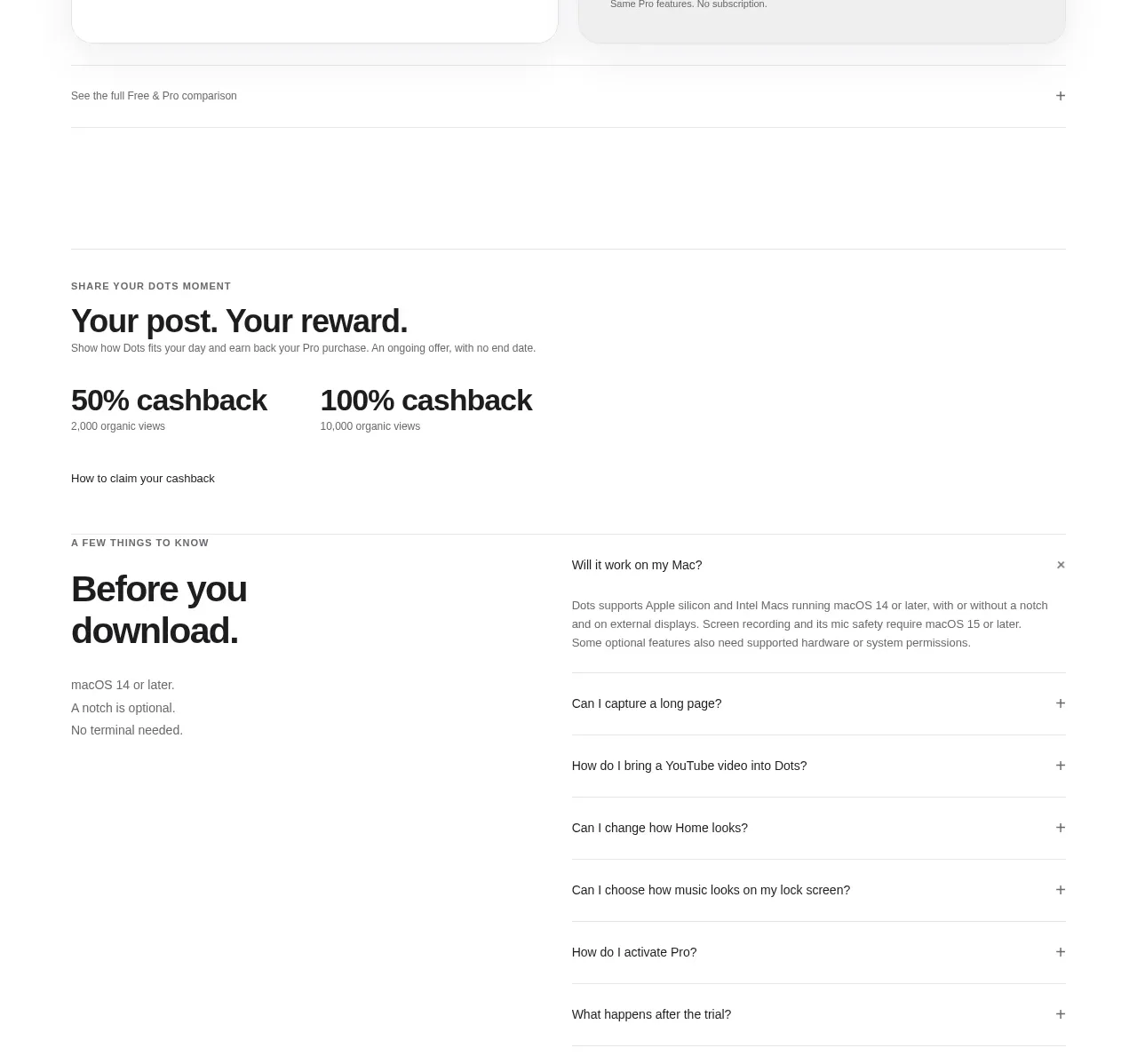
A restrained FAQ section that uses two aligned columns of compact accordion rows, creating a clear scan path without cards or visual noise. Thin dividers, generous whitespace, and subtle chevrons keep the component editorial and easy to expand.
Prompt preview
## Reference images

Study these alongside the description below: hierarchy, rhythm, spacing, colour. Build for the product you are asked about, using this design language.

- Component: https://kage-design-assets.t3.tigrisfiles.io/components/fplxi-com/54b8421e-1a9f-4884-bebf-8d70ddcd8ef8-1789073157-7.webp
- Full page it was cut from: https://kage-design-assets.t3.tigrisfiles.io/screenshots/fplxi-com/54b8421e-1a9f-4884-bebf-8d70ddcd8ef8-1789073135-full.webp
- Component on Kage: https://kage.design/component/fplxi-faq

## Before you start
Ask the user what their product is, who it is for, and what visual brand language they want to use. Then apply the principles below to create an original FAQ section for that product—not a copy of the reference.

## Design goal
Build a quiet, editorial FAQ section for a modern product website. The section should make many questions easy to scan at once, while allowing answers to expand inline. Prioritise clarity, rhythm, and low visual noise over decorative treatment.

## Layout and alignment
- Use a full-width section inside a responsive page container with generous horizontal padding; cap the content width around 1200–1280px.
- Place a small uppercase or small-caps section label above the question list, aligned to the same left edge as the grid.
- On desktop, arrange questions in two equal-width columns with a substantial horizontal gap, approximately 28–40px.
- Each column is an independent vertical list. Keep row heights and divider alignment consistent across both columns where possible.
- On smaller screens, collapse to one column while preserving the original question order; use a comfortable horizontal gutter of roughly 20–24px.
- Avoid cards, boxed panels, prominent section backgrounds, or a centred narrow accordion: the dividers should define the structure.

## Typography hierarchy
- Use a neutral, highly legible sans-serif or the product’s existing UI typeface.
- The section label should be small and muted, approximately 11–12px, uppercase with modest letter spacing.
- Questions should be medium-weight, dark, and readable at approximately 14–16px with a line height around 1.4–1.5.
- Expanded answers should be visually subordinate to the question, around 13–15px with a relaxed line height and a softer text colour.
- Do not use oversized display typography; this component is about efficient scanning.

## Spacing and rhythm
- Give the section label around 12–18px of space before the first divider.
- Use compact but comfortable rows: approximately 44–56px minimum height on desktop, with 16–20px vertical padding depending on the type scale.
- Keep question text left-aligned and vertically centred within each row.
- Reserve a small, consistent area at the far right of every row for the disclosure control.
- When a row opens, add enough vertical padding for the answer without disturbing the neighbouring column’s visual hierarchy.

## Colour
- Use an off-white or very light neutral page background, approximately #F7F7F5 to #FAFAF8.
- Use near-black charcoal for questions, approximately #171717 to #242424.
- Use a muted grey for the section label and answer text, approximately #8A8A86 to #70706C.
- Use subtle divider lines, approximately #DCDCD8 to #E4E4E0; they should be visible but never dominant.
- If the product has a brand accent, apply it sparingly to focus, hover, or answer links rather than filling the rows.

## Borders and radius
- Use a 1px horizontal border at the top or bottom of each accordion row; avoid vertical borders and card outlines.
- Keep the outer section visually open with no enclosing border.
- Use little or no corner radius. If an expanded answer or focus treatment needs a surface, keep the radius subtle—around 2–6px.

## Interaction
- Make every question row a clearly keyboard-accessible button or disclosure trigger, with a generous hit area.
- Show a small, thin chevron at the far right, approximately 12–16px, pointing down when closed and rotating smoothly when open.
- Use restrained hover and focus states: slightly darken the text or divider, and provide a visible accessible focus ring without adding heavy decoration.
- Animate expansion and collapse smoothly but quickly, around 180–240ms, respecting `prefers-reduced-motion`.
- Support multiple open questions unless the product’s content strategy strongly benefits from a single-open accordion.
- Preserve layout stability and ensure answers do not overflow on narrow screens.

## Content and accessibility
- Write concise, product-specific questions and useful answers for the user’s actual product; do not use placeholder filler in the finished section.
- Use semantic headings for the section label if appropriate, and native disclosure semantics such as buttons with `aria-expanded` and an associated answer region.
- Ensure colour contrast, visible keyboard focus, screen-reader clarity, and touch targets of at least roughly 44px.

## Never
- Never copy the reference’s logos, product names, exact questions, exact answers, or branded wording.
- Never reuse illustrations, imagery, icons, or decorative assets from the reference; a simple CSS/SVG chevron is sufficient.
- Never make the section look like a card grid, pricing table, or boxed dashboard unless the user’s brand explicitly requires it.
- Never introduce unrelated marketing copy, oversized headings, gradients, or ornamental graphics that weaken the FAQ’s scanability.