kage
kage
fplxi.com

Design analysis
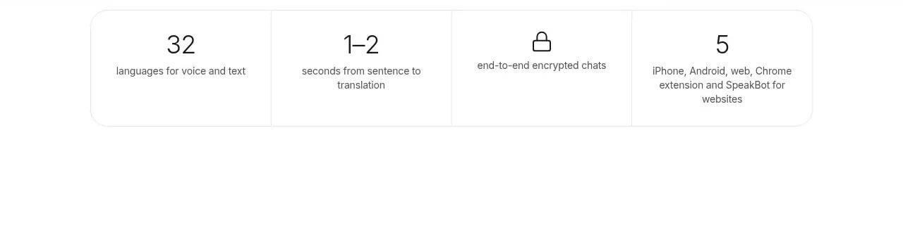
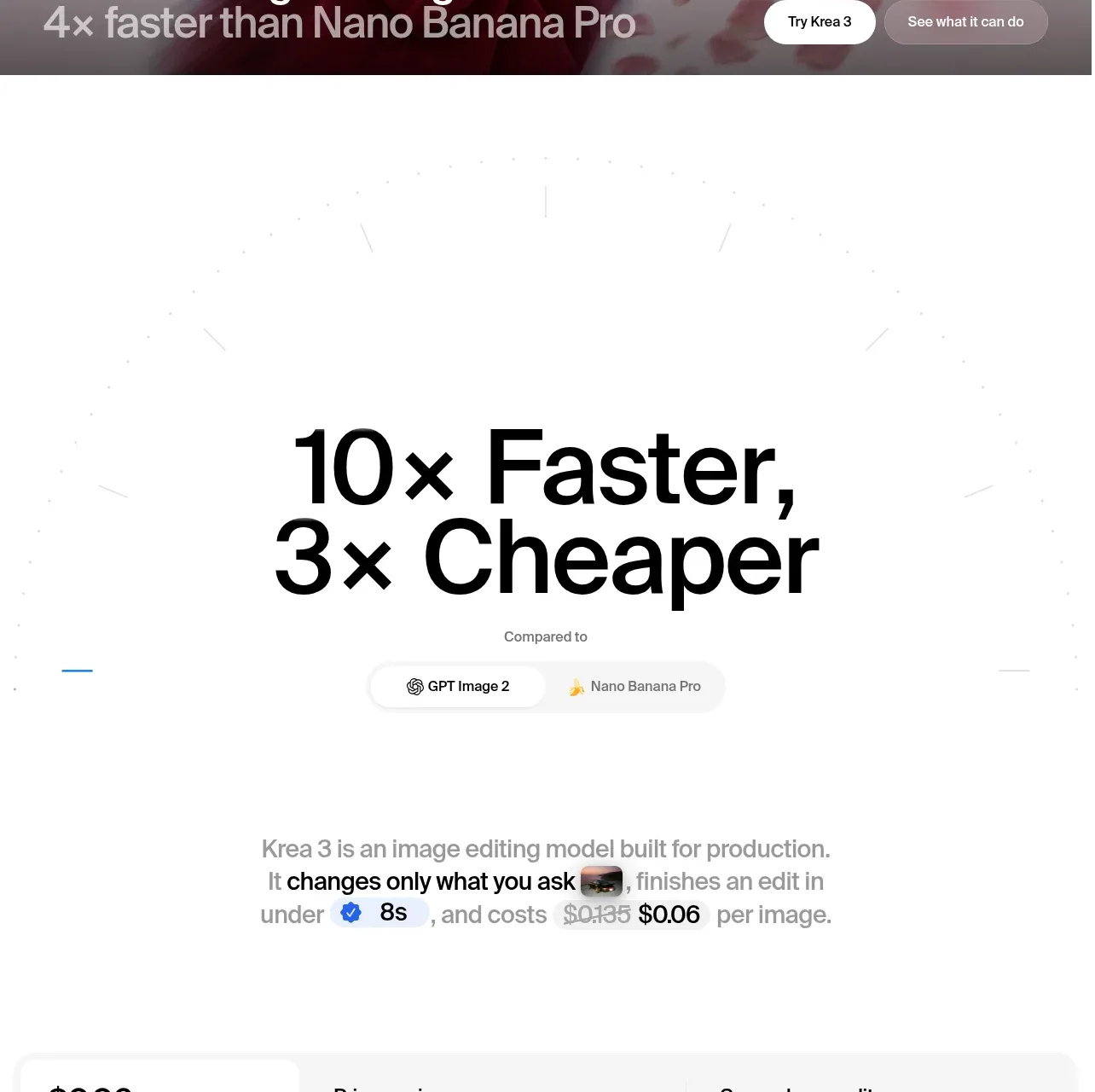
A compact horizontal row of four metric cards creates a fast-scanning proof point section. Consistent card geometry, restrained typography, and one dark emphasis card establish hierarchy without making the strip feel like a dense dashboard.
Prompt preview
## Reference images

Study these alongside the description below: hierarchy, rhythm, spacing, colour. Build for the product you are asked about, using this design language.

- Component: https://kage-design-assets.t3.tigrisfiles.io/components/fplxi-com/54b8421e-1a9f-4884-bebf-8d70ddcd8ef8-1789073156-2.webp
- Full page it was cut from: https://kage-design-assets.t3.tigrisfiles.io/screenshots/fplxi-com/54b8421e-1a9f-4884-bebf-8d70ddcd8ef8-1789073135-full.webp
- Component on Kage: https://kage.design/component/fplxi-stats

## Before you start
Ask what the user's product is, who the audience is, and what visual brand system should guide the work. Apply the principles below to that product rather than reproducing this reference literally.

## Build a compact metrics strip
Create a responsive stats section containing four equal-width metric cards in a single horizontal row on wide screens. The component should feel like a polished product proof-point band: calm, analytical, and easy to scan in under a second.

### Layout and alignment
- Place the cards inside a centered container with a maximum width of roughly 1200–1280px and generous horizontal page padding, around 24px on mobile and 32–40px on desktop.
- Use a four-column grid with a small, consistent gap of approximately 12–16px.
- Give every card the same minimum height, around 100px, with internal padding of about 16px.
- Align all content to the top-left so labels, values, and supporting text form predictable vertical columns.
- On smaller screens, collapse to two columns or a single stacked column based on available width; preserve equal card heights where practical.
- Keep the section visually self-contained with ample whitespace above and below rather than adding a heavy section heading.

### Typography hierarchy
- Use a compact uppercase eyebrow label with generous letter spacing, approximately 10–11px, medium weight, and muted contrast.
- Make the primary statistic the dominant element: approximately 22–26px, regular or medium weight, with any unit or denominator slightly smaller and lower contrast.
- Use supporting context below the value at approximately 12–13px with relaxed line height. Keep it concise and allow wrapping only when necessary.
- Use a clean sans-serif suited to the user's brand. Avoid overly geometric display typography unless the product calls for it.

### Colour
- For the default cards, use a near-white surface such as `#FFFFFF` or `#FAFAF9` against a very light warm-gray page background around `#F5F5F3`.
- Use primary text around `#171717`, secondary text around `#8A8A86`, and label text around `#9A9A96`.
- Give one strategically selected card a dark emphasis treatment, such as a charcoal gradient from `#2B2B2B` to `#151515`, with white primary text and muted gray supporting text around `#A7A7A7`.
- The emphasized card should communicate importance, not an error state. Use the user's brand accent only if it improves hierarchy and remains restrained.

### Borders, radius, and depth
- Use a subtle 1px border on light cards, approximately `#E7E7E3` or a low-opacity black.
- Use a moderate corner radius around 12–14px; keep it consistent across all cards.
- Add only a very soft shadow, for example `0 2px 8px rgba(0,0,0,0.03)`, or omit the shadow when the border and background provide enough separation.
- The dark card can use a slightly stronger border or inset highlight so its edge remains visible without looking glossy.

### Interaction and behaviour
- If the metrics are interactive, make the entire card the target and add a subtle hover treatment: a 1–2px upward shift, slightly stronger shadow, or a small surface-contrast change.
- Preserve clear focus-visible states with a 2px outline using the product's accessible accent colour.
- Do not make decorative animation compete with the numbers. If values update, use a restrained transition and avoid rapidly counting numbers on every render.
- Ensure text remains readable at increased browser zoom and that cards do not clip units, labels, or supporting copy.

### Content guidance
- Use four distinct metric types that support the product's credibility or value proposition.
- Keep labels short, values prominent, and supporting descriptions explanatory rather than promotional.
- Format numbers, decimals, units, and denominators consistently across the row.

## Never
- Never use logos, product names, or branded copy from the reference.
- Never copy the reference metrics, numbers, labels, wording, or exact content structure.
- Never reuse illustrations or imagery from the reference; this component should be typographic and UI-led.
- Never reproduce the reference as a pixel-for-pixel clone.
- Never make every card visually loud, add unnecessary charts, or sacrifice responsive behaviour for the desktop row.