 kage
kage
frctl.art
Design analysis
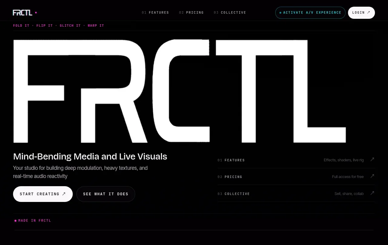
The hero uses an enormous cropped wordmark-like typographic treatment as the visual, followed by a concise product promise, two contrasting CTAs, and a small list of value anchors. It succeeds through scale, stark contrast, and unusually sparse composition.
Prompt preview
## Reference images

Study these alongside the description below: hierarchy, rhythm, spacing, colour. Build for the product you are asked about, using this design language.

- Component: https://kage-design-assets.t3.tigrisfiles.io/components/frctl/44ee5e18-5619-4ecf-b1a3-c989d58893aa-1790488993-1.webp
- Full page it was cut from: https://kage-design-assets.t3.tigrisfiles.io/screenshots/frctl/44ee5e18-5619-4ecf-b1a3-c989d58893aa-1790488956222-full.webp
- Component on Kage: https://kage.design/component/frctl-hero

## Before you start
Ask what the user's product and brand are, what transformation it offers, and which action matters most. Use those answers to create an original hero following these principles.

Create a black, full-width hero with a 32px horizontal gutter and an oversized abstract typographic visual occupying the upper half; use a custom or geometric sans wordform that may crop against the viewport, but do not use a literal logo. Under it, place a clear 24–28px product promise, a two-line supporting sentence, and two horizontally aligned pill buttons: an off-white primary CTA and a dark outlined secondary CTA. Balance the left content with three compact numbered value links on the right. Use near-white text (#f4f4f4), muted gray secondary text (#737073), and small electric magenta details (#c32679). Headings should be tight, heavy, and modern; labels should be uppercase monospaced with 0.18em tracking. Add generous vertical breathing room and a faint section rule. Buttons should have 999px radius, 14–16px horizontal padding, and arrow affordances.

Never: use logos, product names, copy, illustrations, or imagery from the reference.
More components
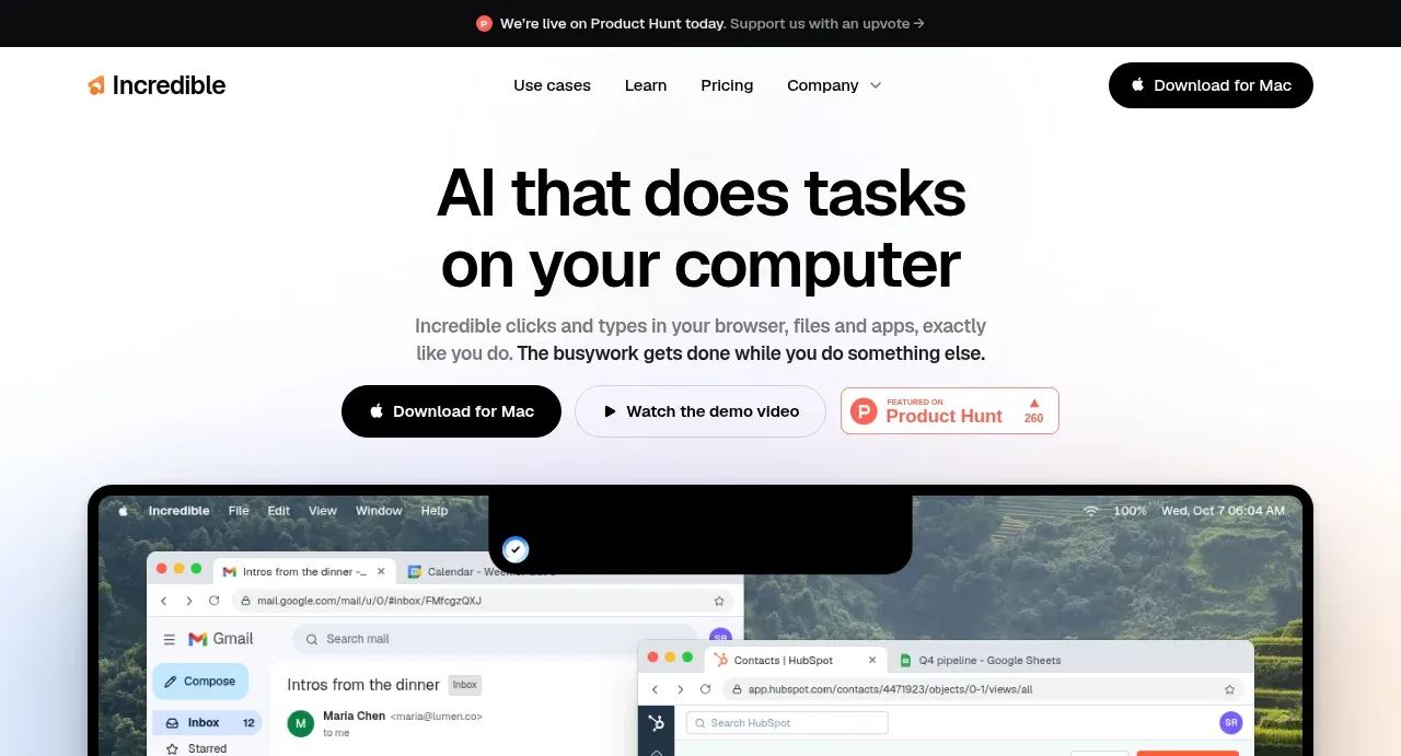
 AI workflow hero
Incredible · Hero
AI workflow hero
Incredible · Hero
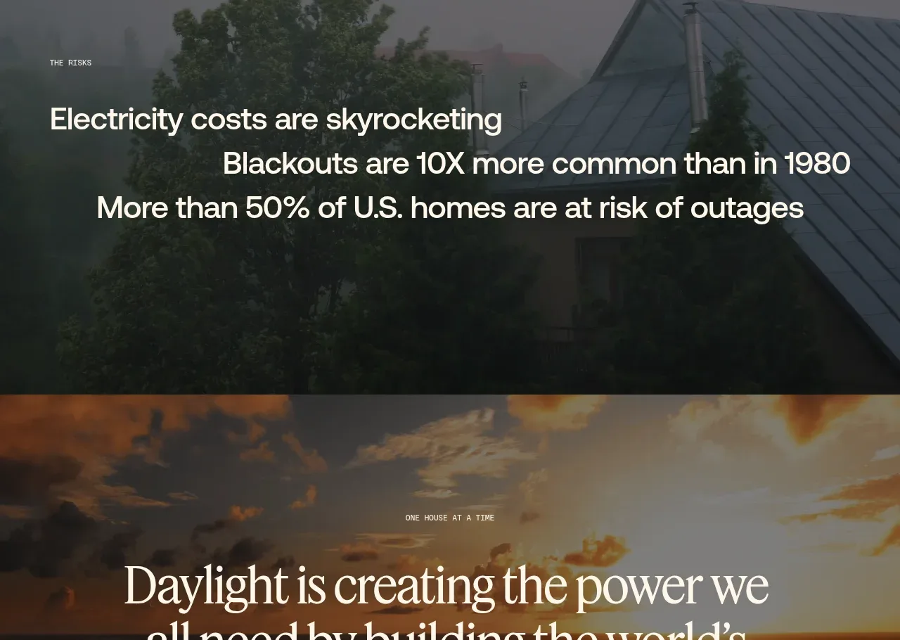
 Decentralized energy statement
godaylight.com · Hero
Decentralized energy statement
godaylight.com · Hero
 Warm mission statement panel
godaylight.com · Hero
Warm mission statement panel
godaylight.com · Hero
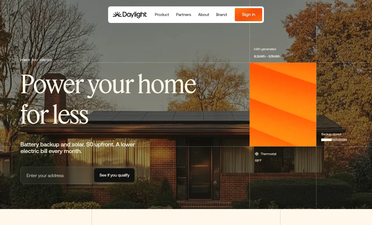 Photographic power-home hero
godaylight.com · Hero
Photographic power-home hero
godaylight.com · Hero
 Grid problem statement
godaylight.com · Hero
Grid problem statement
godaylight.com · Hero
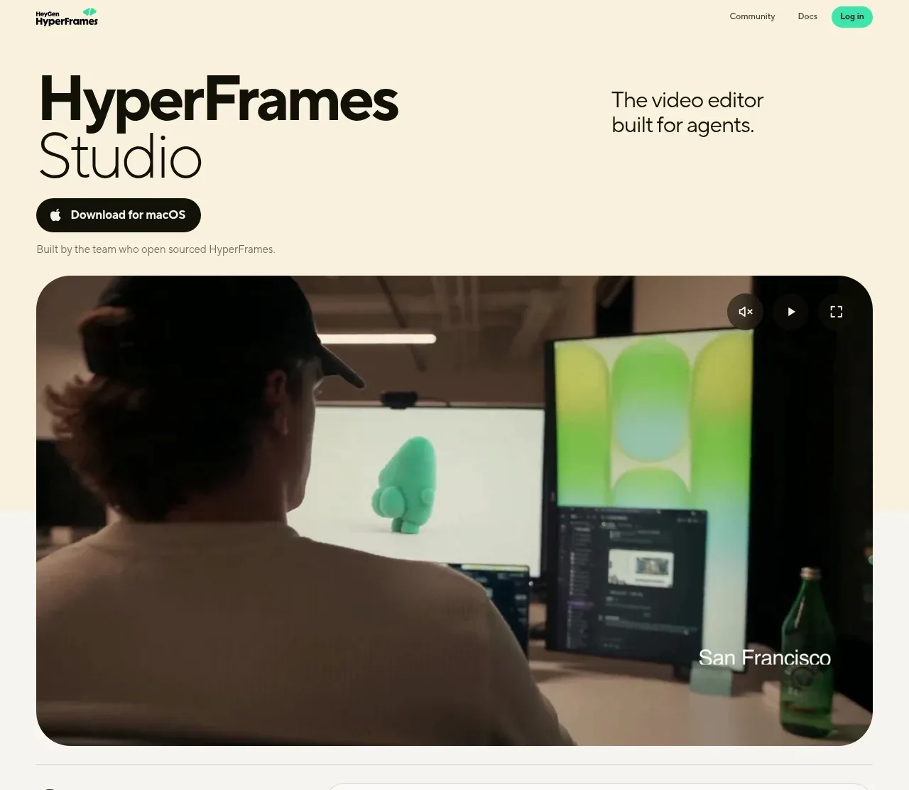
 Product hero with download action and video
HyperFrames Studio (Desktop) · Hero
Product hero with download action and video
HyperFrames Studio (Desktop) · Hero