 kage
kage
frctl.art
Design analysis
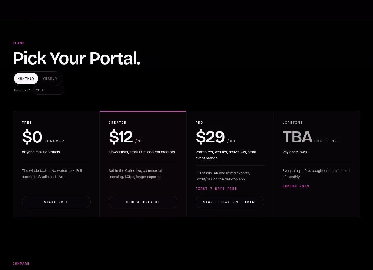
A short pricing introduction leads into a segmented billing switch and a single bordered four-column pricing panel. One tier is emphasized with a magenta top rule while all plans retain equal visual weight.
Prompt preview
## Reference images

Study these alongside the description below: hierarchy, rhythm, spacing, colour. Build for the product you are asked about, using this design language.

- Component: https://kage-design-assets.t3.tigrisfiles.io/components/frctl/44ee5e18-5619-4ecf-b1a3-c989d58893aa-1790488993-2.webp
- Full page it was cut from: https://kage-design-assets.t3.tigrisfiles.io/screenshots/frctl/44ee5e18-5619-4ecf-b1a3-c989d58893aa-1790488956222-full.webp
- Component on Kage: https://kage.design/component/frctl-pricing-table

## Before you start
Ask what the user's product sells, which plans exist, what billing cadence is relevant, and which plan should be emphasized. Then build an original pricing section using the rules below.

Design a dark pricing section with a small uppercase eyebrow, a large left-aligned heading, and a compact monthly/yearly segmented control. Keep the layout within a 32px page gutter. Below, use one rounded rectangular pricing panel (#080709) with a subtle 1px border (#222025), divided into four equal columns by faint vertical rules. Each plan needs a tiny uppercase name, prominent price, cadence, one-sentence audience description, a short list or note of included capability, and an outlined pill CTA. Highlight one recommended plan with a thin magenta top border (#c32679), magenta plan label, and slightly brighter text. Use 42–48px heading type, 12–14px body text, and condensed mono labels around 10px. Keep the panel internally spacious and make the billing switch keyboard accessible with a clear selected state.

Never: use logos, product names, copy, illustrations, or imagery from the reference.
More components
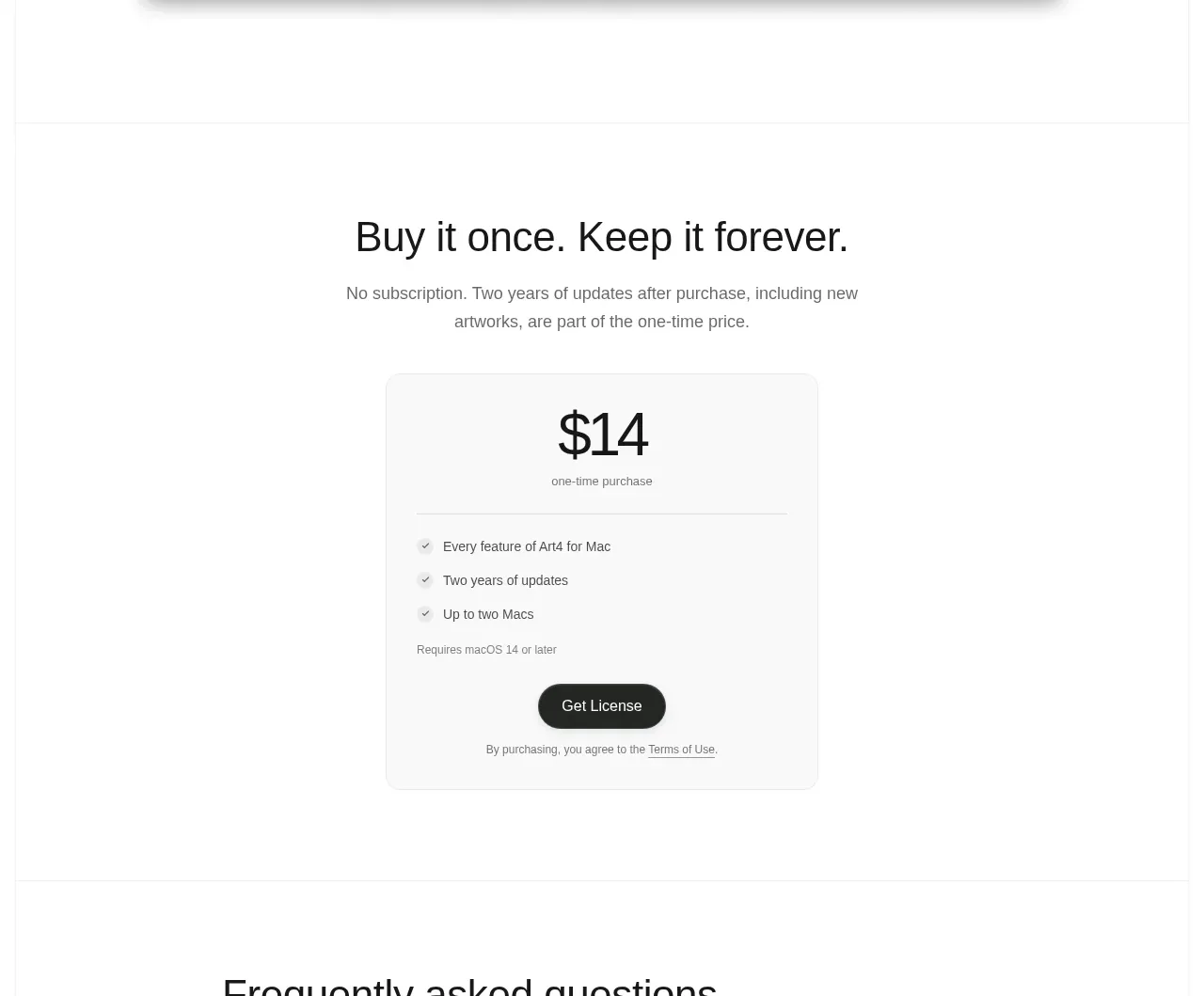
 Single purchase pricing card
Art4 · Pricing table
Single purchase pricing card
Art4 · Pricing table
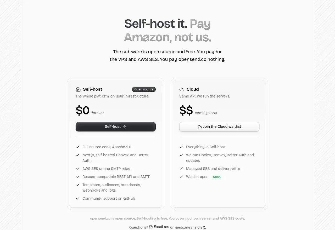
 Self-host versus cloud pricing
opensend.cc · Pricing table
Self-host versus cloud pricing
opensend.cc · Pricing table
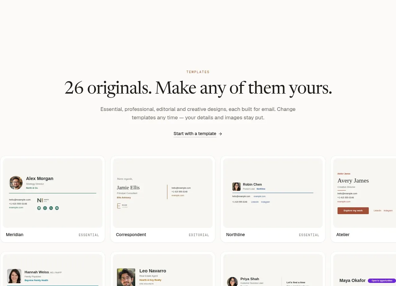
 Two-tier pricing table
esigna · Pricing table
Two-tier pricing table
esigna · Pricing table
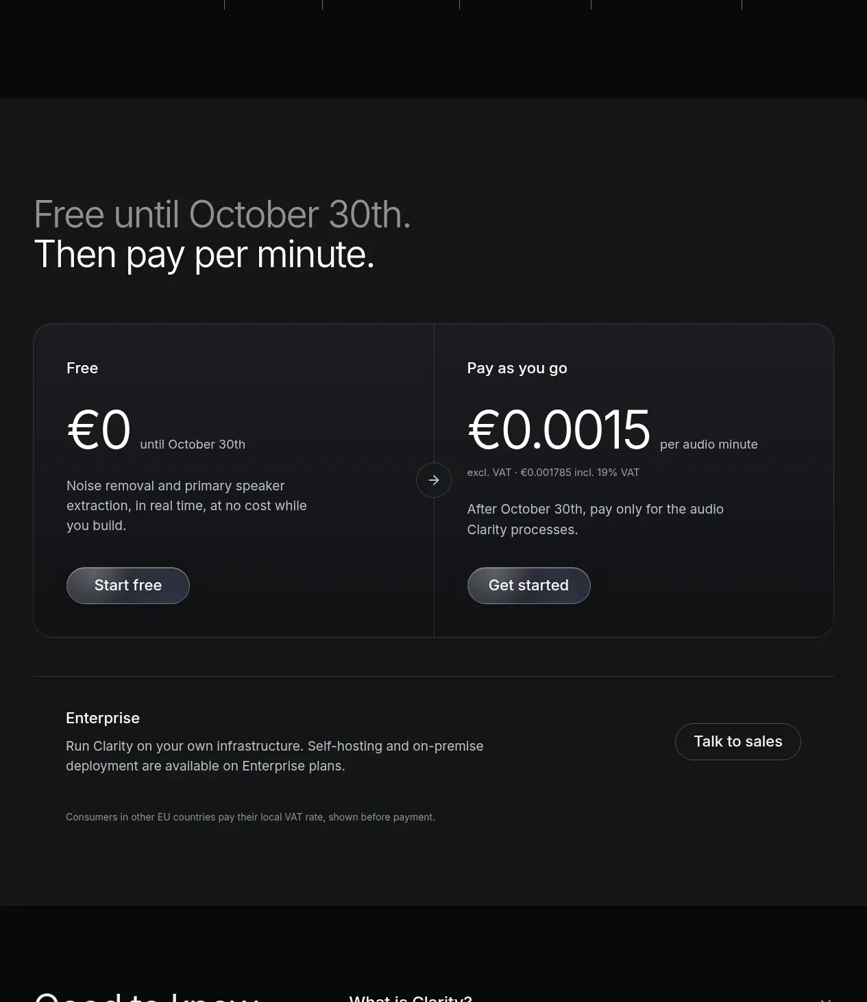
 Usage-based pricing
Clarity · Pricing table
Usage-based pricing
Clarity · Pricing table
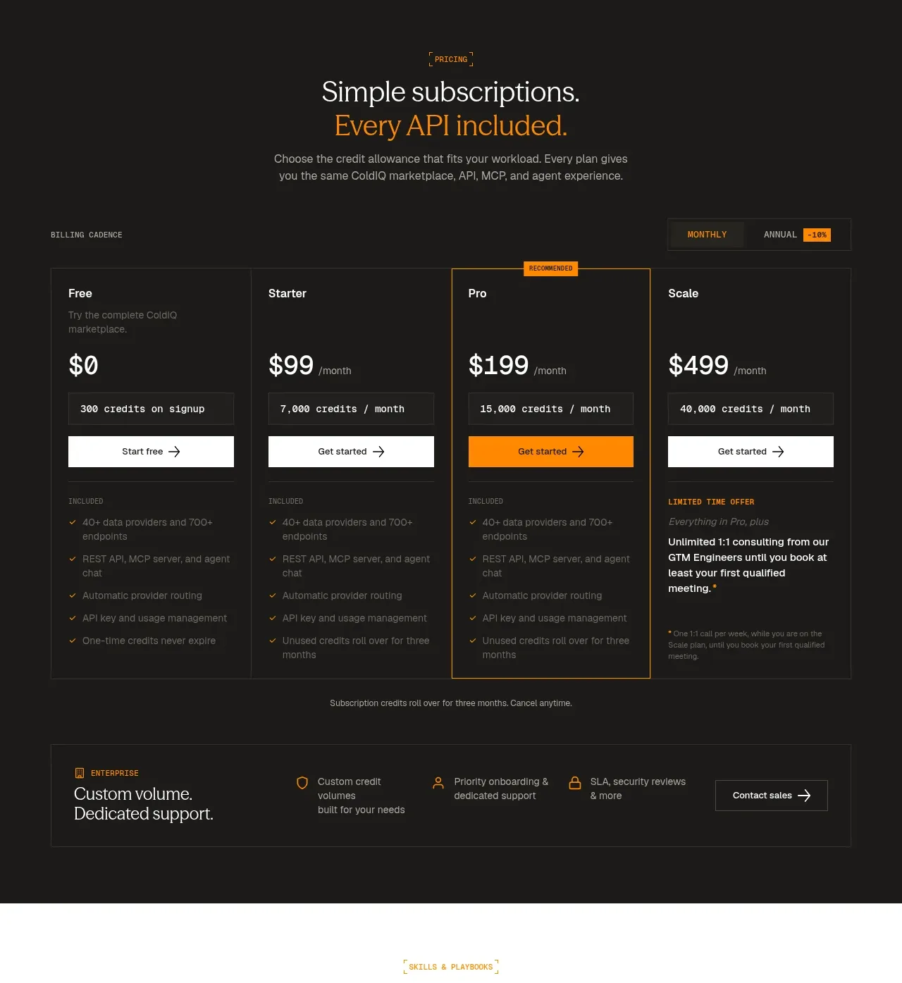
 Four-tier subscription pricing
ColdIQ x Slack · Pricing table
Four-tier subscription pricing
ColdIQ x Slack · Pricing table
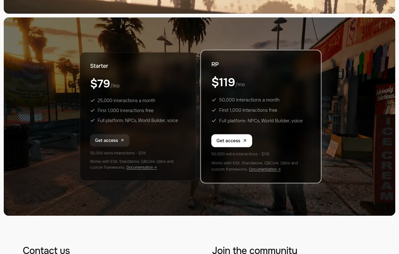
 Two-plan access pricing
Humalike x GTA RP · Pricing table
Two-plan access pricing
Humalike x GTA RP · Pricing table