 kage
kage
fresha.com

Design analysis
A directory section combines a heading, horizontally scrolling location pills, multiple link columns, and a second category-pill row for SEO-oriented browsing.
Prompt preview
## Reference images

Study these alongside the description below: hierarchy, rhythm, spacing, colour. Build for the product you are asked about, using this design language.

- Component: https://kage-design-assets.t3.tigrisfiles.io/components/fresha-com/a0edb032-1288-4233-aedd-1c2eb6d6db18-1789146194-10.webp
- Full page it was cut from: https://kage-design-assets.t3.tigrisfiles.io/screenshots/fresha-com/a0edb032-1288-4233-aedd-1c2eb6d6db18-1789146166919-full.webp
- Component on Kage: https://kage.design/component/fresha-tabs

## Before you start
Ask what the user's product and brand are, then apply the principles below to that context rather than reproducing this reference.

Create a browse-directory section with a heading followed by a horizontally scrollable row of location tabs or pills. Mark the active location with a dark filled pill and keep inactive options white with subtle borders. Below, render four or five evenly spaced link columns with bold city/category headings and compact muted links. Add a second horizontal category-pill row beneath the links. Use 12–14px text, 8–12px gaps, pill radii around 20px, and responsive overflow rather than clipped text. Keep the overall section airy and utility-focused.

Never: use the reference's logo, product name, exact copy, illustrations, imagery, or branding.
More components

 Directory filters and sorting
The Brains · Tabs & steps
Directory filters and sorting
The Brains · Tabs & steps
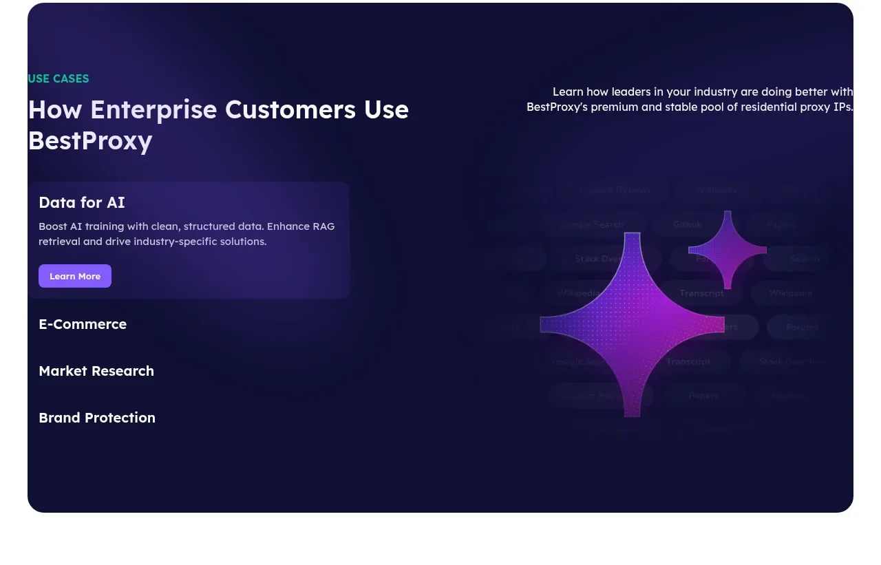
 Enterprise use cases
bestproxy.com · Tabs & steps
Enterprise use cases
bestproxy.com · Tabs & steps
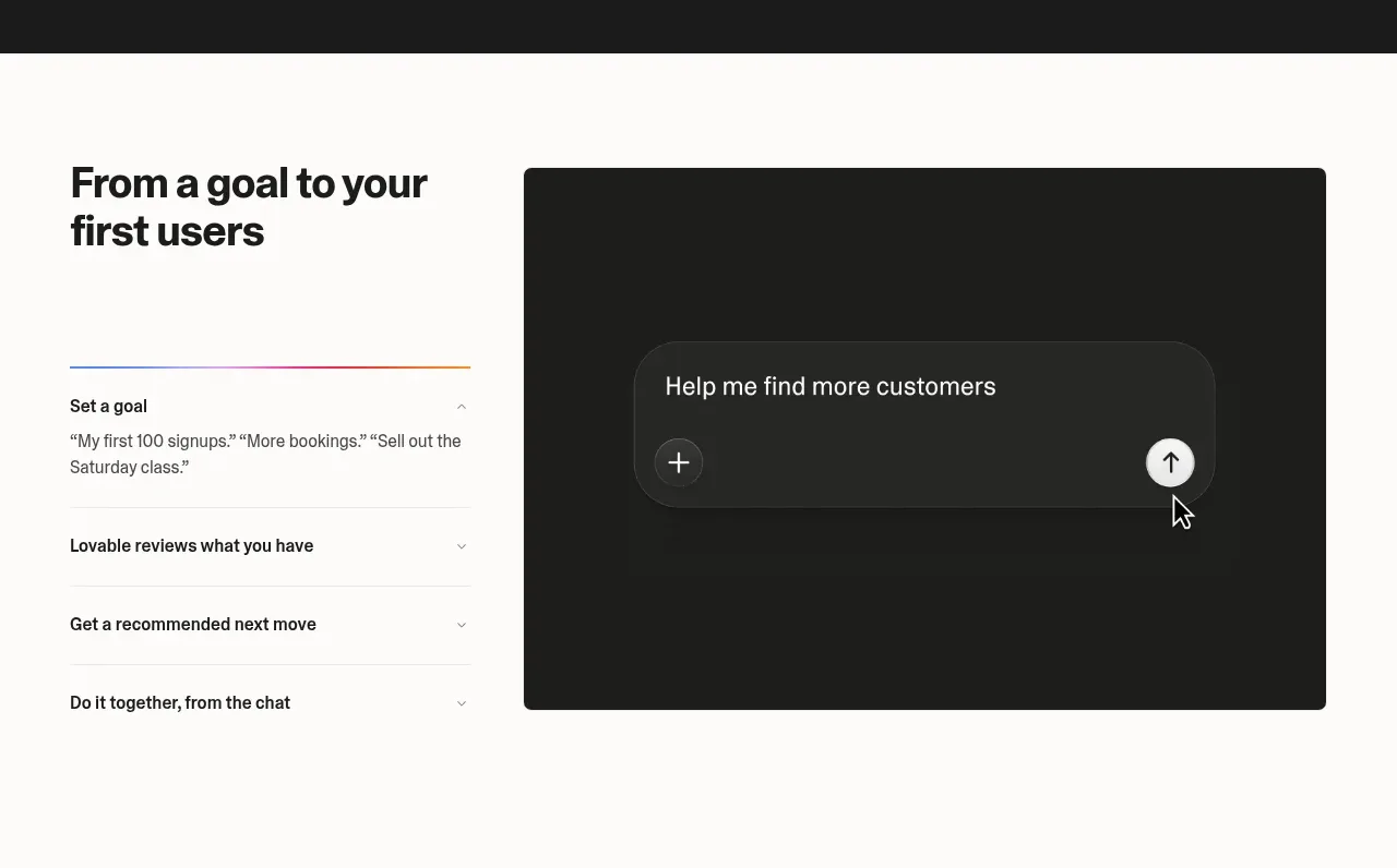
 Goal-to-first-users assistant
Lovable Growth Tools · Tabs & steps
Goal-to-first-users assistant
Lovable Growth Tools · Tabs & steps
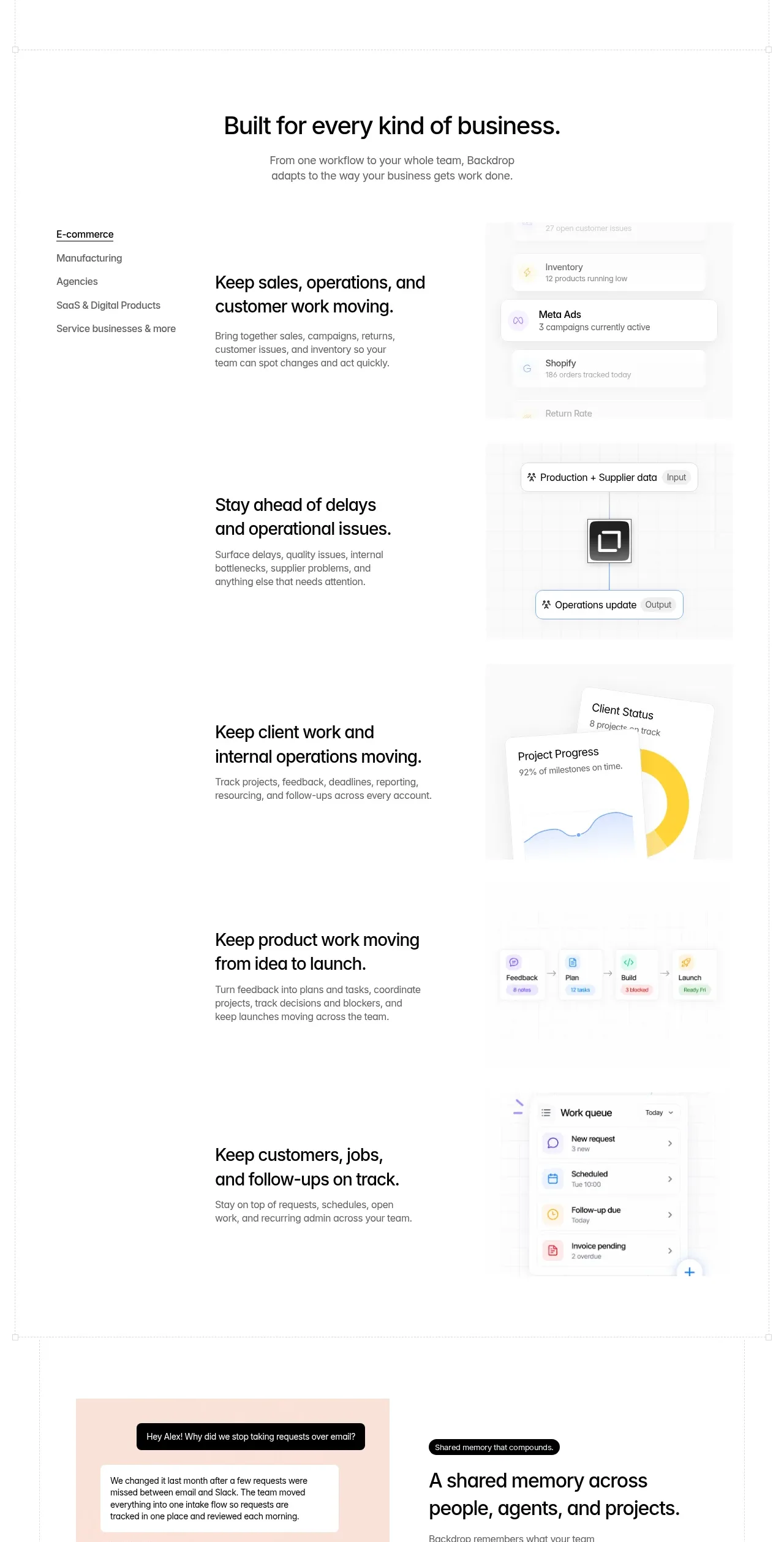
 Business use cases tabs
Backdrop · Tabs & steps
Business use cases tabs
Backdrop · Tabs & steps
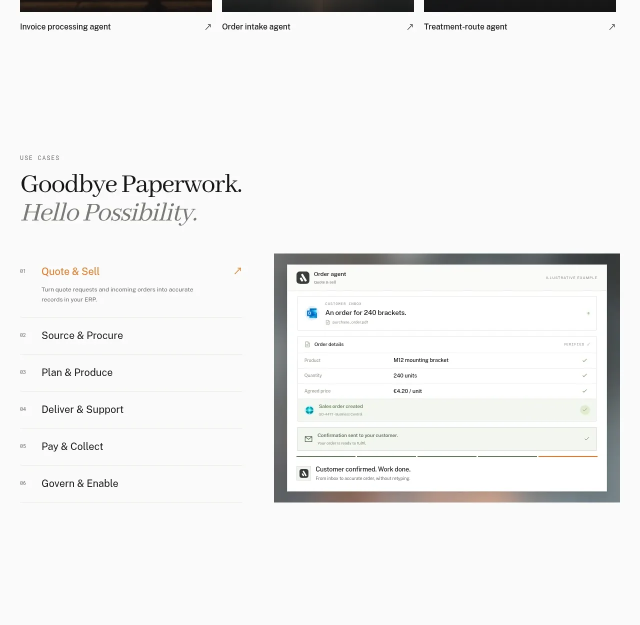
 Workflow stages with product preview
Lleverage · Tabs & steps
Workflow stages with product preview
Lleverage · Tabs & steps
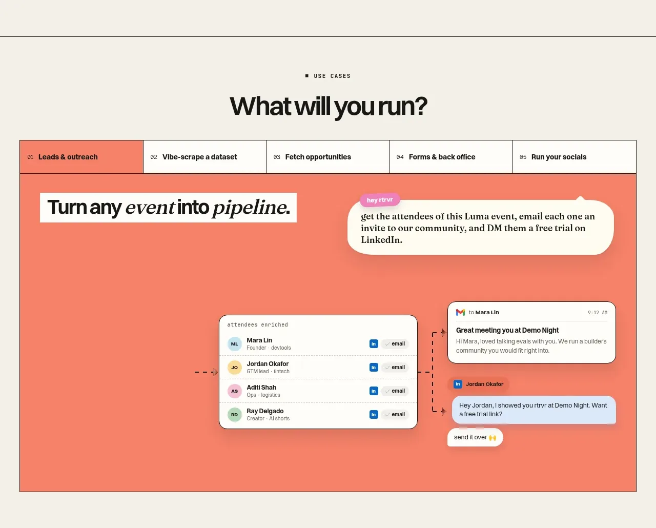
 Use-case selector and interactive showcase
Retriever AI · Tabs & steps
Use-case selector and interactive showcase
Retriever AI · Tabs & steps