kage
kage
geardex.app
Design analysis
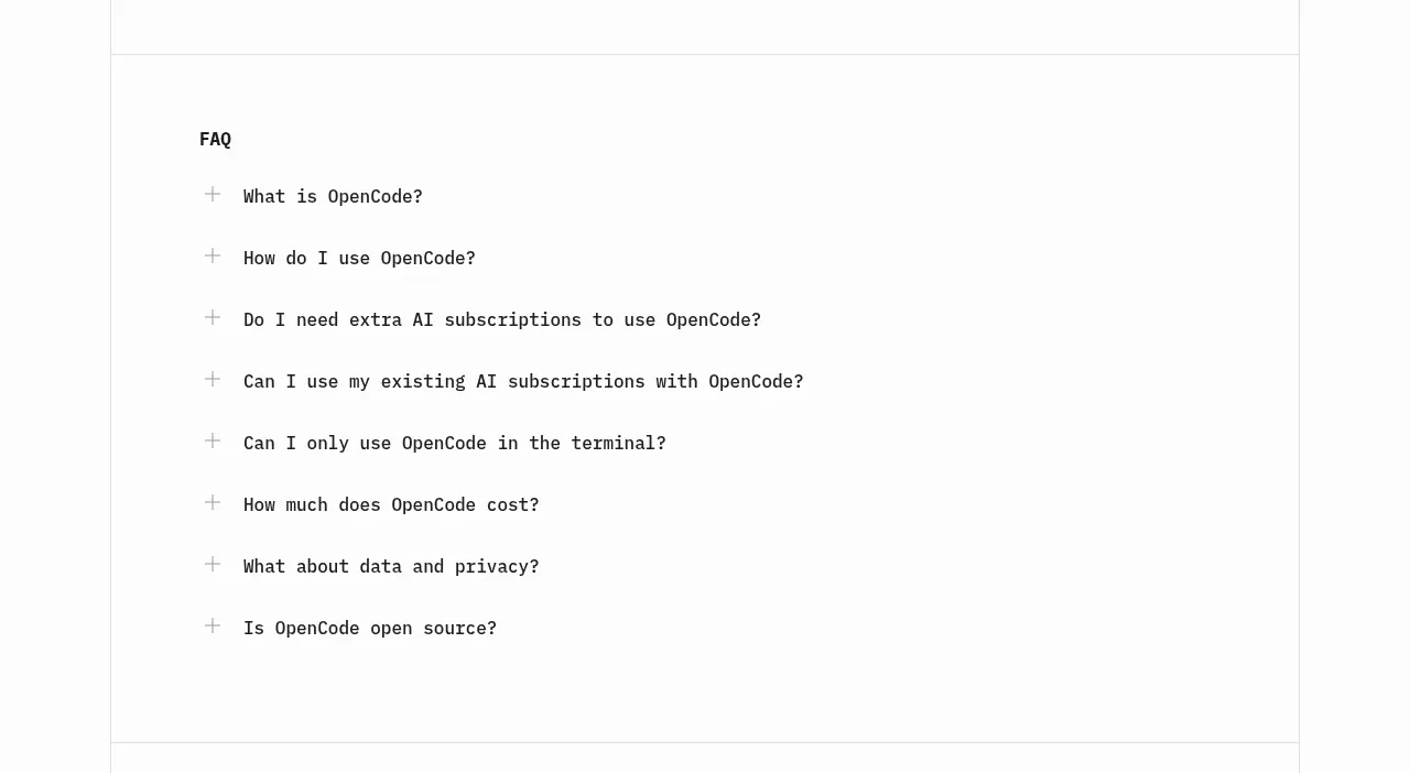
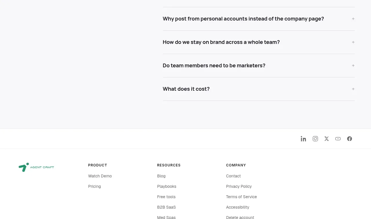
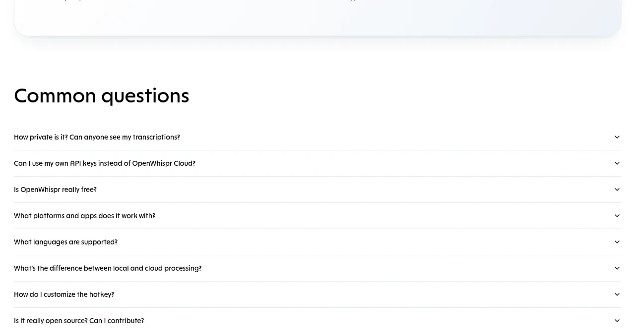
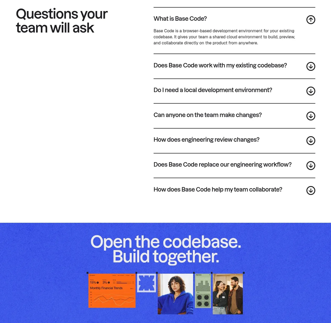
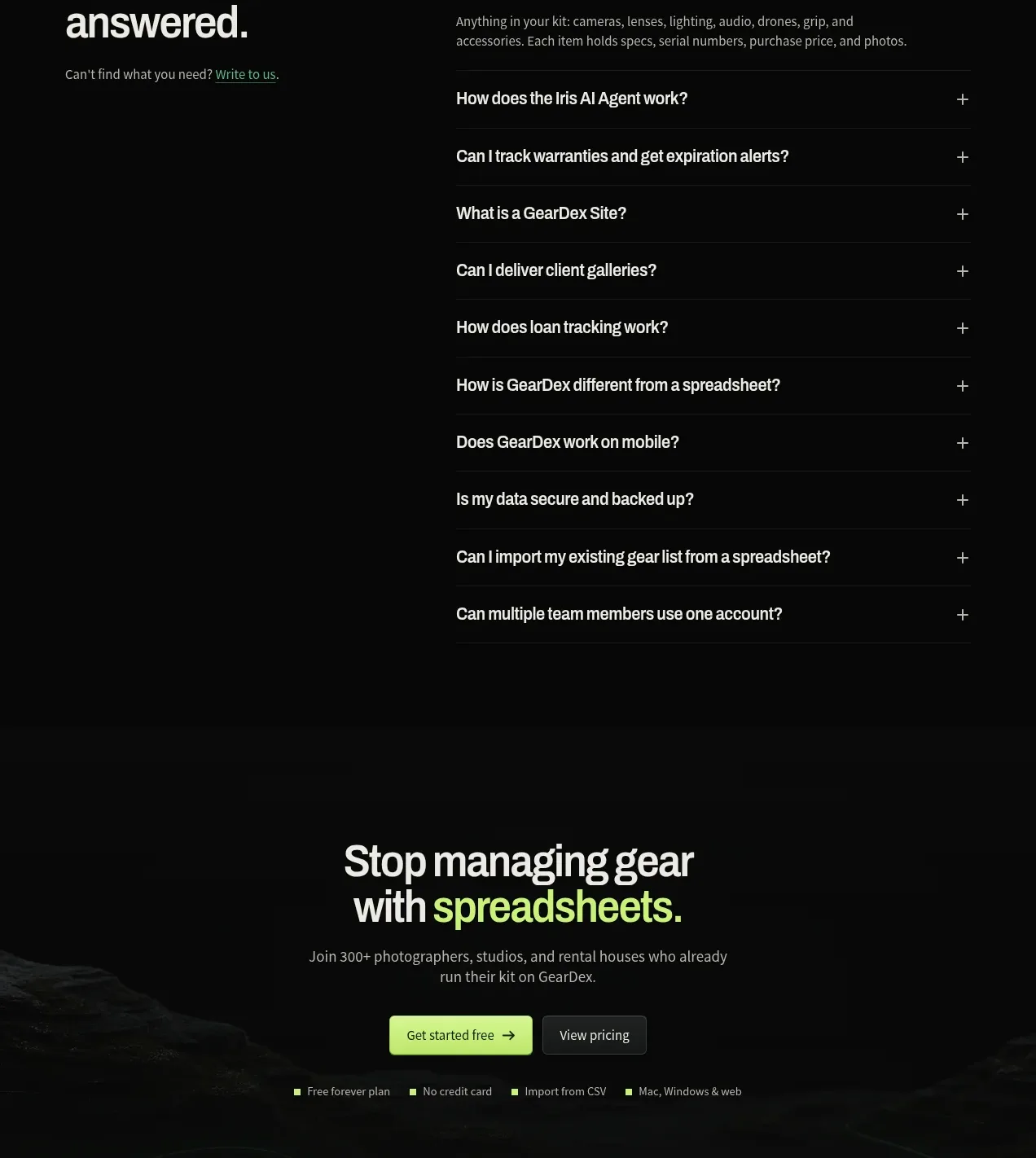
A two-column FAQ places a strong heading and contact hint beside a long, clean accordion list with one expanded answer and plus/close affordances.
Prompt preview
## Reference images

Study these alongside the description below: hierarchy, rhythm, spacing, colour. Build for the product you are asked about, using this design language.

- Component: https://kage-design-assets.t3.tigrisfiles.io/components/geardex-app/fc33b7d0-970c-45a6-93bf-9b94f05b130c-1791941533-10.webp
- Full page it was cut from: https://kage-design-assets.t3.tigrisfiles.io/screenshots/geardex-app/fc33b7d0-970c-45a6-93bf-9b94f05b130c-1791941487258-full.webp
- Component on Kage: https://kage.design/component/geardex-faq

## Before you start
Ask what the user's product, audience, and brand are, then apply these principles to that product rather than reproducing the reference.

Create a FAQ section on a nearly black background. Use a two-column desktop layout: a large left heading with a short invitation to contact support, and a right accordion list. Each question row should have strong readable text, generous vertical padding, a subtle divider, and a plus icon that changes to a close icon when expanded. Show one answer open initially with smaller muted copy. Use #080a09, #e9eee9, #929a94, and subtle #202722 rules; avoid boxed cards so the section feels calm and editorial. Make the layout single-column on mobile and ensure keyboard-accessible disclosure controls.

Never use logos, product names, copy, illustrations, or imagery from the reference.