 kage
kage
geardex.app
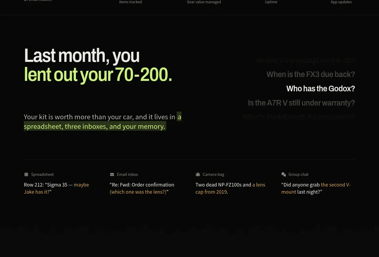
Design analysis
A large problem statement is supported by highlighted phrases and a row of small examples showing where fragmented work currently lives.
Prompt preview
## Reference images

Study these alongside the description below: hierarchy, rhythm, spacing, colour. Build for the product you are asked about, using this design language.

- Component: https://kage-design-assets.t3.tigrisfiles.io/components/geardex-app/fc33b7d0-970c-45a6-93bf-9b94f05b130c-1791941529-2.webp
- Full page it was cut from: https://kage-design-assets.t3.tigrisfiles.io/screenshots/geardex-app/fc33b7d0-970c-45a6-93bf-9b94f05b130c-1791941487258-full.webp
- Component on Kage: https://kage.design/component/geardex-feature-grid

## Before you start
Ask what the user's product, audience, and brand are, then apply these principles to that product rather than reproducing the reference.

Create a dark problem-framing section with a bold left-aligned headline, a short paragraph beneath it, and selective inline highlight treatments in a lime or brand accent. To the right or below, add a quiet row of four evidence cards representing disconnected tools or contexts; each card should have a tiny category label and one or two lines of realistic placeholder content. Use a generous max-width, strong vertical rhythm, 48–64px section padding, and a thin divider above the evidence row. Typography should move from 34–46px headline to 14px supporting copy to 11–12px metadata. Use #080909, #e8eee8, #929b95, and lime #b9ed5a with subtle #171c19 surfaces.

Never use logos, product names, copy, illustrations, or imagery from the reference.
More components
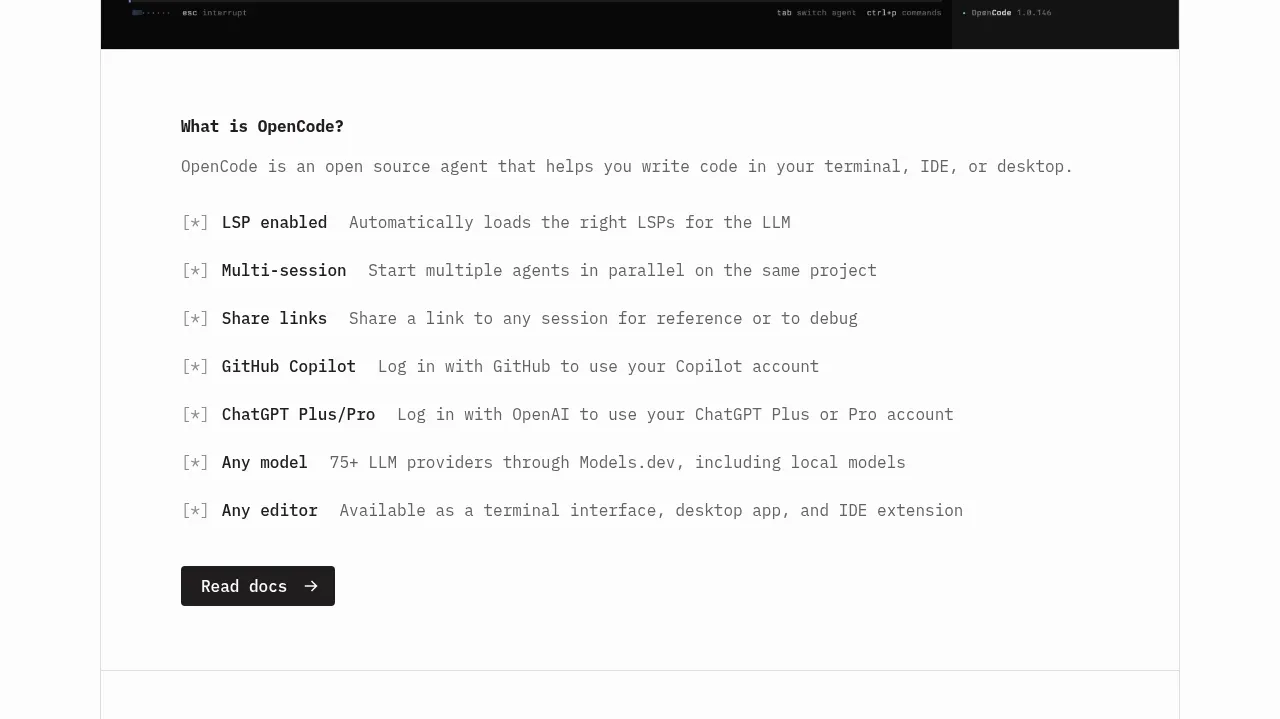
 Core capabilities overview
OpenCode 2.0 · Feature grid
Core capabilities overview
OpenCode 2.0 · Feature grid
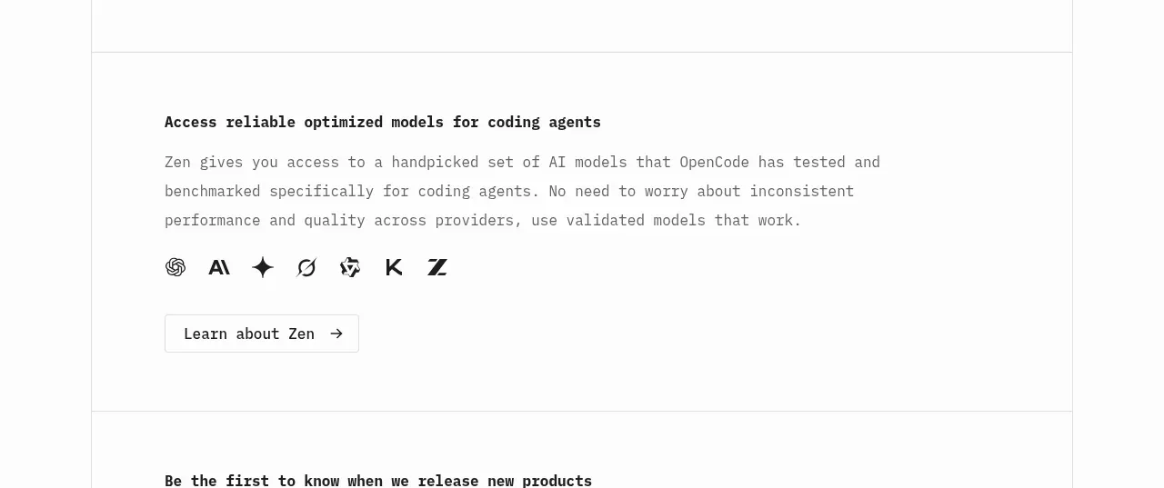 Model access feature block
OpenCode 2.0 · Feature grid
Model access feature block
OpenCode 2.0 · Feature grid

 Mobile capture workflow
Agent Craft · Feature grid
Mobile capture workflow
Agent Craft · Feature grid
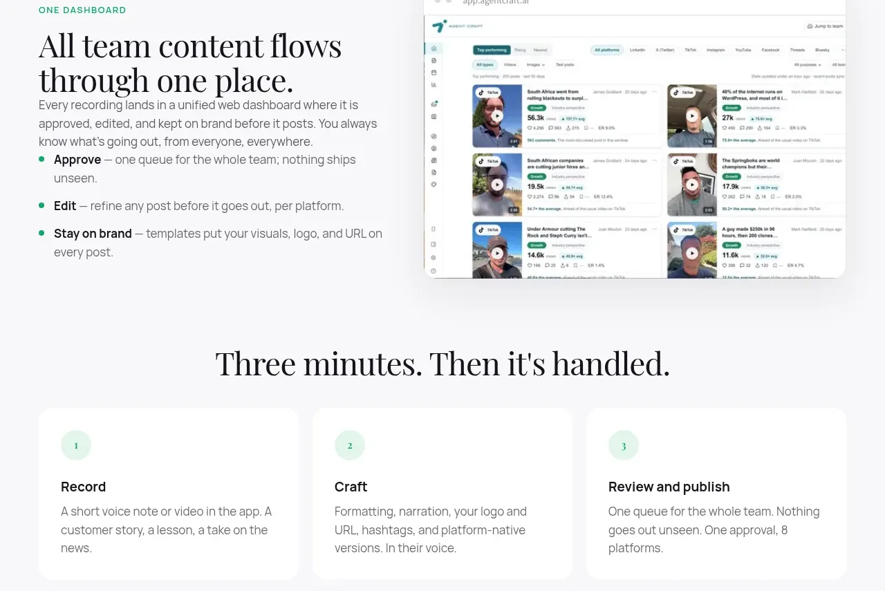 Unified dashboard workflow
Agent Craft · Feature grid
Unified dashboard workflow
Agent Craft · Feature grid
 Three-step operating model
Agent Craft · Feature grid
Three-step operating model
Agent Craft · Feature grid
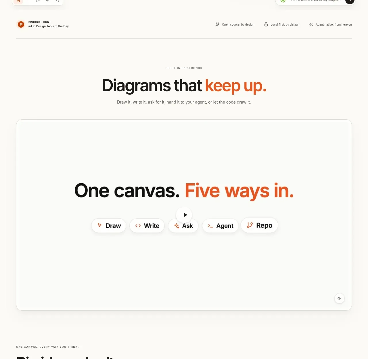
 Canvas modes showcase
OpenFlowKit 2 · Feature grid
Canvas modes showcase
OpenFlowKit 2 · Feature grid