 kage
kage
geardex.app
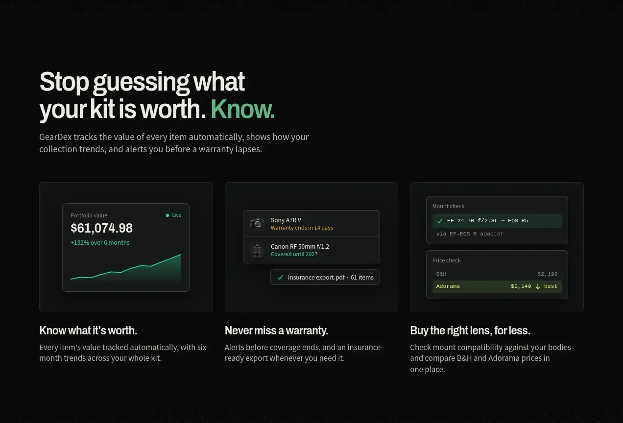
Design analysis
This section explains three concrete benefits through a heading, short introduction, and three dark UI thumbnail cards with captions.
Prompt preview
## Reference images

Study these alongside the description below: hierarchy, rhythm, spacing, colour. Build for the product you are asked about, using this design language.

- Component: https://kage-design-assets.t3.tigrisfiles.io/components/geardex-app/fc33b7d0-970c-45a6-93bf-9b94f05b130c-1791941529-3.webp
- Full page it was cut from: https://kage-design-assets.t3.tigrisfiles.io/screenshots/geardex-app/fc33b7d0-970c-45a6-93bf-9b94f05b130c-1791941487258-full.webp
- Component on Kage: https://kage.design/component/geardex-feature-grid-2

## Before you start
Ask what the user's product, audience, and brand are, then apply these principles to that product rather than reproducing the reference.

Build a three-column feature grid on a near-black background. Start with a left-aligned section heading that combines a problem phrase with a colored benefit word, followed by one concise explanatory sentence. Beneath it place three equal cards: each has a small framed product-interface thumbnail, a bold benefit title, and two lines of supporting copy. Give cards 1px low-contrast borders, 8px radius, muted inset shadows, and consistent image heights. Use a restrained palette of #090b0a, #151a17, #edf1ec, #929a94, emerald #34cf91, and occasional lime highlights. On mobile, stack cards while retaining the same title-thumbnail-copy order.

Never use logos, product names, copy, illustrations, or imagery from the reference.
More components
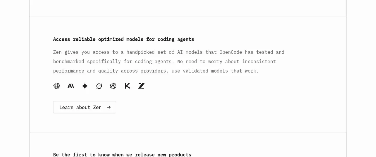
 Model access feature block
OpenCode 2.0 · Feature grid
Model access feature block
OpenCode 2.0 · Feature grid
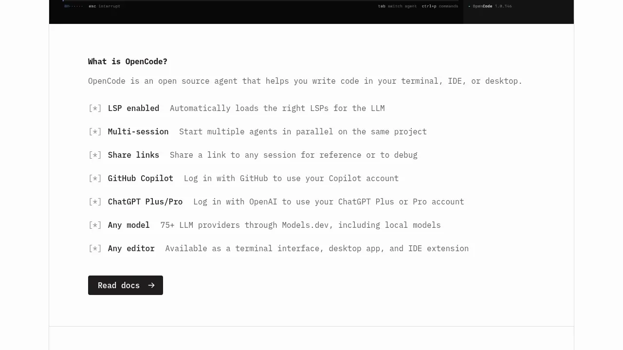 Core capabilities overview
OpenCode 2.0 · Feature grid
Core capabilities overview
OpenCode 2.0 · Feature grid
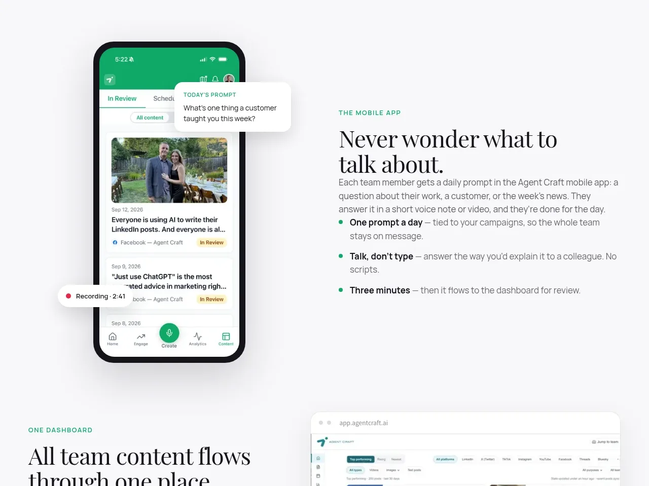
 Mobile capture workflow
Agent Craft · Feature grid
Mobile capture workflow
Agent Craft · Feature grid
 Three-step operating model
Agent Craft · Feature grid
Three-step operating model
Agent Craft · Feature grid
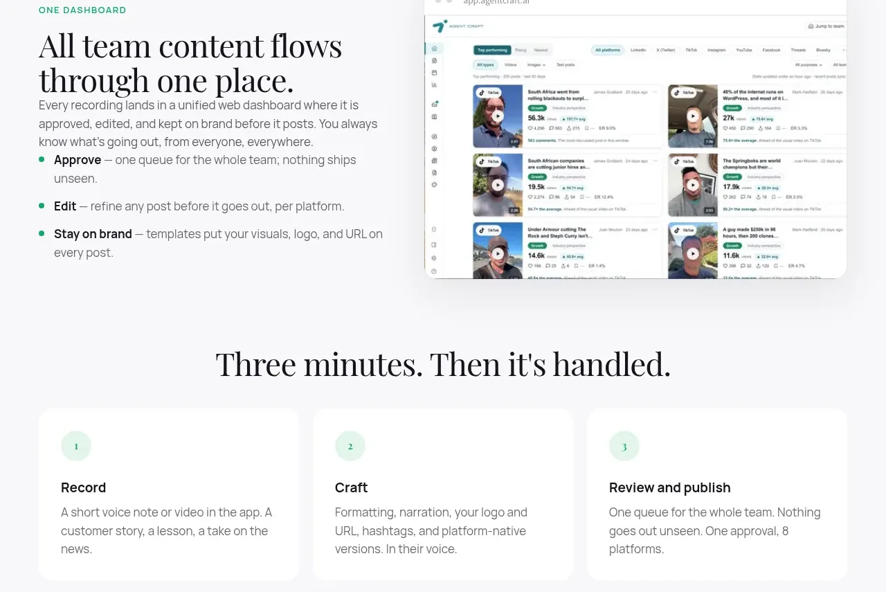 Unified dashboard workflow
Agent Craft · Feature grid
Unified dashboard workflow
Agent Craft · Feature grid
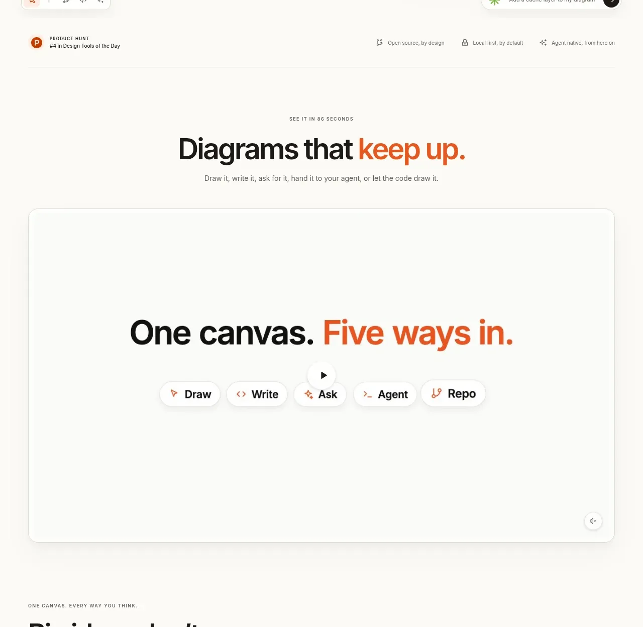
 Canvas modes showcase
OpenFlowKit 2 · Feature grid
Canvas modes showcase
OpenFlowKit 2 · Feature grid