 kage
kage
geardex.app
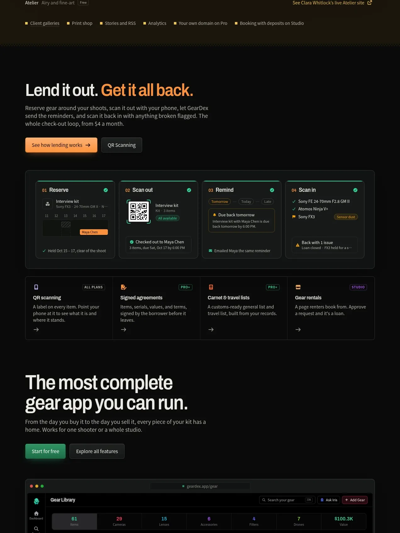
Design analysis
A workflow section explains lending gear through a four-step visual sequence and a second row of supporting capabilities.
Prompt preview
## Reference images

Study these alongside the description below: hierarchy, rhythm, spacing, colour. Build for the product you are asked about, using this design language.

- Component: https://kage-design-assets.t3.tigrisfiles.io/components/geardex-app/fc33b7d0-970c-45a6-93bf-9b94f05b130c-1791941530-5.webp
- Full page it was cut from: https://kage-design-assets.t3.tigrisfiles.io/screenshots/geardex-app/fc33b7d0-970c-45a6-93bf-9b94f05b130c-1791941487258-full.webp
- Component on Kage: https://kage.design/component/geardex-feature-grid-3

## Before you start
Ask what the user's product, audience, and brand are, then apply these principles to that product rather than reproducing the reference.

Build a workflow section with a left-aligned headline, concise explanation, and a two-button control row. The main visual is a four-step horizontal process card: each step has a numbered label, compact UI mock content, a clear status color, and enough internal spacing to feel like a real operational flow. Under it, add four smaller capability cards with icons, titles, descriptions, and arrow affordances. Use a dark #080a09 canvas, raised panels #101512, thin #242c27 borders, emerald #2bd18b, amber #eab84d, and small 10–13px labels. Make the process horizontally scrollable on narrow screens and keep step numbering visually prominent.

Never use logos, product names, copy, illustrations, or imagery from the reference.
More components
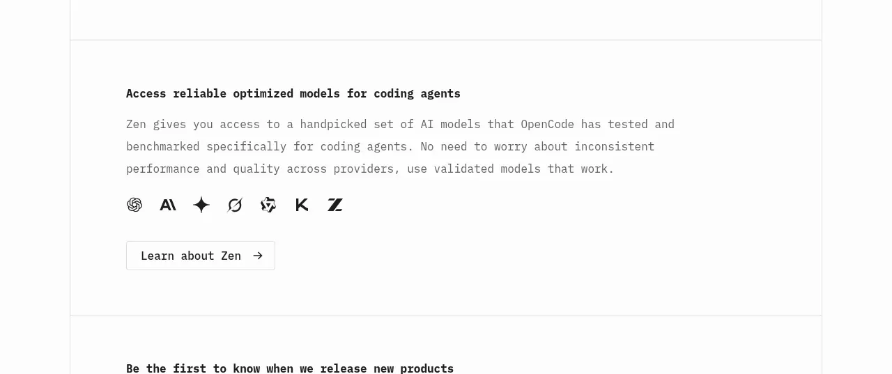
 Model access feature block
OpenCode 2.0 · Feature grid
Model access feature block
OpenCode 2.0 · Feature grid
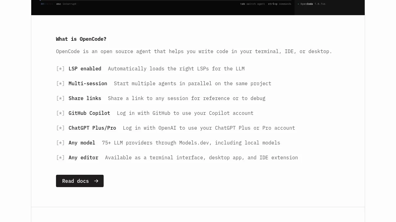 Core capabilities overview
OpenCode 2.0 · Feature grid
Core capabilities overview
OpenCode 2.0 · Feature grid

 Mobile capture workflow
Agent Craft · Feature grid
Mobile capture workflow
Agent Craft · Feature grid
 Three-step operating model
Agent Craft · Feature grid
Three-step operating model
Agent Craft · Feature grid
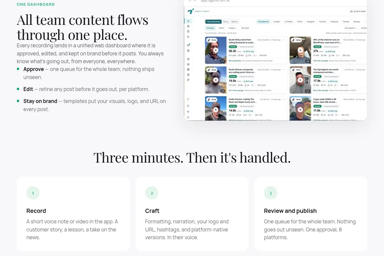 Unified dashboard workflow
Agent Craft · Feature grid
Unified dashboard workflow
Agent Craft · Feature grid
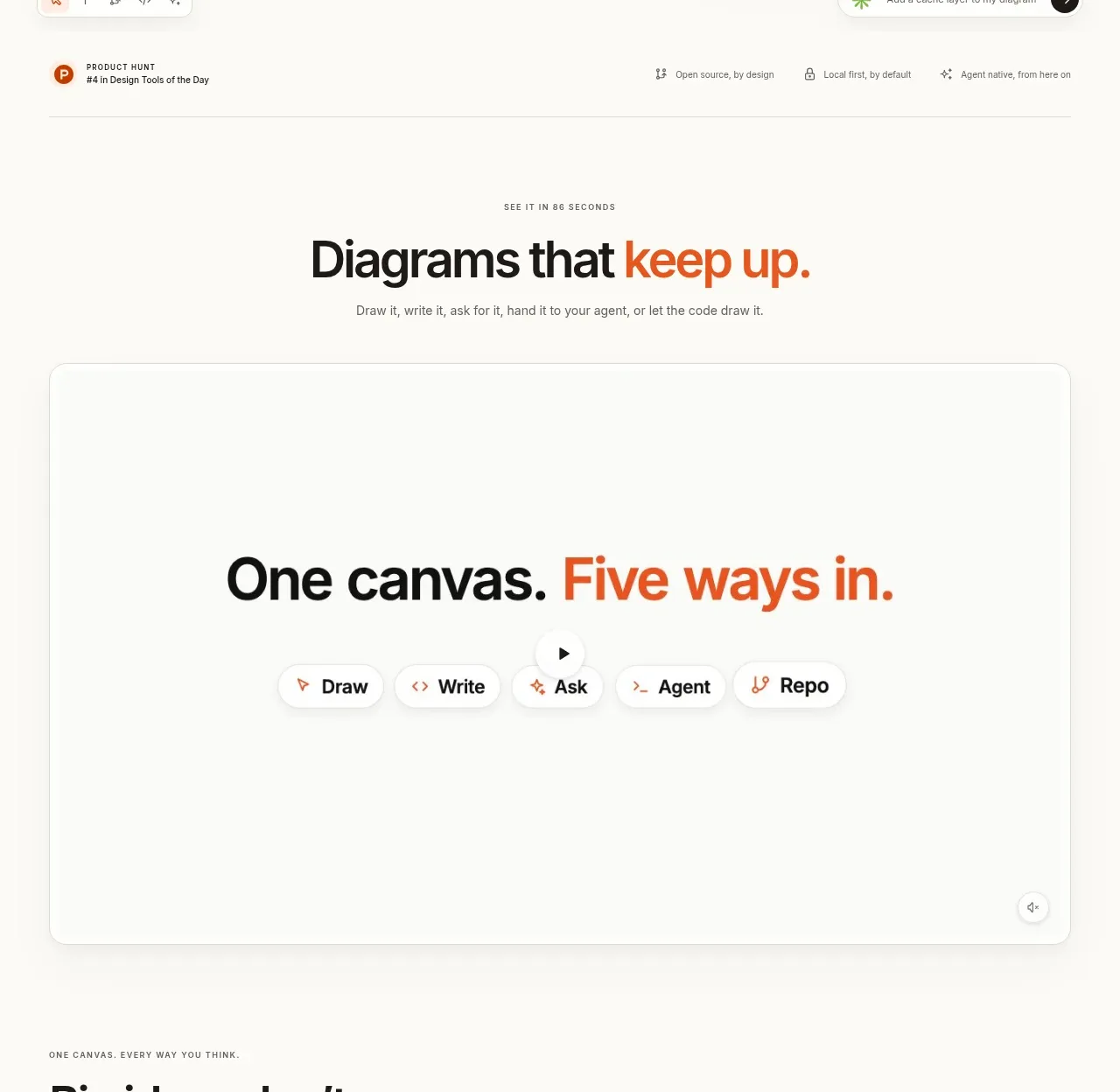
 Canvas modes showcase
OpenFlowKit 2 · Feature grid
Canvas modes showcase
OpenFlowKit 2 · Feature grid