 kage
kage
geardex.app
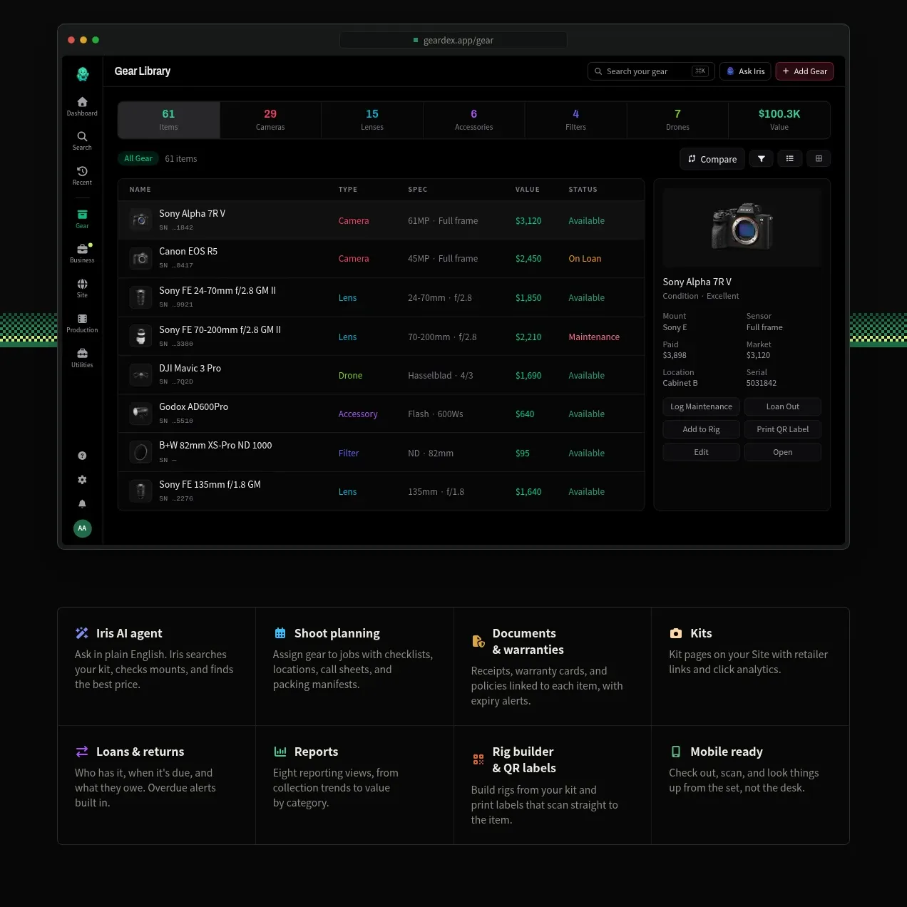
Design analysis
A second product-focused section presents a strong claim, CTAs, a full-width gear-library interface, and an eight-item capability grid.
Prompt preview
## Reference images

Study these alongside the description below: hierarchy, rhythm, spacing, colour. Build for the product you are asked about, using this design language.

- Component: https://kage-design-assets.t3.tigrisfiles.io/components/geardex-app/fc33b7d0-970c-45a6-93bf-9b94f05b130c-1791941531-6.webp
- Full page it was cut from: https://kage-design-assets.t3.tigrisfiles.io/screenshots/geardex-app/fc33b7d0-970c-45a6-93bf-9b94f05b130c-1791941487258-full.webp
- Component on Kage: https://kage.design/component/geardex-feature-grid-4

## Before you start
Ask what the user's product, audience, and brand are, then apply these principles to that product rather than reproducing the reference.

Create a product-tour section with a large left-aligned headline and short supporting copy, followed by primary and secondary actions. Place a wide, realistic application screenshot beneath, framed in a dark browser shell with rounded corners and a faint glow. Follow it with an evenly spaced grid of eight concise capabilities, each using a small colored icon, bold title, and two-line description. Use near-black #080a09, surface #111613, border #252c27, off-white #edf1eb, muted #8d9790, and varied but restrained green, blue, violet, and amber accents. Keep the screenshot readable through strong contrast and ensure the capability grid collapses to two columns then one.

Never use logos, product names, copy, illustrations, or imagery from the reference.
More components
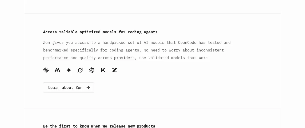
 Model access feature block
OpenCode 2.0 · Feature grid
Model access feature block
OpenCode 2.0 · Feature grid
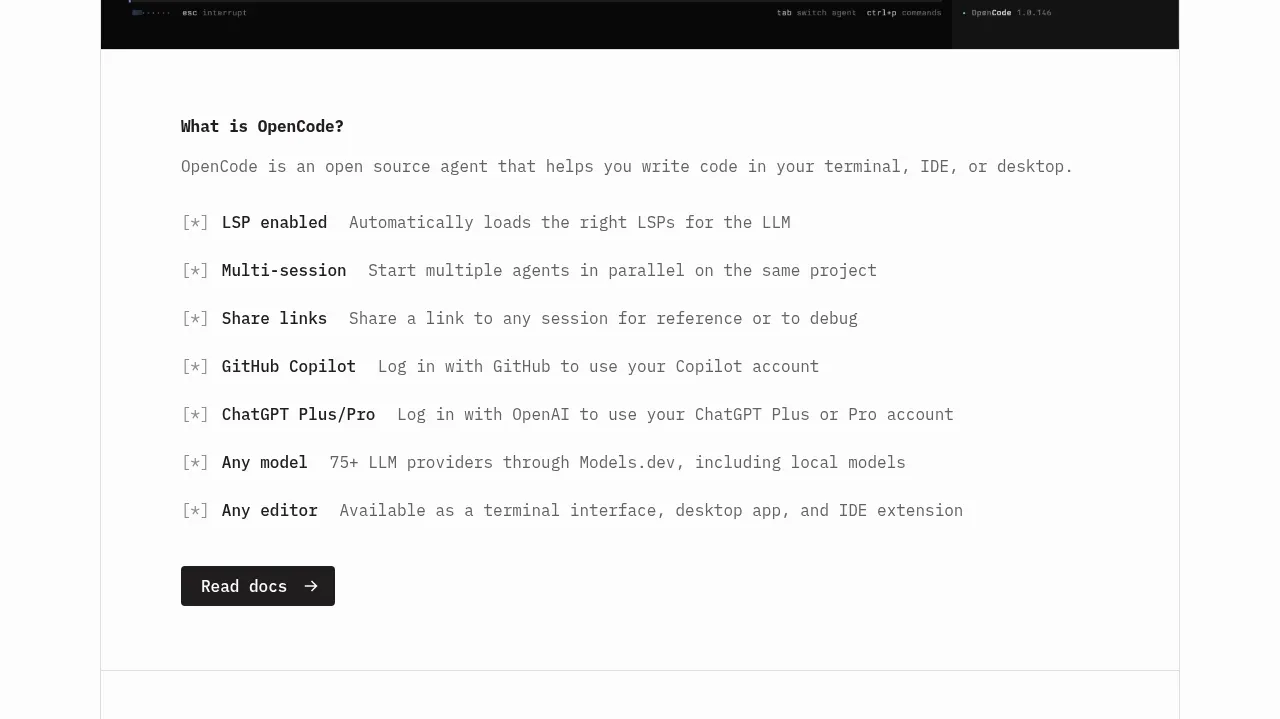 Core capabilities overview
OpenCode 2.0 · Feature grid
Core capabilities overview
OpenCode 2.0 · Feature grid

 Mobile capture workflow
Agent Craft · Feature grid
Mobile capture workflow
Agent Craft · Feature grid
 Three-step operating model
Agent Craft · Feature grid
Three-step operating model
Agent Craft · Feature grid
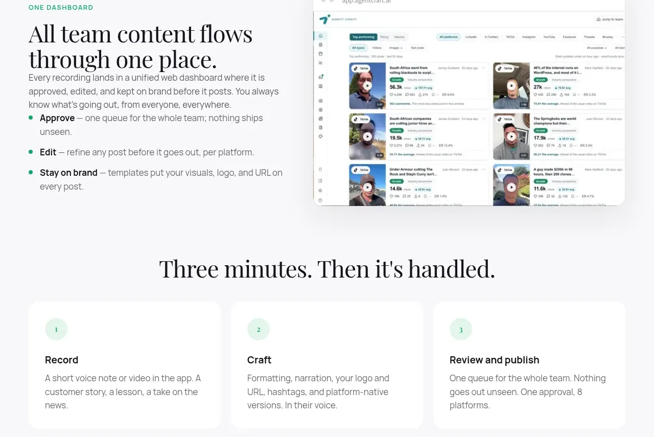 Unified dashboard workflow
Agent Craft · Feature grid
Unified dashboard workflow
Agent Craft · Feature grid
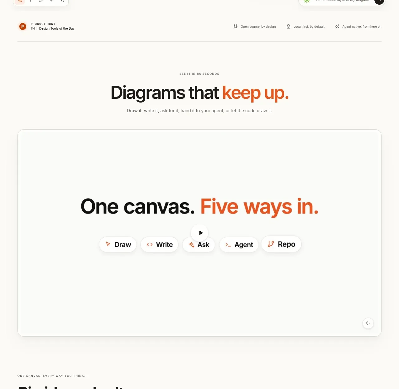
 Canvas modes showcase
OpenFlowKit 2 · Feature grid
Canvas modes showcase
OpenFlowKit 2 · Feature grid