 kage
kage
godaylight.com
Design analysis
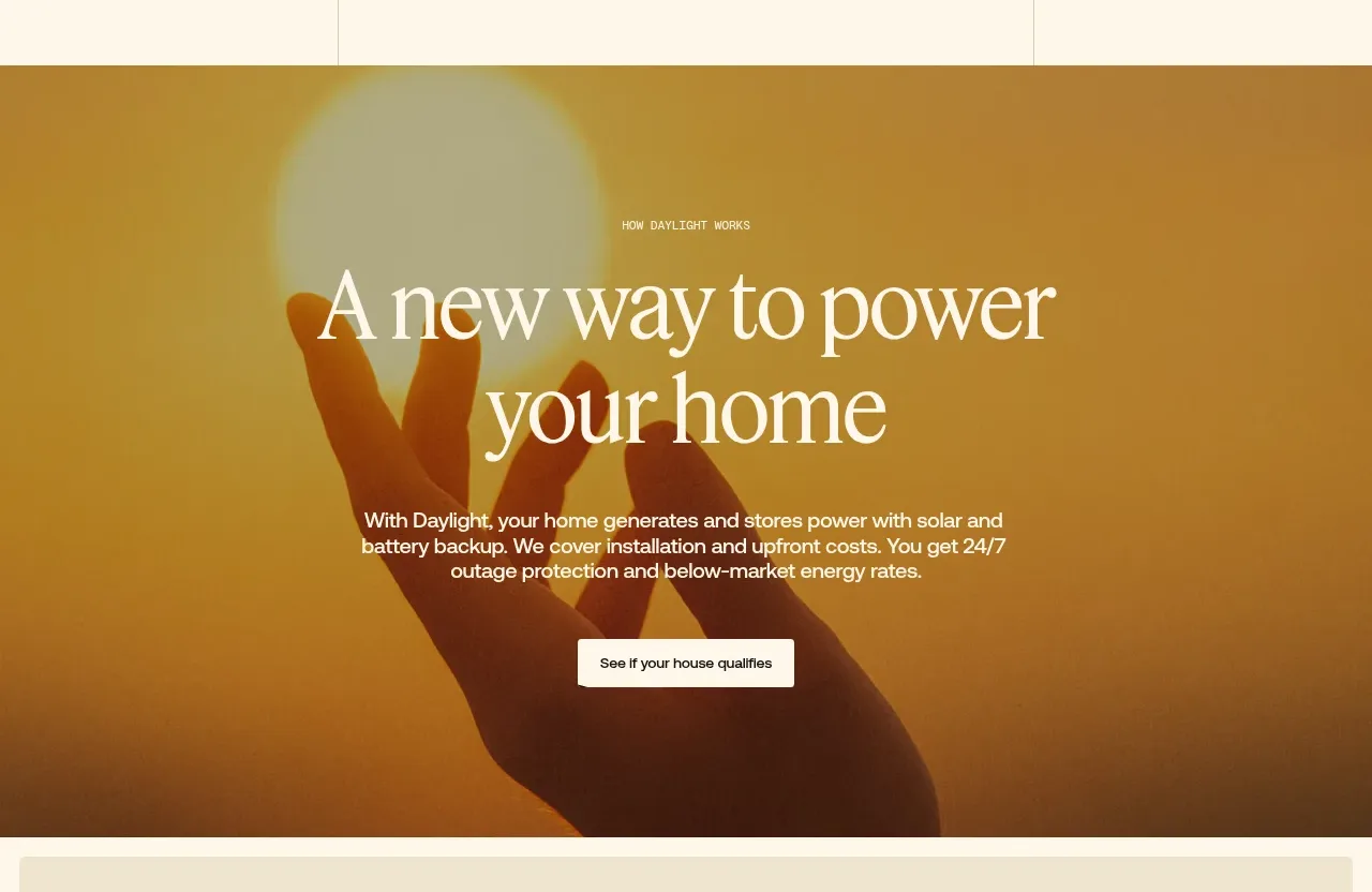
A full-width atmospheric image panel centers a concise mission statement and supporting paragraph, using warm orange grading and a single qualification CTA.
Prompt preview
## Reference images

Study these alongside the description below: hierarchy, rhythm, spacing, colour. Build for the product you are asked about, using this design language.

- Component: https://kage-design-assets.t3.tigrisfiles.io/components/godaylight-com/ca5e907b-4256-46ba-9367-b5c95fdb4894-1791311228-2.webp
- Full page it was cut from: https://kage-design-assets.t3.tigrisfiles.io/screenshots/godaylight-com/ca5e907b-4256-46ba-9367-b5c95fdb4894-1791311174290-full.webp
- Component on Kage: https://kage.design/component/godaylight-hero-2

## Before you start
Ask what the user's product is, who it serves, and what its brand personality and visual identity are. Apply the principles below to that product rather than reproducing this reference.

Create a full-width image-backed mission panel with a warm amber/orange color grade and darkened overlay. Center a tiny uppercase eyebrow, a two-line refined serif headline, a compact paragraph, and one light button. Use a constrained text width around 420–520px so the message reads as a statement, not a paragraph. Use ivory text (#fff9ee), amber/orange atmosphere (#c47d17 / #f45118), 72–120px vertical padding, and a white or near-white CTA with dark text. Keep the image atmospheric and subordinate to the message; ensure readable contrast and responsive type scaling.

Never: use logos, product names, copy, illustrations, or imagery from the reference.
More components
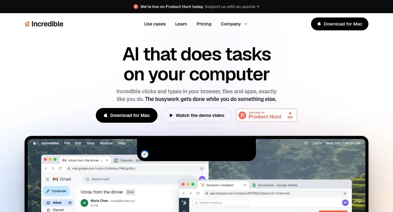
 AI workflow hero
Incredible · Hero
AI workflow hero
Incredible · Hero
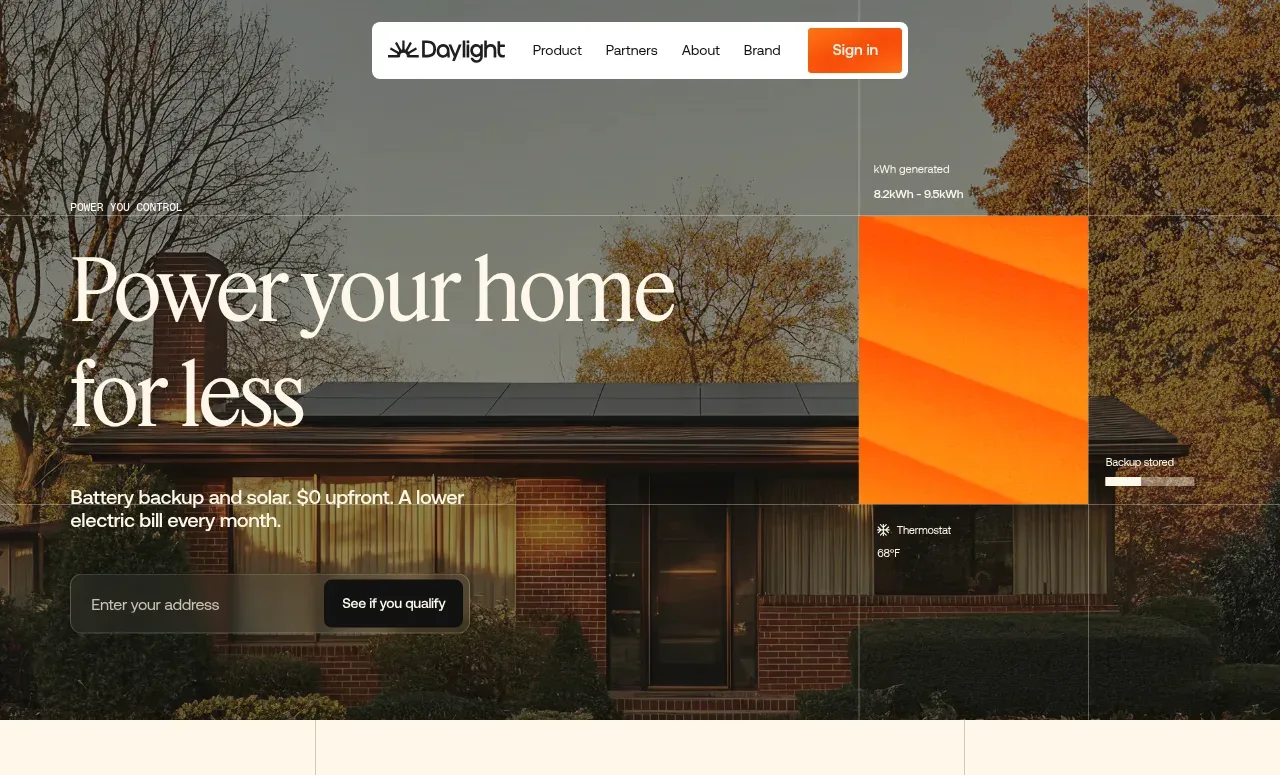
 Photographic power-home hero
godaylight.com · Hero
Photographic power-home hero
godaylight.com · Hero
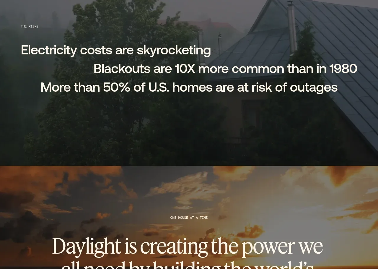 Decentralized energy statement
godaylight.com · Hero
Decentralized energy statement
godaylight.com · Hero
 Grid problem statement
godaylight.com · Hero
Grid problem statement
godaylight.com · Hero
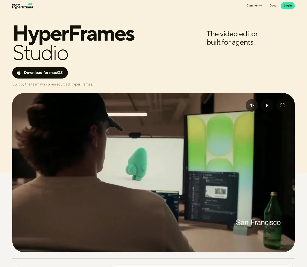
 Product hero with download action and video
HyperFrames Studio (Desktop) · Hero
Product hero with download action and video
HyperFrames Studio (Desktop) · Hero
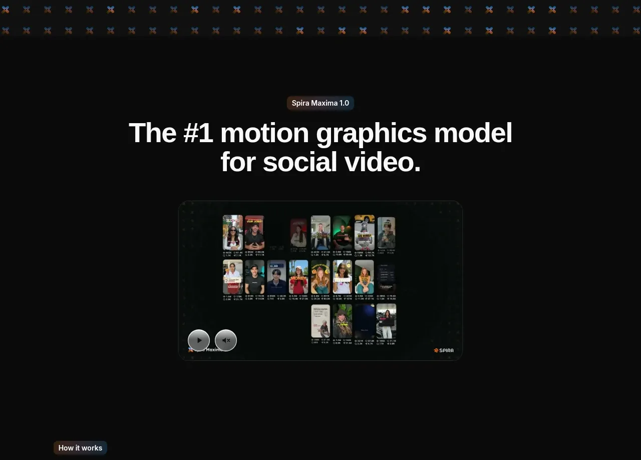
 Model introduction and demo
Spira Maxima · Hero
Model introduction and demo
Spira Maxima · Hero