 kage
kage
flow.google.com
Design analysis
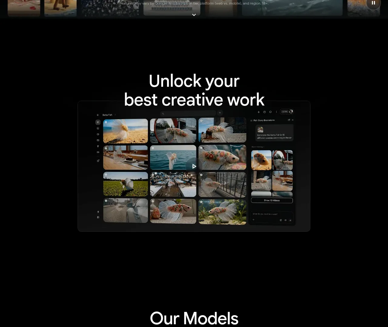
A large centered promise is followed by a single framed product preview with ample black space. The minimal composition makes the interface screenshot feel like the proof point.
Prompt preview
## Reference images

Study these alongside the description below: hierarchy, rhythm, spacing, colour. Build for the product you are asked about, using this design language.

- Component: https://kage-design-assets.t3.tigrisfiles.io/components/google-flow-for-ios-android/998b1c85-b331-490a-bec1-b2413c6fadd0-1790056895-2.webp
- Full page it was cut from: https://kage-design-assets.t3.tigrisfiles.io/screenshots/google-flow-for-ios-android/998b1c85-b331-490a-bec1-b2413c6fadd0-1790056849877-full.webp
- Component on Kage: https://kage.design/component/google-flow-for-ios-android-feature-grid

## Before you start
Ask what outcome the user's product unlocks and what interface or artifact best demonstrates it. Apply these principles to that product and brand.

Build a centered showcase section on a pure black canvas (#000). Use generous vertical whitespace, a two-line white heading in the upper half, and a restrained supporting line if needed. Under it, place one wide rounded product preview or media frame, centered and slightly elevated from the background using a subtle #202020 border and soft shadow. Keep the preview width around 60–72% of the desktop container and make it fluid on mobile. Use 28–40px section padding, 56–72px heading size, and rounded corners around 10–14px. A small play indicator may sit on the preview when the media is interactive.

Never: use logos, product names, copy, illustrations, or imagery from the reference.
More components

 Spend visibility and daily-cost breakdown
Subscrr · Feature grid
Spend visibility and daily-cost breakdown
Subscrr · Feature grid
 Reminders and simple setup flow
Subscrr · Feature grid
Reminders and simple setup flow
Subscrr · Feature grid

 Security and permissions cards
NotchPop · Feature grid
Security and permissions cards
NotchPop · Feature grid
 Focused feature cards
NotchPop · Feature grid
Focused feature cards
NotchPop · Feature grid
 Interactive product demonstration
NotchPop · Feature grid
Interactive product demonstration
NotchPop · Feature grid
 Quiet information cards
NotchPop · Feature grid
Quiet information cards
NotchPop · Feature grid