 kage
kage
flow.google.com
Design analysis
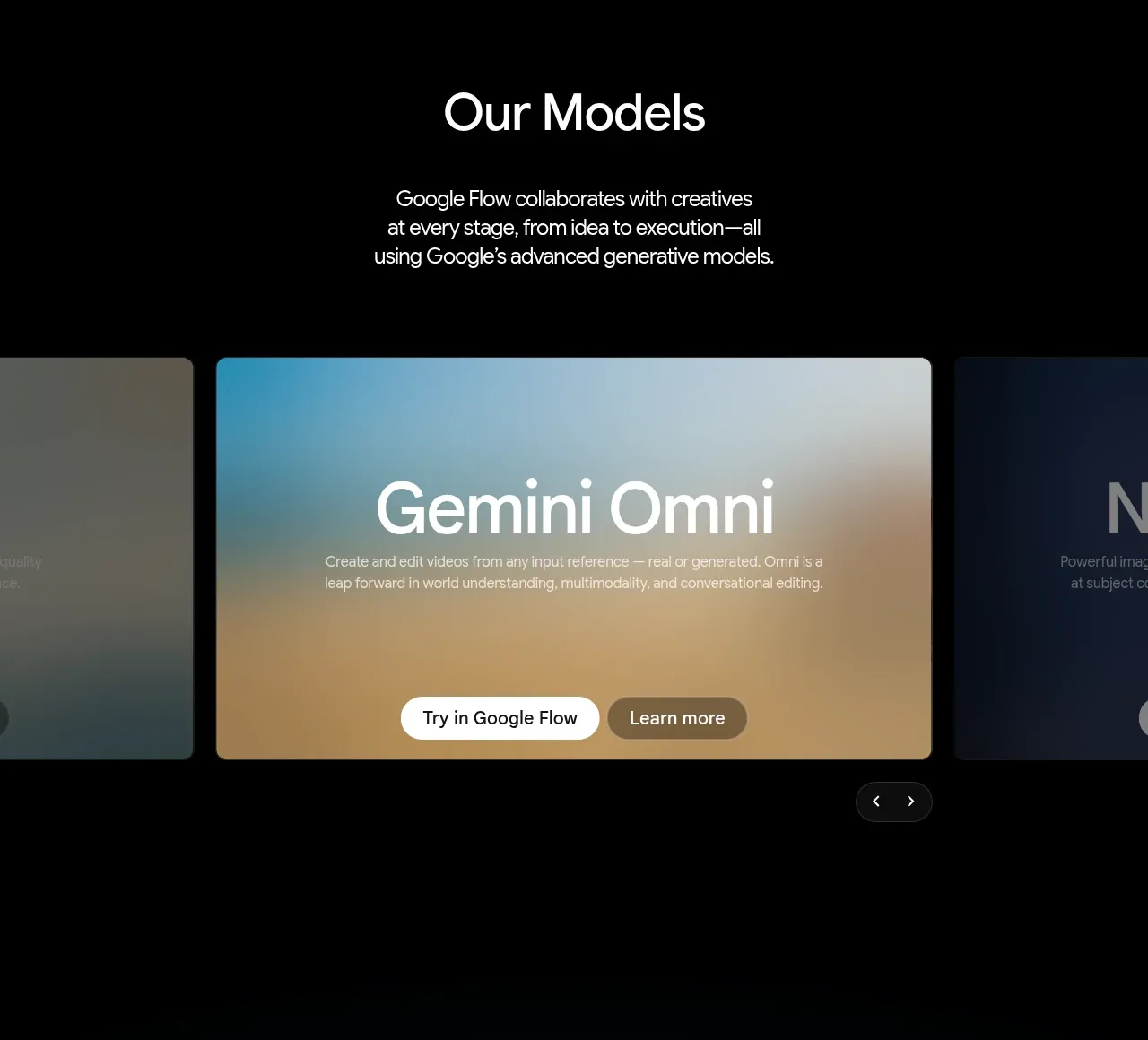
A section heading and explanatory copy introduce a horizontal carousel of large capability cards. The centered active card is emphasized while neighboring cards peek in to signal more content.
Prompt preview
## Reference images

Study these alongside the description below: hierarchy, rhythm, spacing, colour. Build for the product you are asked about, using this design language.

- Component: https://kage-design-assets.t3.tigrisfiles.io/components/google-flow-for-ios-android/998b1c85-b331-490a-bec1-b2413c6fadd0-1790056896-3.webp
- Full page it was cut from: https://kage-design-assets.t3.tigrisfiles.io/screenshots/google-flow-for-ios-android/998b1c85-b331-490a-bec1-b2413c6fadd0-1790056849877-full.webp
- Component on Kage: https://kage.design/component/google-flow-for-ios-android-feature-grid-2

## Before you start
Ask what capabilities or models the user's product offers and which one should be featured first. Use the user's own content and brand system.

Create a dark capability-carousel section with a centered heading and a short paragraph above a horizontally scrolling row of large cards. Use a black background, white heading around 36–48px, muted body text around 15–17px, and a generous gap between intro and cards. Make the active card approximately 62–70% of the container width with 10–14px radius, a thin #292929 border, and a full-bleed tinted visual background with a readable gradient overlay. Let adjacent cards partially enter from both sides. Place short title, description, and two pill actions in the active card, plus compact previous/next controls below or to the side. Support drag, keyboard arrows, and touch swipe.

Never: use logos, product names, copy, illustrations, or imagery from the reference.
More components

 Spend visibility and daily-cost breakdown
Subscrr · Feature grid
Spend visibility and daily-cost breakdown
Subscrr · Feature grid
 Reminders and simple setup flow
Subscrr · Feature grid
Reminders and simple setup flow
Subscrr · Feature grid

 Security and permissions cards
NotchPop · Feature grid
Security and permissions cards
NotchPop · Feature grid
 Focused feature cards
NotchPop · Feature grid
Focused feature cards
NotchPop · Feature grid
 Interactive product demonstration
NotchPop · Feature grid
Interactive product demonstration
NotchPop · Feature grid
 Quiet information cards
NotchPop · Feature grid
Quiet information cards
NotchPop · Feature grid