 kage
kage
flow.google.com
Design analysis
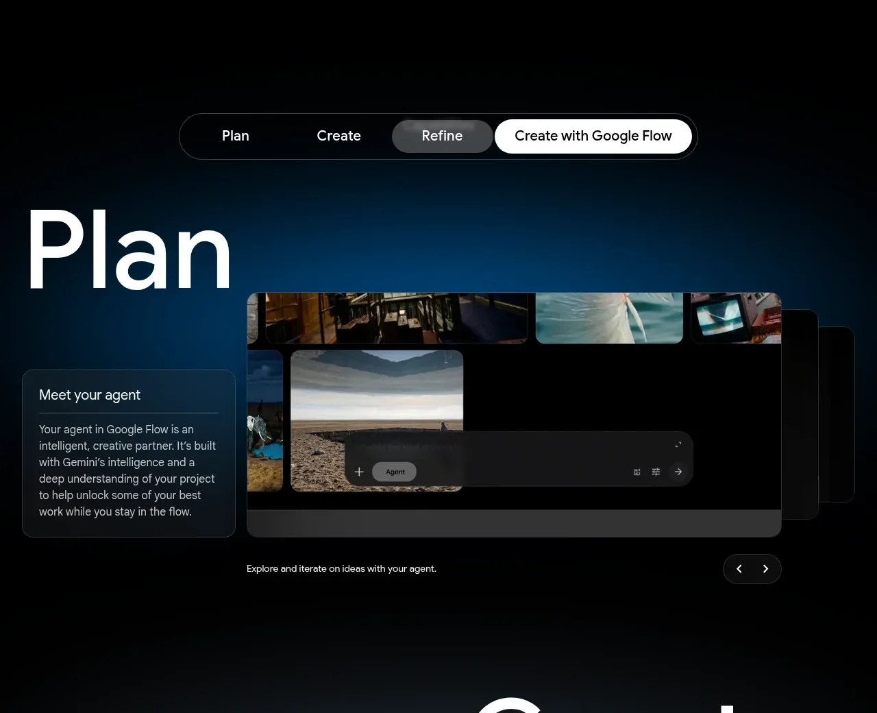
A large stage label, segmented workflow control, side explanation, and interface image explain one step in a creative process. The asymmetry creates editorial scale without losing product clarity.
Prompt preview
## Reference images

Study these alongside the description below: hierarchy, rhythm, spacing, colour. Build for the product you are asked about, using this design language.

- Component: https://kage-design-assets.t3.tigrisfiles.io/components/google-flow-for-ios-android/998b1c85-b331-490a-bec1-b2413c6fadd0-1790056896-4.webp
- Full page it was cut from: https://kage-design-assets.t3.tigrisfiles.io/screenshots/google-flow-for-ios-android/998b1c85-b331-490a-bec1-b2413c6fadd0-1790056849877-full.webp
- Component on Kage: https://kage.design/component/google-flow-for-ios-android-feature-grid-3

## Before you start
Ask what multi-step workflow the user's product supports and which stage matters most to introduce. Translate the pattern into the user's product and brand.

Build an editorial workflow feature section on a near-black background with a faint blue atmospheric glow. Put a compact segmented control near the top center with 3–4 stages; the selected segment should be light gray or white with dark text and a pill radius. Below, use a two-column composition: an oversized stage title on the left/top, a short bordered explanation card offset beside or below it, and a large rounded interface preview occupying the visual focus. Use white display typography around 80–110px for the stage label, body text at 13–15px, dark translucent cards (#15191d) with #30353a borders, and 10–14px radius. Animate the preview and selected tab subtly when changing stages.

Never: use logos, product names, copy, illustrations, or imagery from the reference.
More components

 Spend visibility and daily-cost breakdown
Subscrr · Feature grid
Spend visibility and daily-cost breakdown
Subscrr · Feature grid
 Reminders and simple setup flow
Subscrr · Feature grid
Reminders and simple setup flow
Subscrr · Feature grid

 Security and permissions cards
NotchPop · Feature grid
Security and permissions cards
NotchPop · Feature grid
 Focused feature cards
NotchPop · Feature grid
Focused feature cards
NotchPop · Feature grid
 Interactive product demonstration
NotchPop · Feature grid
Interactive product demonstration
NotchPop · Feature grid
 Quiet information cards
NotchPop · Feature grid
Quiet information cards
NotchPop · Feature grid