 kage
kage
flow.google.com
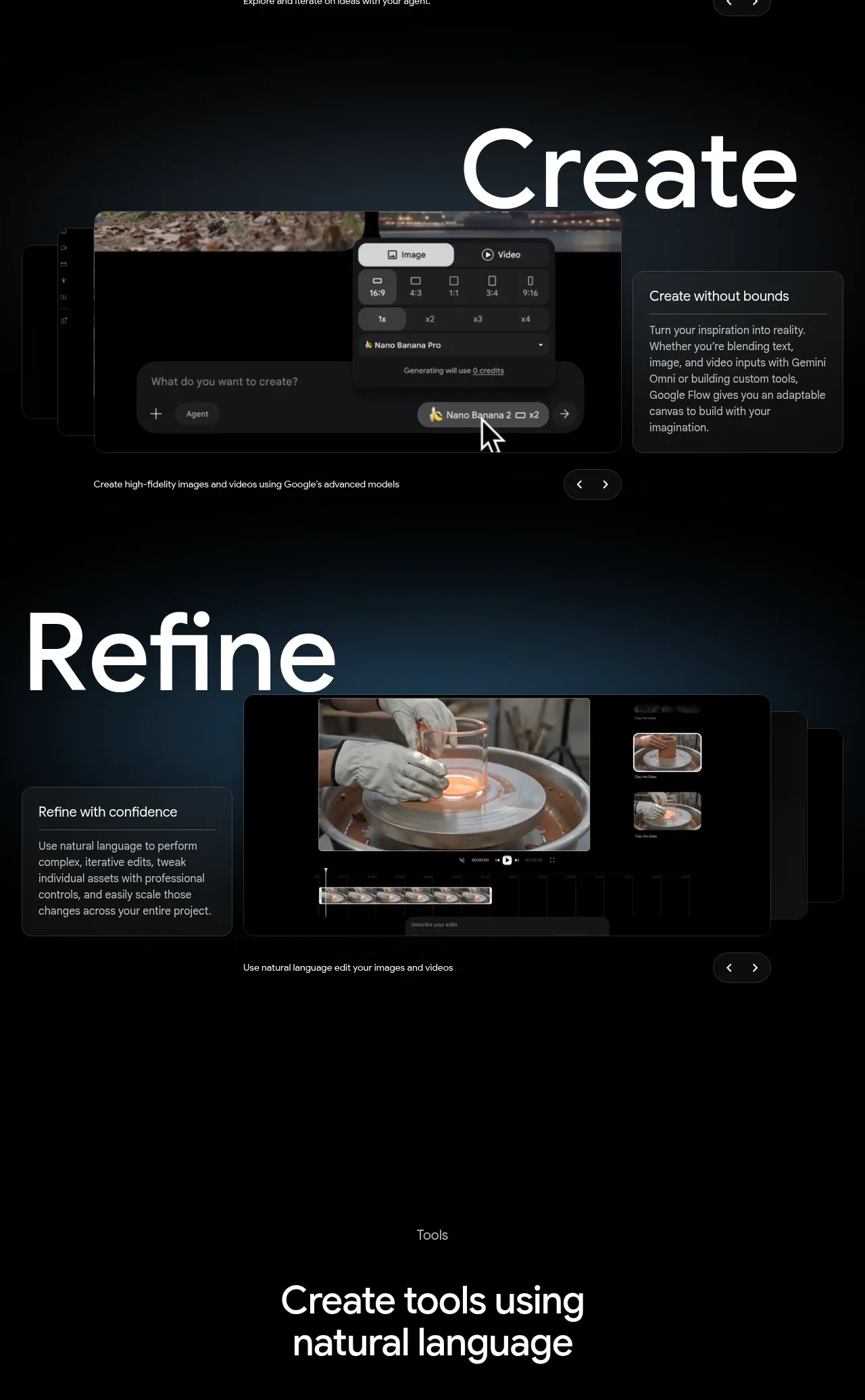
Design analysis
Two consecutive visual workflow panels demonstrate creation and refinement using oversized labels, interface previews, contextual explanation cards, and navigation controls. Repetition gives the product story a clear rhythm.
Prompt preview
## Reference images

Study these alongside the description below: hierarchy, rhythm, spacing, colour. Build for the product you are asked about, using this design language.

- Component: https://kage-design-assets.t3.tigrisfiles.io/components/google-flow-for-ios-android/998b1c85-b331-490a-bec1-b2413c6fadd0-1790056896-5.webp
- Full page it was cut from: https://kage-design-assets.t3.tigrisfiles.io/screenshots/google-flow-for-ios-android/998b1c85-b331-490a-bec1-b2413c6fadd0-1790056849877-full.webp
- Component on Kage: https://kage.design/component/google-flow-for-ios-android-feature-grid-4

## Before you start
Ask what creation and editing actions define the user's product and what evidence will make each step understandable. Apply the same visual language to the user's brand.

Create two vertically stacked workflow panels for a creative application: one for making a first result and one for refining it. Give each panel its own dark atmospheric stage, a huge white verb-like heading aligned toward an outer edge, a large framed UI preview, and a compact explanatory card on the opposite side. Keep each panel around 480–560px tall with 72–120px vertical spacing, 80–120px display type, black backgrounds with subtle navy/teal glows, and previews in near-black frames with 1px gray borders and 10px corners. Add a one-line caption and small previous/next controls beneath each preview. On mobile, stack heading, preview, and explanation while retaining the same hierarchy.

Never: use logos, product names, copy, illustrations, or imagery from the reference.
More components

 Spend visibility and daily-cost breakdown
Subscrr · Feature grid
Spend visibility and daily-cost breakdown
Subscrr · Feature grid
 Reminders and simple setup flow
Subscrr · Feature grid
Reminders and simple setup flow
Subscrr · Feature grid

 Security and permissions cards
NotchPop · Feature grid
Security and permissions cards
NotchPop · Feature grid
 Focused feature cards
NotchPop · Feature grid
Focused feature cards
NotchPop · Feature grid
 Interactive product demonstration
NotchPop · Feature grid
Interactive product demonstration
NotchPop · Feature grid
 Quiet information cards
NotchPop · Feature grid
Quiet information cards
NotchPop · Feature grid