 kage
kage
flow.google.com
Design analysis
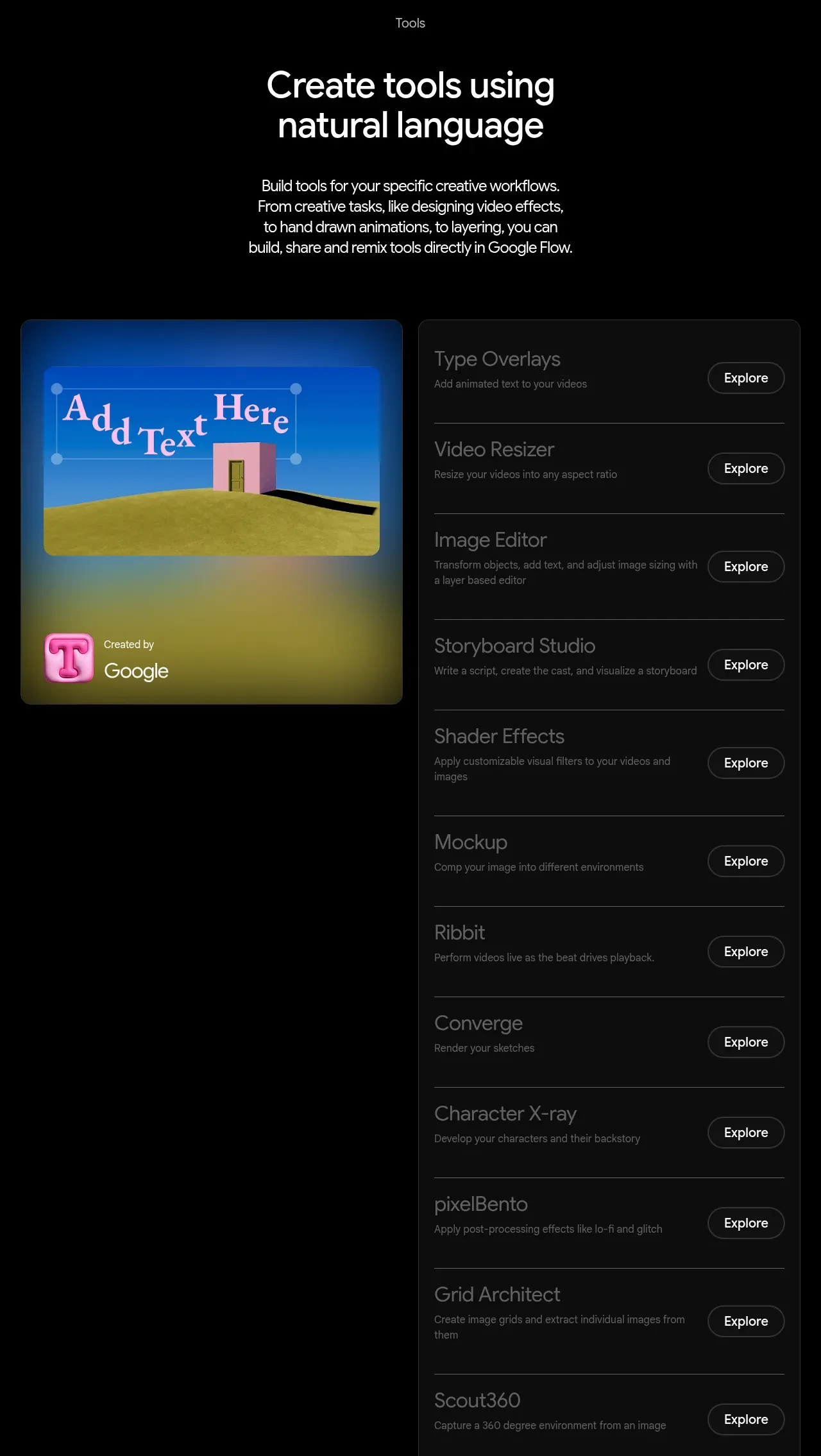
An introductory heading leads into a split layout with a colorful featured tool tile and a tall dark directory of tool rows. Repeated dividers and compact Explore controls make a long catalog scannable.
Prompt preview
## Reference images

Study these alongside the description below: hierarchy, rhythm, spacing, colour. Build for the product you are asked about, using this design language.

- Component: https://kage-design-assets.t3.tigrisfiles.io/components/google-flow-for-ios-android/998b1c85-b331-490a-bec1-b2413c6fadd0-1790056897-6.webp
- Full page it was cut from: https://kage-design-assets.t3.tigrisfiles.io/screenshots/google-flow-for-ios-android/998b1c85-b331-490a-bec1-b2413c6fadd0-1790056849877-full.webp
- Component on Kage: https://kage.design/component/google-flow-for-ios-android-feature-grid-5

## Before you start
Ask what tools, extensions, or templates the user's product offers and what should be featured. Use the user's product taxonomy and brand colors.

Build a tools directory section with a centered eyebrow, two-line heading, and concise explanatory paragraph above a split content area. On desktop, use a 48–52% featured visual card on the left and a 48–52% tall list panel on the right; stack them on mobile. Use black page background, a rounded featured card with a saturated but product-appropriate gradient, and a charcoal list panel (#101010) with #292929 border and 10–12px radius. Each list row should have a tool name, one muted description line, a right-aligned outlined pill labeled with a generic action, and a 1px divider. Use 14–18px row titles, 11–13px descriptions, 24–32px internal padding, and a final full-width outline CTA below the list. Keep the list keyboard accessible and allow hover highlighting.

Never: use logos, product names, copy, illustrations, or imagery from the reference.
More components

 Spend visibility and daily-cost breakdown
Subscrr · Feature grid
Spend visibility and daily-cost breakdown
Subscrr · Feature grid
 Reminders and simple setup flow
Subscrr · Feature grid
Reminders and simple setup flow
Subscrr · Feature grid

 Security and permissions cards
NotchPop · Feature grid
Security and permissions cards
NotchPop · Feature grid
 Focused feature cards
NotchPop · Feature grid
Focused feature cards
NotchPop · Feature grid
 Interactive product demonstration
NotchPop · Feature grid
Interactive product demonstration
NotchPop · Feature grid
 Quiet information cards
NotchPop · Feature grid
Quiet information cards
NotchPop · Feature grid