kage
kage
flow.google.com

Design analysis
A collage-like visual field sits behind an oversized product title, concise value proposition, and centered pill CTA. The dark overlay preserves legibility while the media creates immediate energy.
Prompt preview
## Reference images

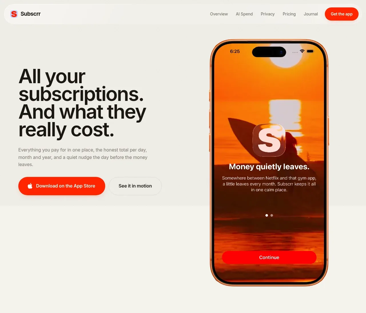
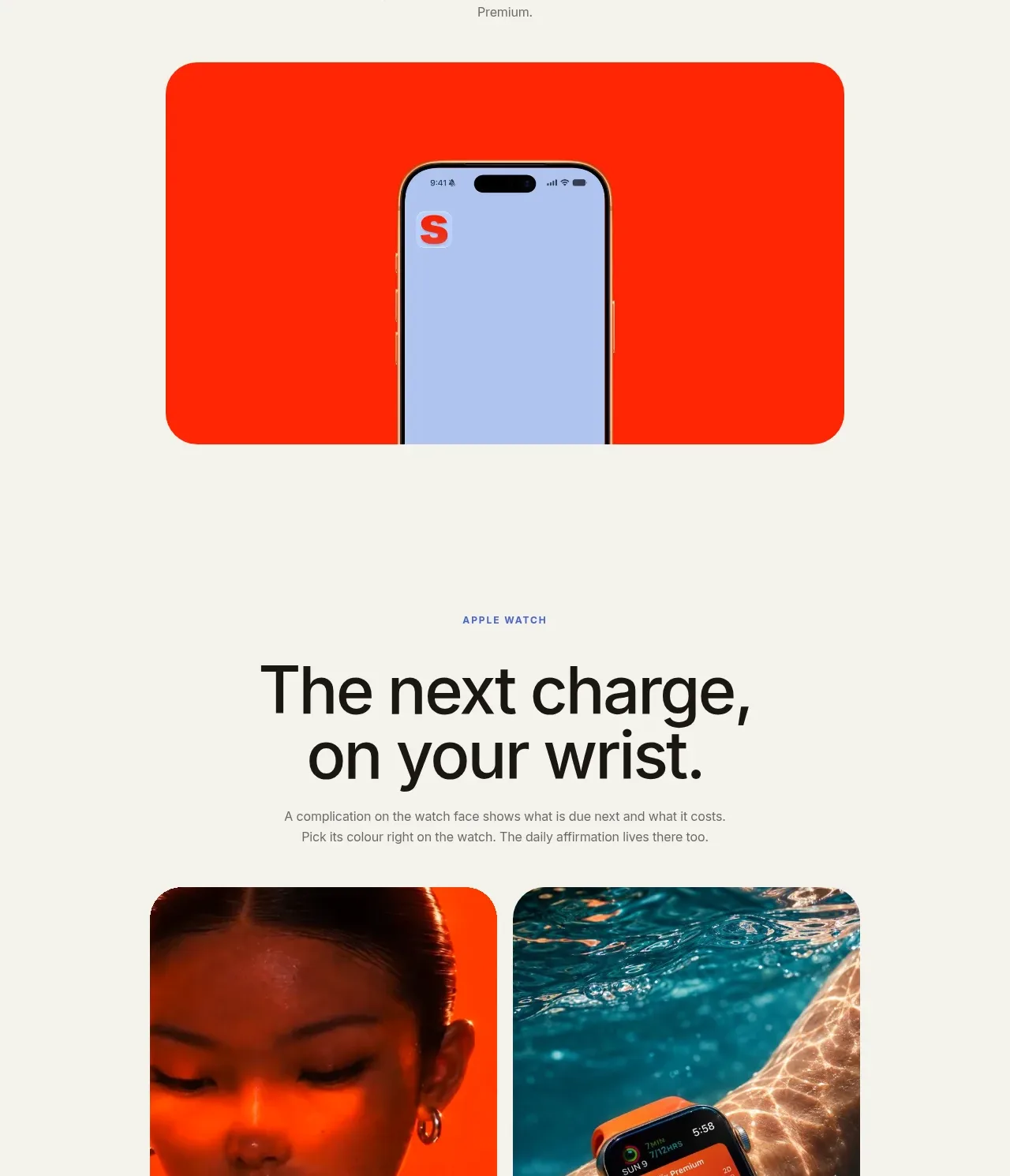
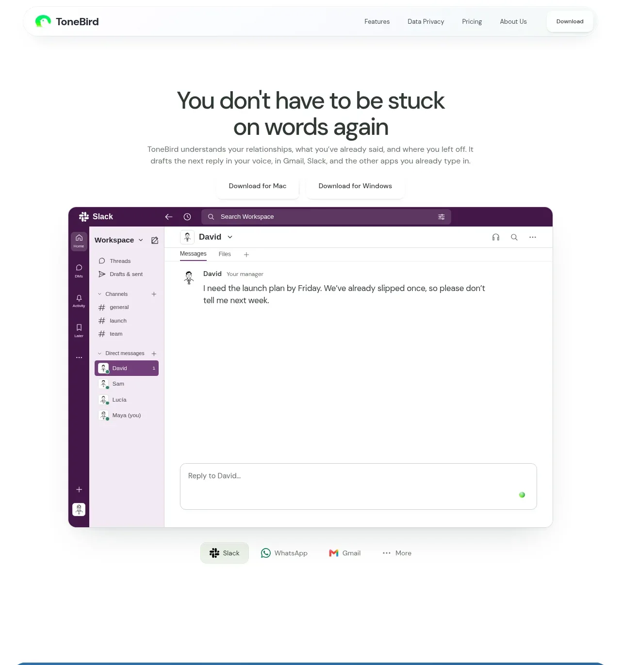
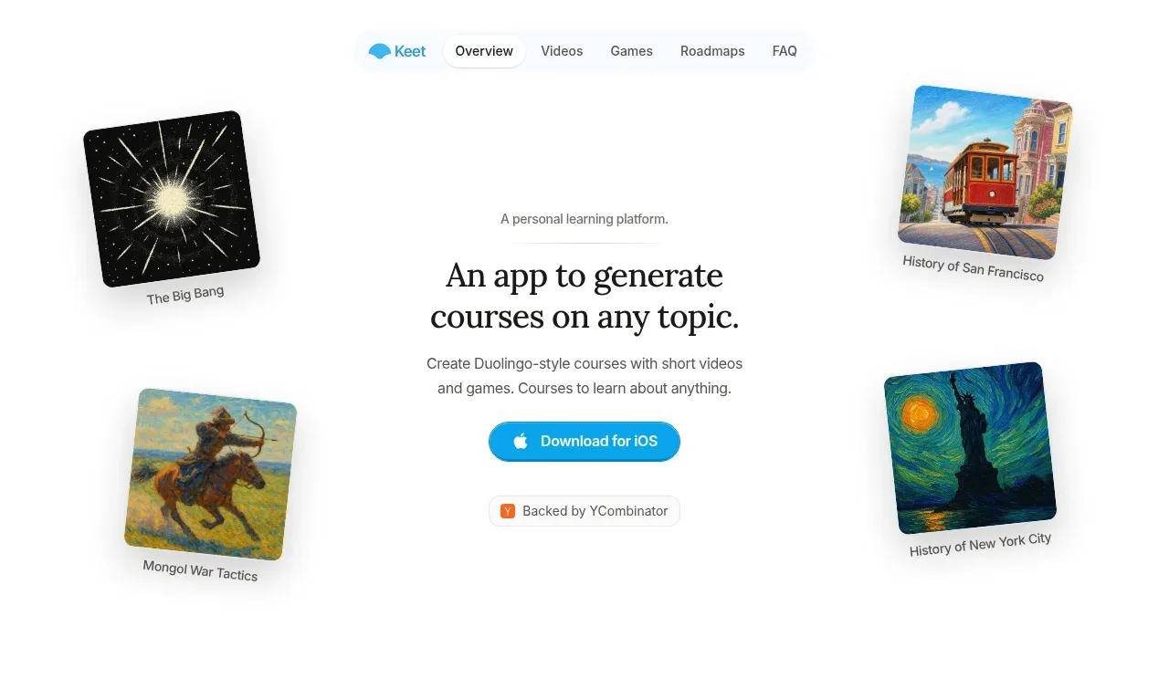
Study these alongside the description below: hierarchy, rhythm, spacing, colour. Build for the product you are asked about, using this design language.

- Component: https://kage-design-assets.t3.tigrisfiles.io/components/google-flow-for-ios-android/998b1c85-b331-490a-bec1-b2413c6fadd0-1790056895-1.webp
- Full page it was cut from: https://kage-design-assets.t3.tigrisfiles.io/screenshots/google-flow-for-ios-android/998b1c85-b331-490a-bec1-b2413c6fadd0-1790056849877-full.webp
- Component on Kage: https://kage.design/component/google-flow-for-ios-android-hero

## Before you start
Ask what the user's product is, what its strongest first impression should be, and what brand style it uses. Adapt these rules to that product.

Create a full-bleed hero directly below the navigation with a dark cinematic media collage or looping video background. Use a 16:9-ish visual stage spanning the viewport, with a soft black gradient and high contrast overlay. Place a very large white headline near the upper third, a two-line supporting statement centered beneath it, and one high-contrast pill CTA below. Use a modern sans-serif, oversized headline scaling from roughly 56px on desktop to 36px on mobile, line-height near 0.95, and supporting text around 15px. Keep the CTA white (#fff) with black text, 40–48px tall, 999px radius, and subtle hover lift. Add unobtrusive playback or scroll affordances only if the product uses motion.

Never: use logos, product names, copy, illustrations, or imagery from the reference.