 kage
kage
flow.google.com
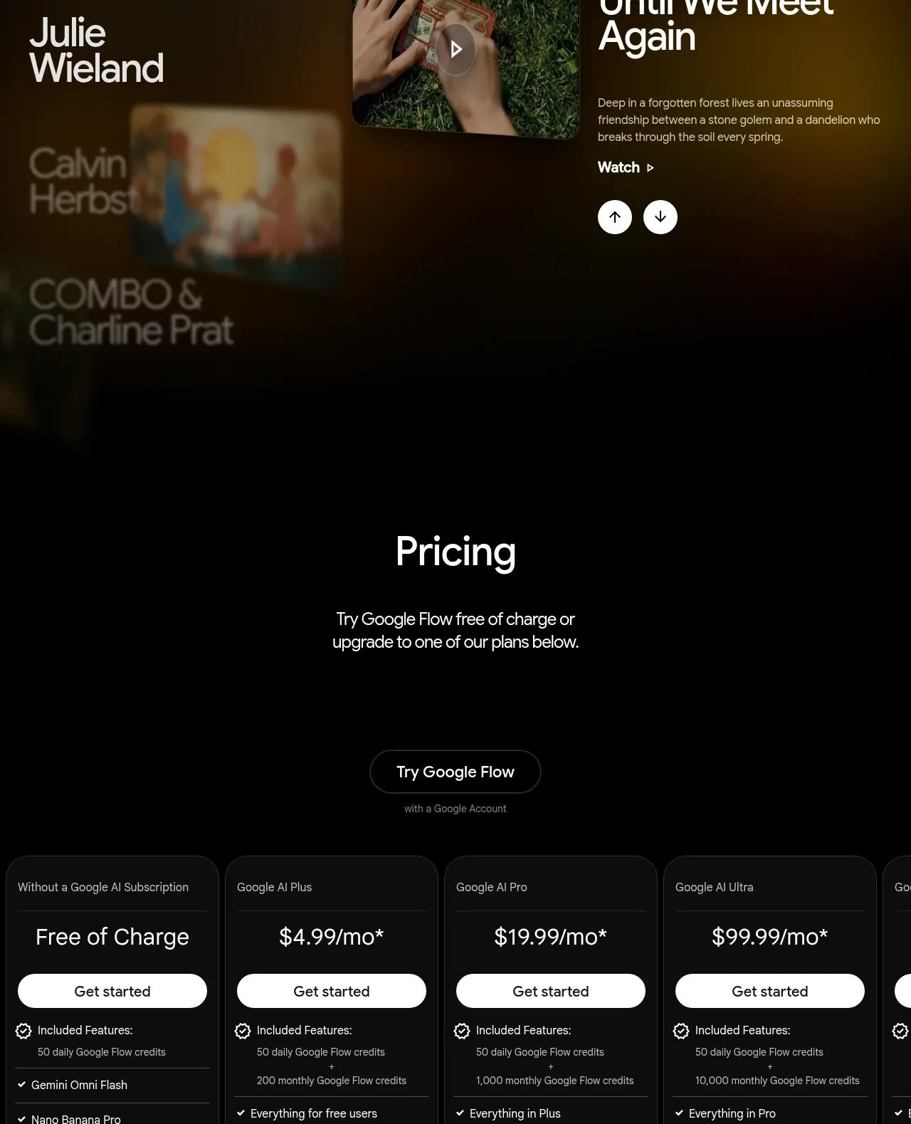
Design analysis
A simple pricing introduction sits above a horizontally scrollable set of dark plan cards. Consistent feature rows and clear primary buttons make differences between tiers easy to scan.
Prompt preview
## Reference images

Study these alongside the description below: hierarchy, rhythm, spacing, colour. Build for the product you are asked about, using this design language.

- Component: https://kage-design-assets.t3.tigrisfiles.io/components/google-flow-for-ios-android/998b1c85-b331-490a-bec1-b2413c6fadd0-1790056898-8.webp
- Full page it was cut from: https://kage-design-assets.t3.tigrisfiles.io/screenshots/google-flow-for-ios-android/998b1c85-b331-490a-bec1-b2413c6fadd0-1790056849877-full.webp
- Component on Kage: https://kage.design/component/google-flow-for-ios-android-pricing-table

## Before you start
Ask about the user's pricing model, billing rules, audience, and which plan should be recommended. Build the comparison using those real requirements.

Create a dark pricing section with a centered heading, short supporting text, and one primary CTA above the plans. Use a horizontal comparison table of 4–5 rounded cards; allow horizontal scrolling on narrow screens while keeping the first column or plan labels understandable. Cards should use #101010–#151515 backgrounds, subtle #2a2a2a borders, 12–16px radius, 16–24px padding, and a clear visual distinction for the recommended tier. Show plan name, price, billing note, full-width high-contrast button, then grouped feature rows with checkmarks and thin dividers. Keep prices large at 20–28px, labels 11–13px, and features 12–14px. Add a small footnote and FAQ link beneath the table.

Never: use logos, product names, copy, illustrations, or imagery from the reference.
More components
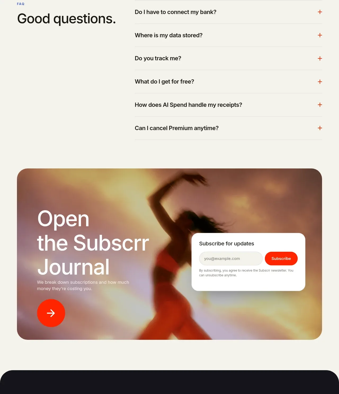
 Free and premium pricing comparison
Subscrr · Pricing table
Free and premium pricing comparison
Subscrr · Pricing table
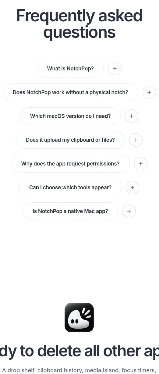
 One-time purchase pricing
NotchPop · Pricing table
One-time purchase pricing
NotchPop · Pricing table
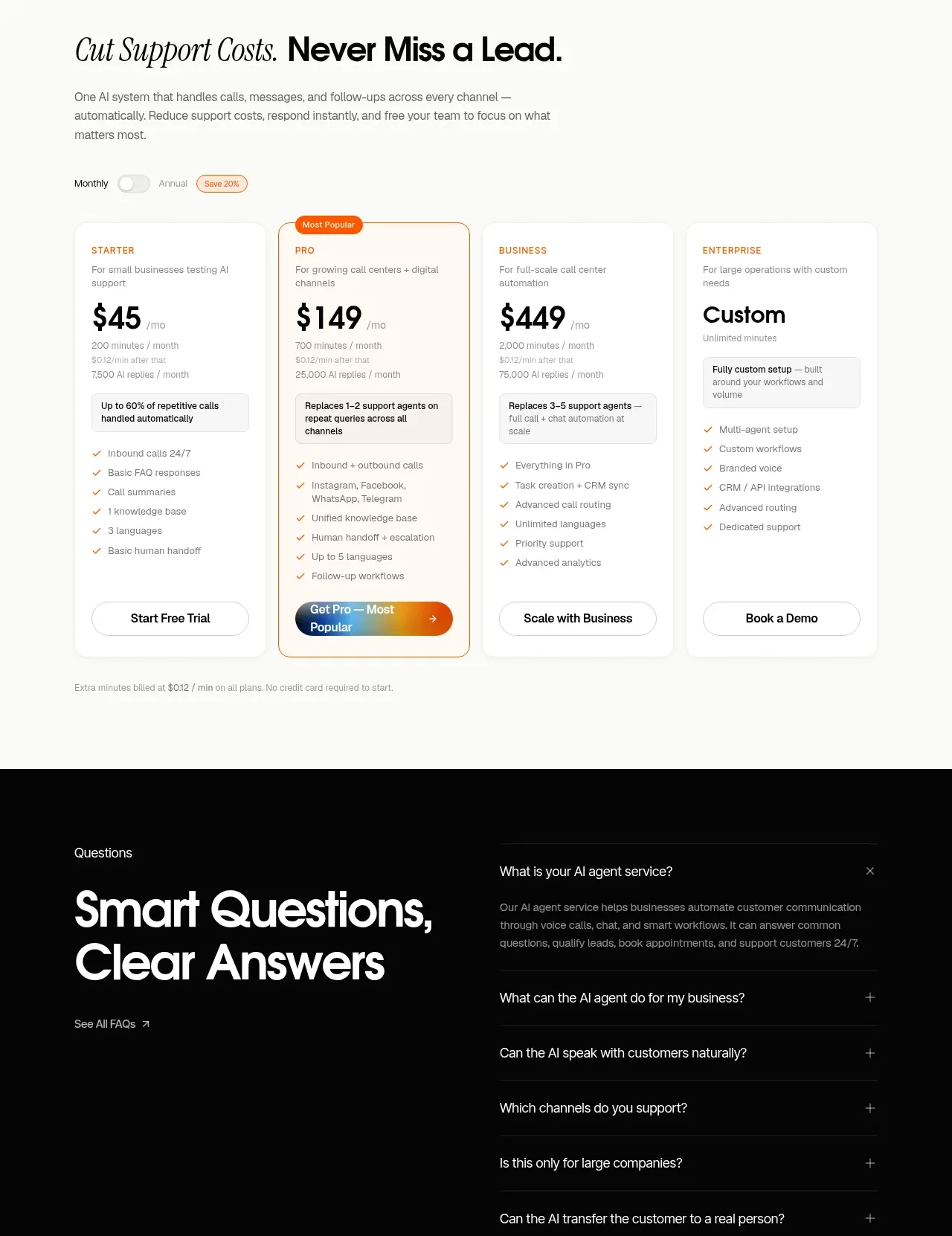
 Support plan pricing
IntellAgents.io · Pricing table
Support plan pricing
IntellAgents.io · Pricing table
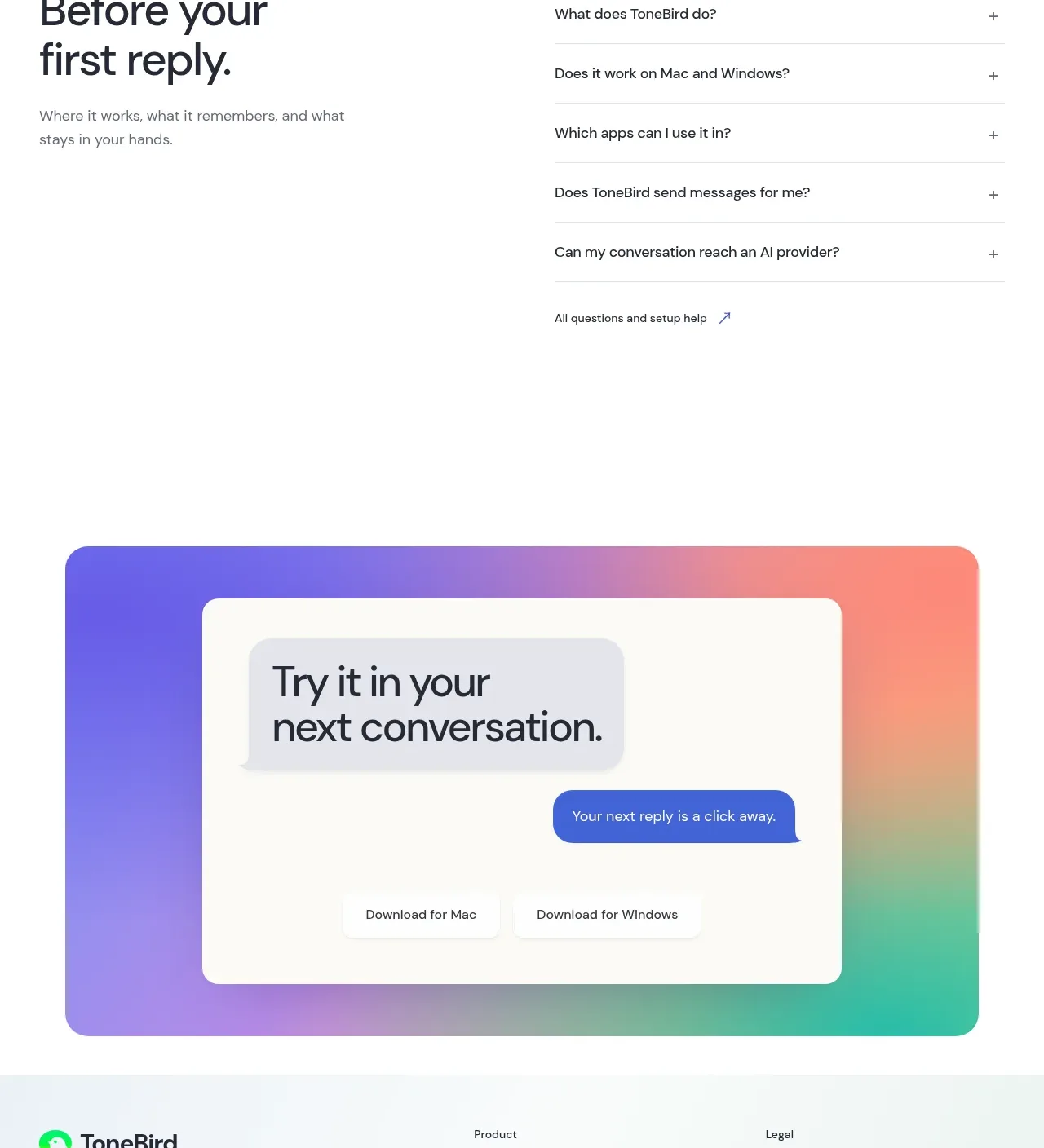
 Four-tier pricing table
ToneBird · Pricing table
Four-tier pricing table
ToneBird · Pricing table
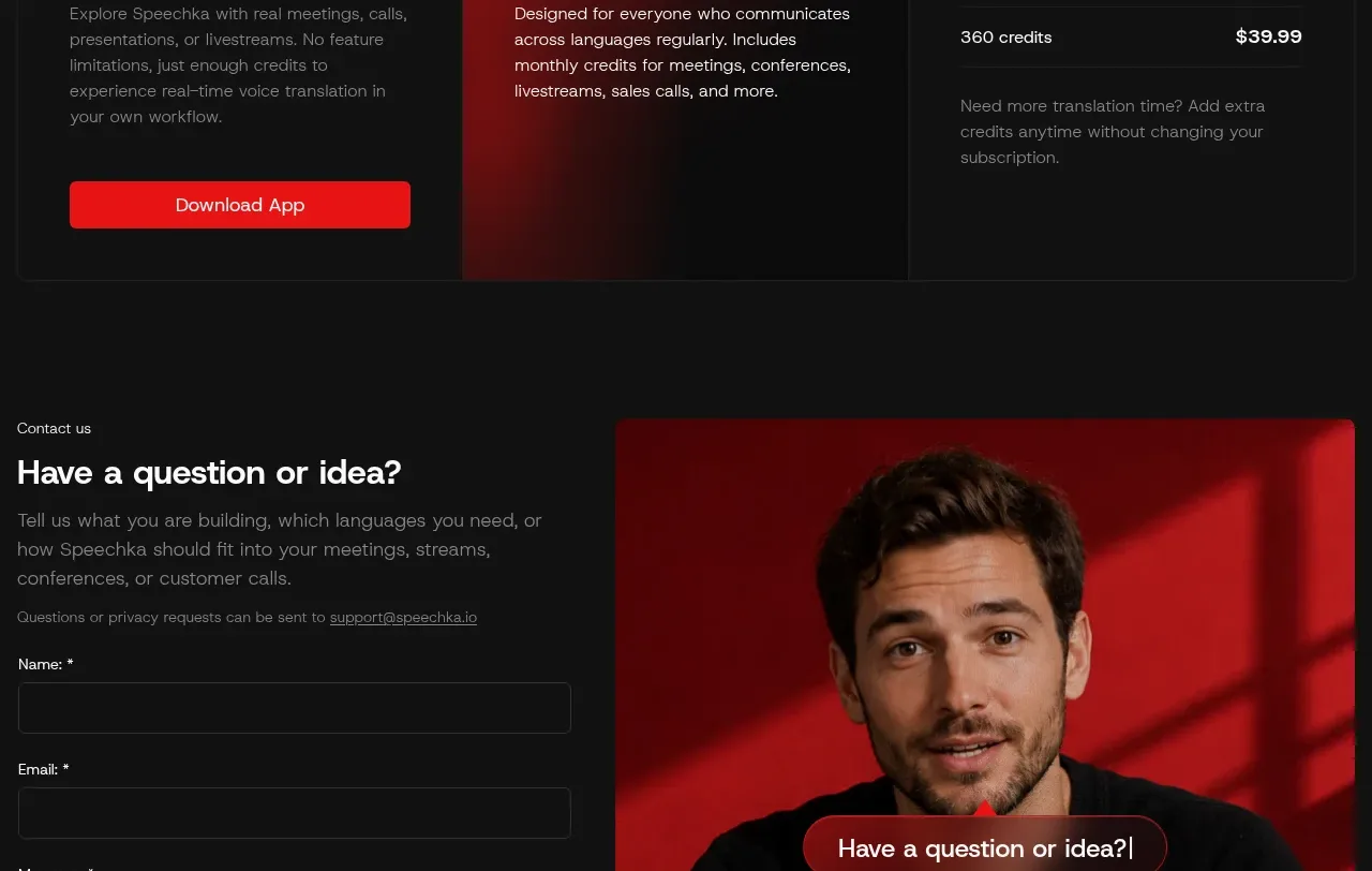
 Trial and subscription plans
Speechka · Pricing table
Trial and subscription plans
Speechka · Pricing table
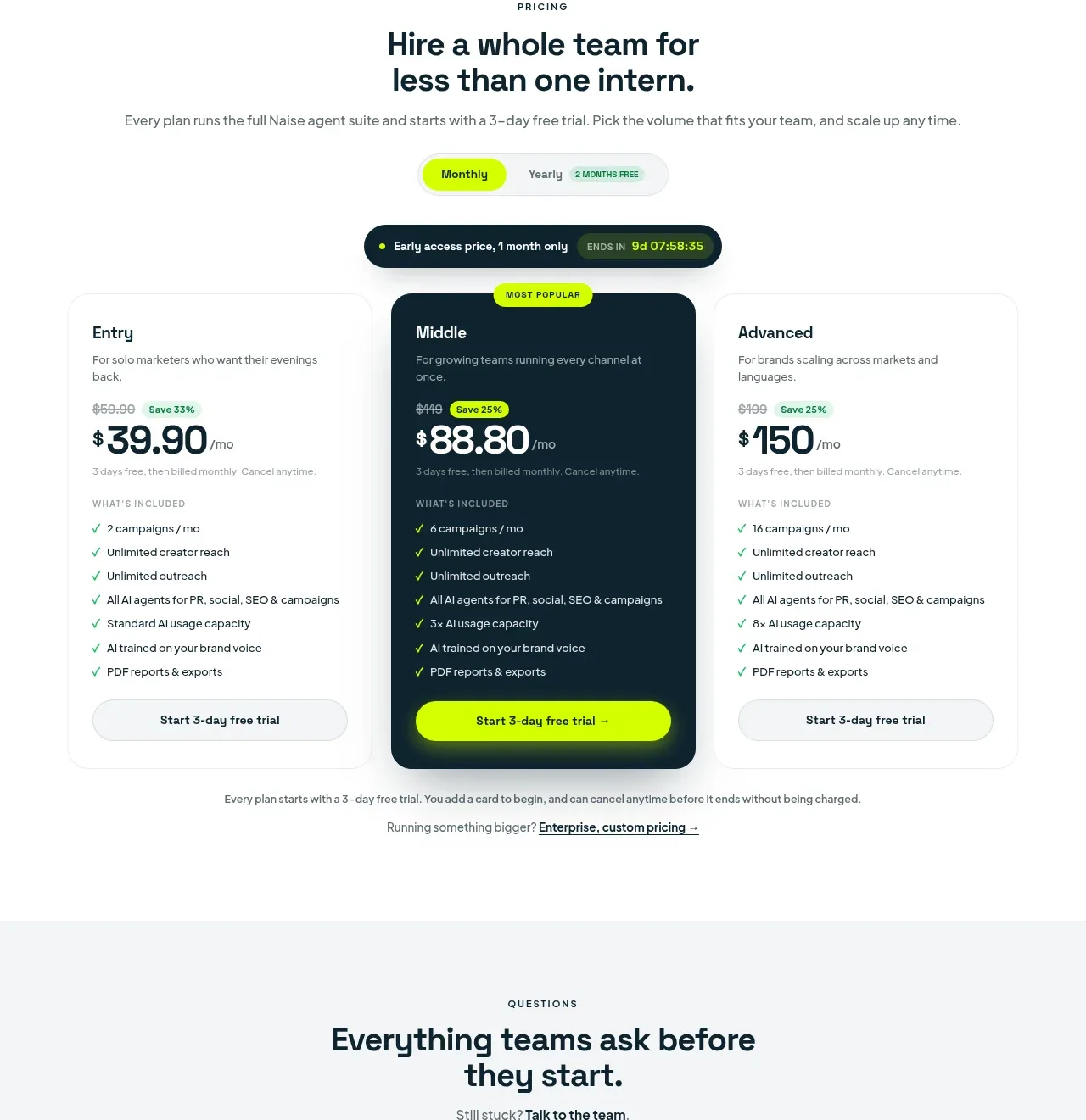
 Three-tier pricing plans
Naise AI · Pricing table
Three-tier pricing plans
Naise AI · Pricing table