 kage
kage
grimoai.com
Design analysis
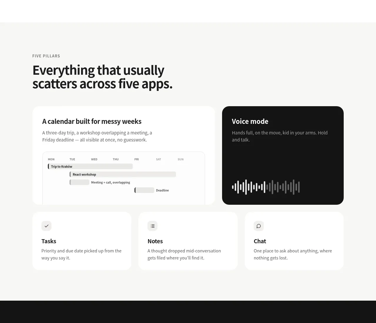
A lightly tinted section introduces the product’s main capabilities with two prominent feature cards above three smaller supporting cards.
Prompt preview
## Reference images

Study these alongside the description below: hierarchy, rhythm, spacing, colour. Build for the product you are asked about, using this design language.

- Component: https://kage-design-assets.t3.tigrisfiles.io/components/grimo-ai/49d17de6-ec9e-4ad1-a407-f0ba9cfffa22-1789538765-2.webp
- Full page it was cut from: https://kage-design-assets.t3.tigrisfiles.io/screenshots/grimo-ai/49d17de6-ec9e-4ad1-a407-f0ba9cfffa22-1789538658825-full.webp
- Component on Kage: https://kage.design/component/grimo-feature-grid

## Before you start
Ask me for my product’s core capabilities and which one or two deserve visual emphasis. Then use the rules below to create a brand-specific feature section.

Build a feature overview on a very light warm-gray background (`#f7f7f5`). Use a max-width container around 744px. Start with a small uppercase eyebrow at 11–12px with letter spacing, followed by a bold 32–38px headline with a tight line-height. Arrange a responsive grid with two larger cards in the first row and three compact cards below. Give cards white fills (`#ffffff`), 16–20px radius, and either no border or a very subtle `#ececea` border. The featured dark card should use near-black (`#171717`) with white text and an original product-specific visual such as a timeline, waveform, or miniature interface. Keep card padding around 24px, use 18–20px card titles, 13–14px descriptions, and consistent icon/visual alignment. On smaller screens, collapse to one column while preserving the featured card first.

Never: use logos, product names, copy, illustrations or imagery from the reference.
More components

 Authentication product capabilities
tiun. · Feature grid
Authentication product capabilities
tiun. · Feature grid
 Customer data and user management
tiun. · Feature grid
Customer data and user management
tiun. · Feature grid
 Problem and unified solution narrative
tiun. · Feature grid
Problem and unified solution narrative
tiun. · Feature grid
 Integration and agent workflow
tiun. · Feature grid
Integration and agent workflow
tiun. · Feature grid
 Billing and checkout capabilities
tiun. · Feature grid
Billing and checkout capabilities
tiun. · Feature grid
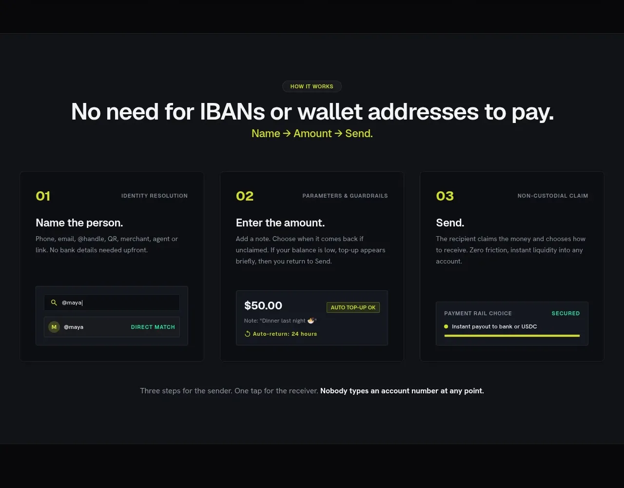
 Three-step payment flow
Payflip · Feature grid
Three-step payment flow
Payflip · Feature grid