 kage
kage
grimoai.com
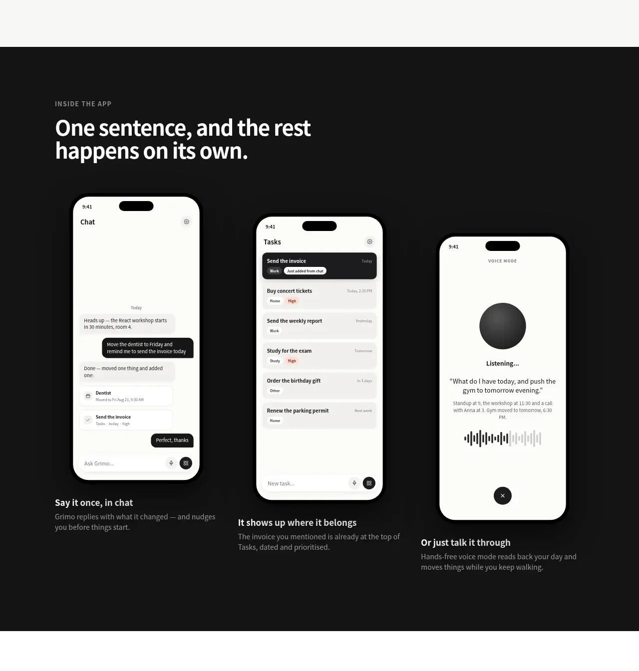
Design analysis
A dark editorial section explains the end-to-end workflow through three tall phone-like screens and short captions, creating a strong visual rhythm.
Prompt preview
## Reference images

Study these alongside the description below: hierarchy, rhythm, spacing, colour. Build for the product you are asked about, using this design language.

- Component: https://kage-design-assets.t3.tigrisfiles.io/components/grimo-ai/49d17de6-ec9e-4ad1-a407-f0ba9cfffa22-1789538765-3.webp
- Full page it was cut from: https://kage-design-assets.t3.tigrisfiles.io/screenshots/grimo-ai/49d17de6-ec9e-4ad1-a407-f0ba9cfffa22-1789538658825-full.webp
- Component on Kage: https://kage.design/component/grimo-feature-grid-2

## Before you start
Ask me what the key workflow is, which stages users move through, and what product UI can demonstrate it. Then build a new visual narrative for my product.

Create a full-width dark workflow showcase using near-black `#151515` or `#171717`, with a centered max-width container around 744px. Use a small uppercase eyebrow in muted gray (`#9a9a9a`) and a large white heading around 32–38px. Below it, place three evenly spaced columns. Each column should contain an original tall device or interface mockup with rounded corners (24–30px), a dark outline, and a soft shadow, followed by a bold 15–16px caption and muted 13–14px explanatory text. Use subtle off-white surfaces (`#f7f7f2`) inside the mockups and limited gray accents. Maintain generous vertical spacing and let the devices form the dominant visual. On mobile, stack the stages vertically and keep the captions attached to their screens.

Never: use logos, product names, copy, illustrations or imagery from the reference.
More components

 Authentication product capabilities
tiun. · Feature grid
Authentication product capabilities
tiun. · Feature grid
 Customer data and user management
tiun. · Feature grid
Customer data and user management
tiun. · Feature grid
 Problem and unified solution narrative
tiun. · Feature grid
Problem and unified solution narrative
tiun. · Feature grid
 Integration and agent workflow
tiun. · Feature grid
Integration and agent workflow
tiun. · Feature grid
 Billing and checkout capabilities
tiun. · Feature grid
Billing and checkout capabilities
tiun. · Feature grid
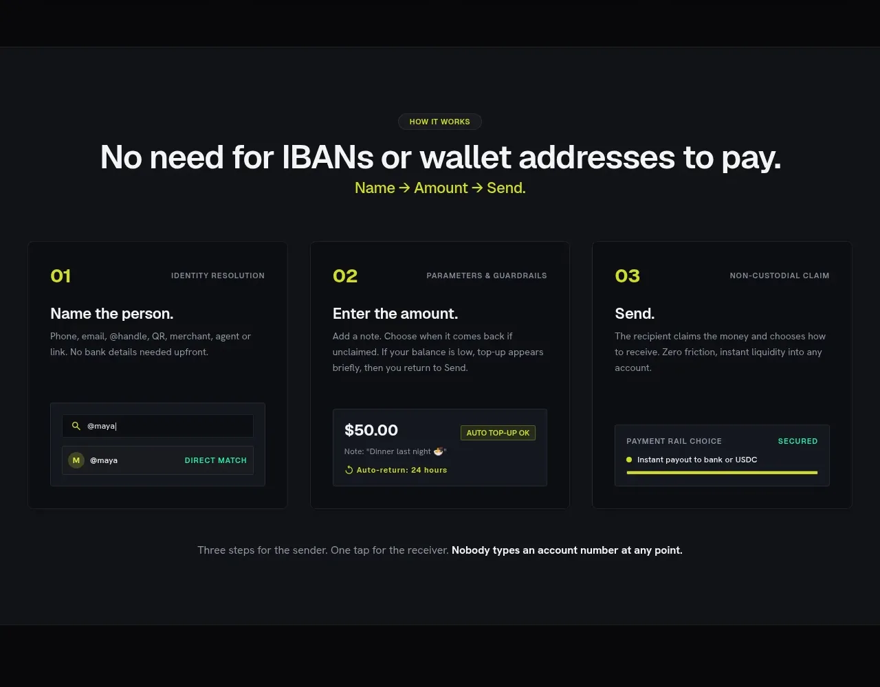
 Three-step payment flow
Payflip · Feature grid
Three-step payment flow
Payflip · Feature grid